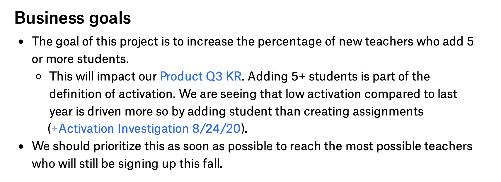
Case Study: Adding Students on NoRedInk
Making it easier for teachers to get up and running.
Previous State of the World
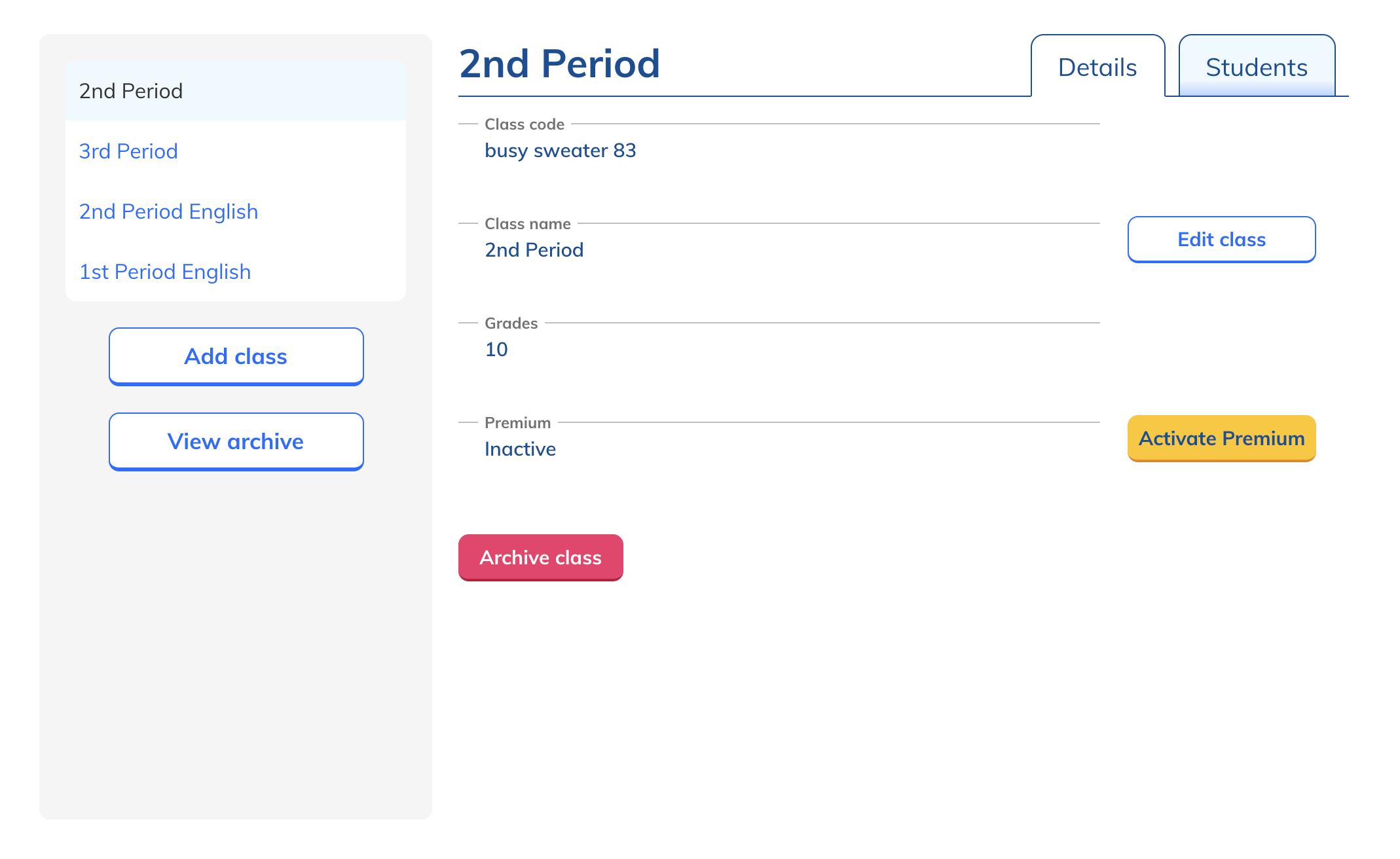
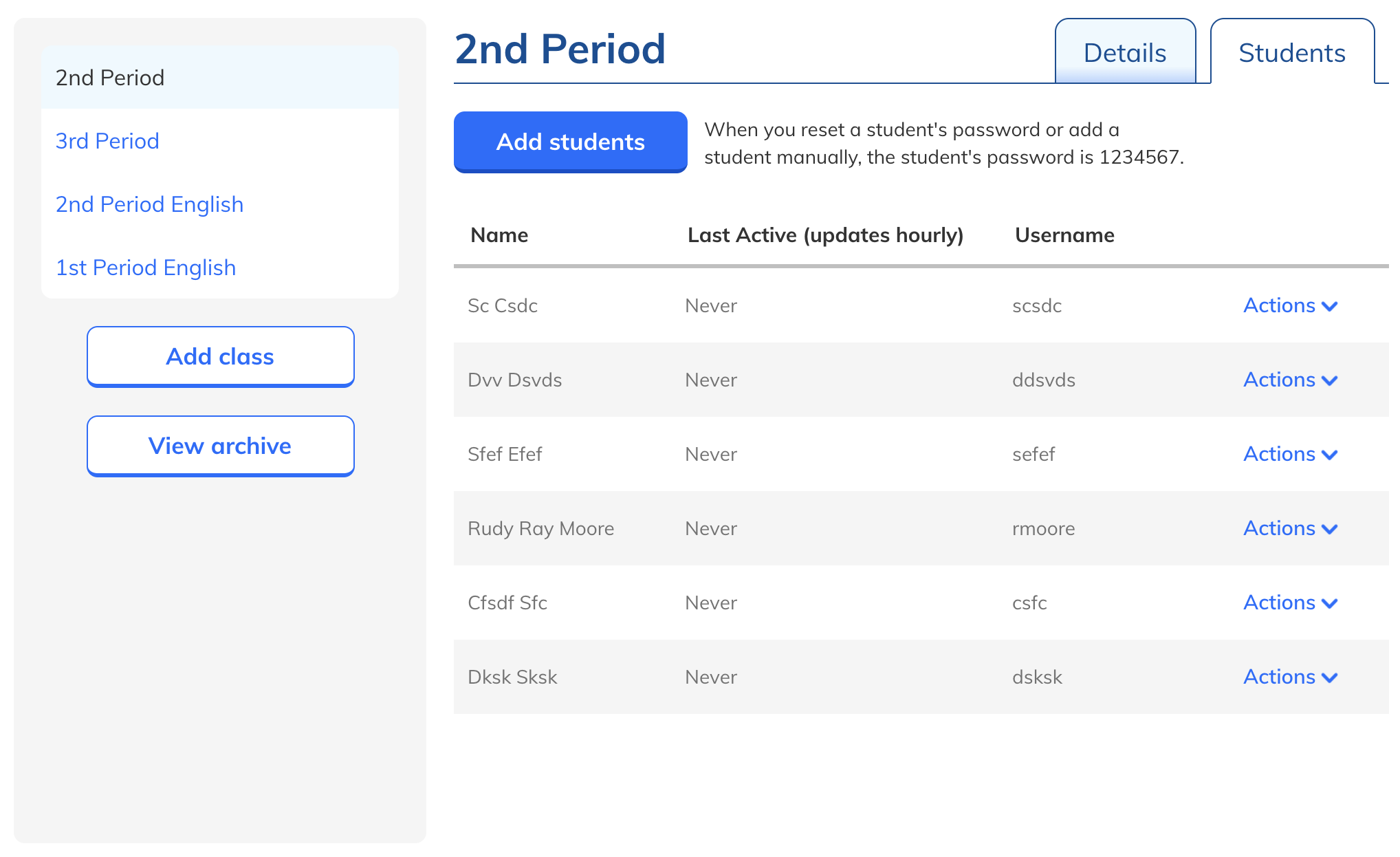
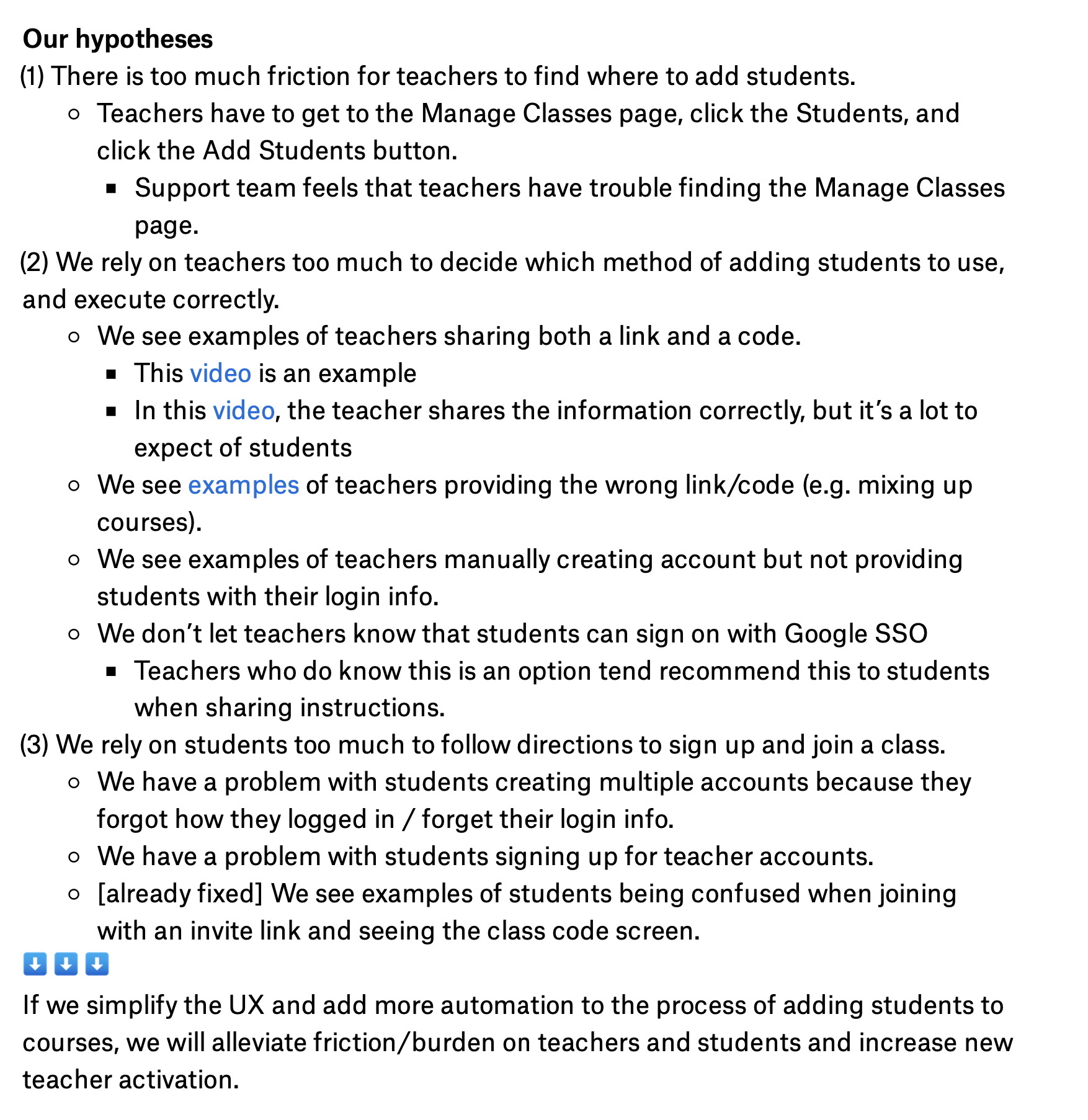
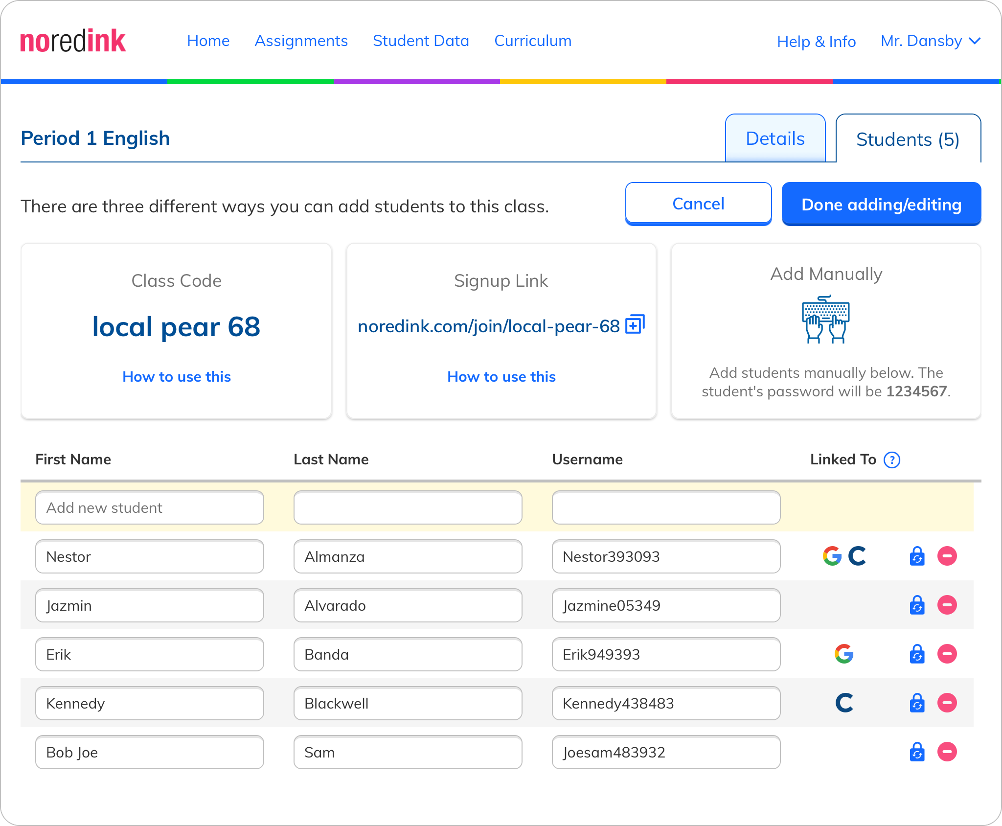
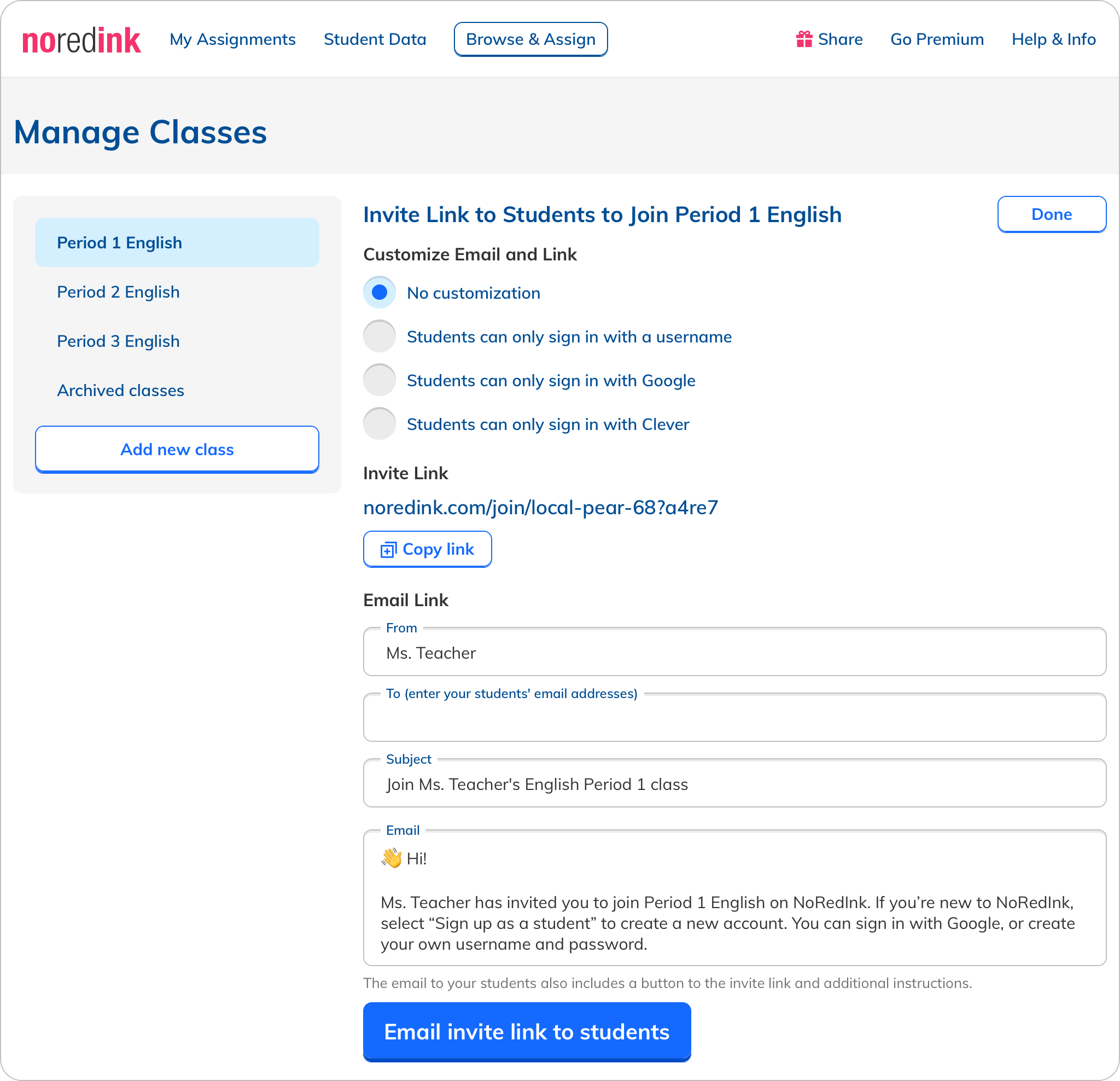
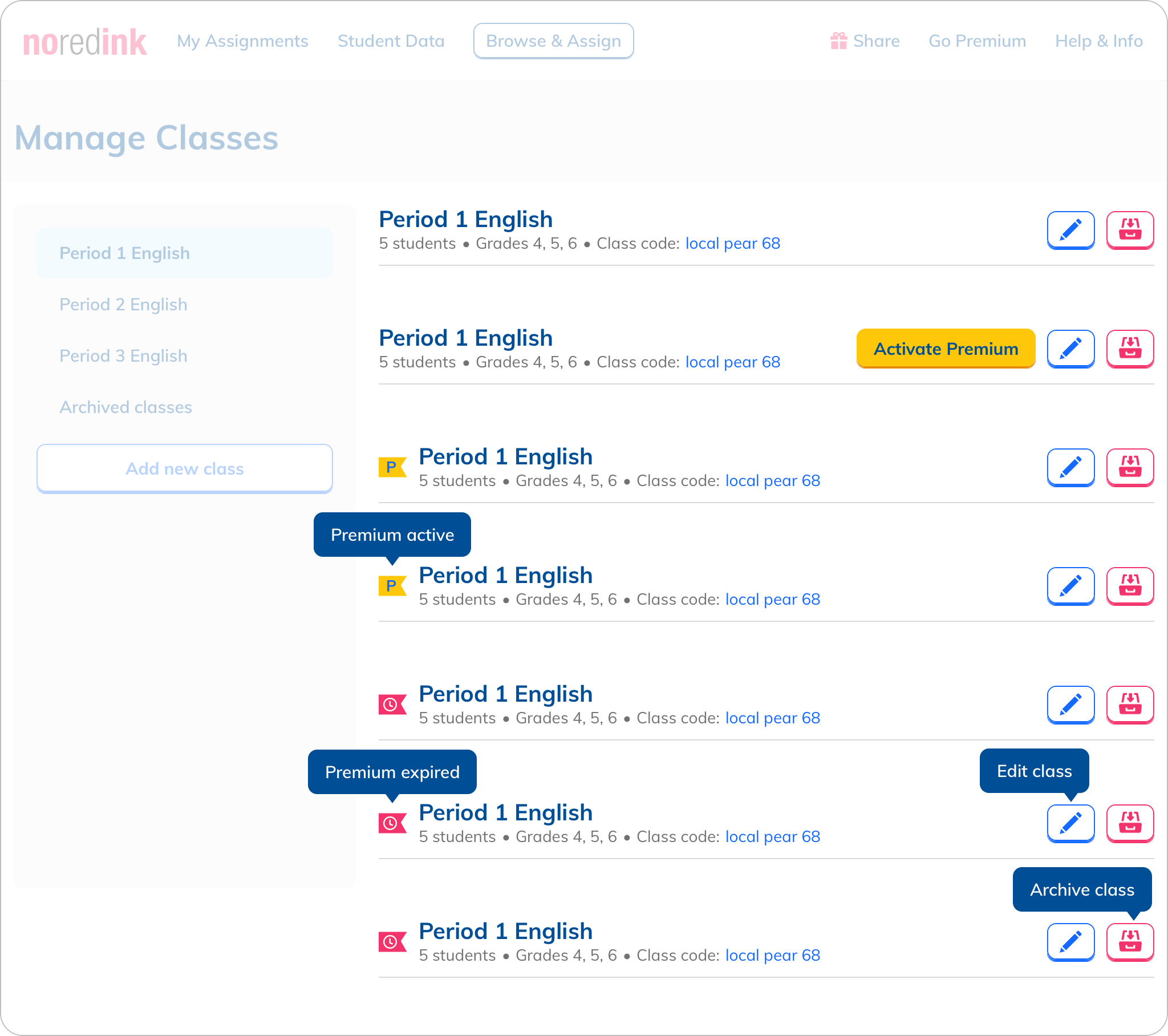
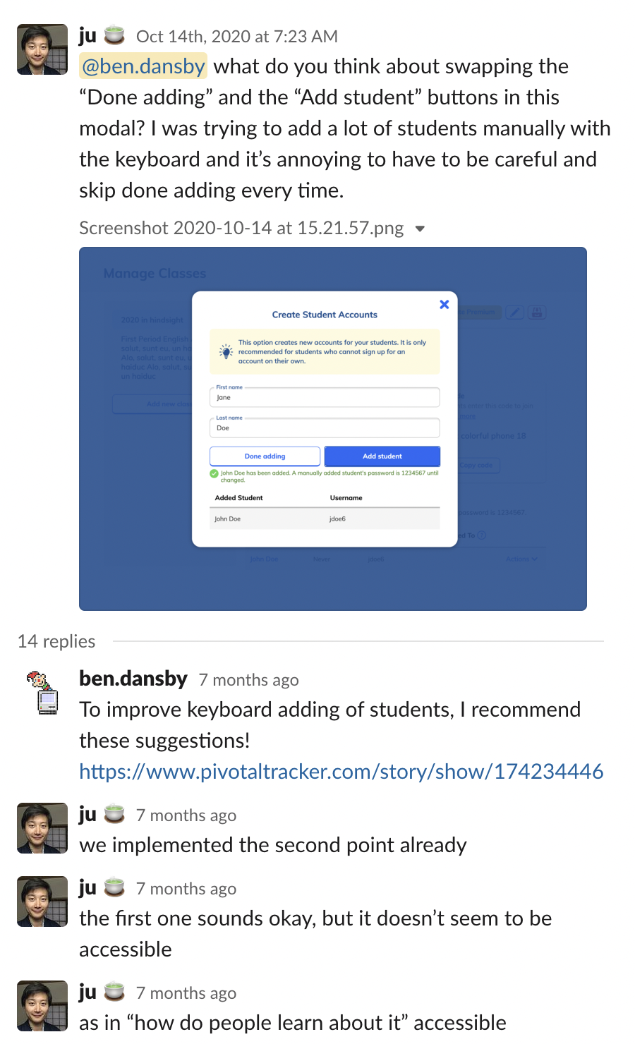
One of the steps in a teacher’s onboarding is adding students to her class. This occurs on the page where teachers manage their classes, which I had designed originally. I had designed the experience for this originally, and had contributed a few tweaks in the years since. In the most recent tweak, we added messages to explain each method of adding students. This was very much a band-aid solution to help teachers understand the methods.
Smelling Smoke
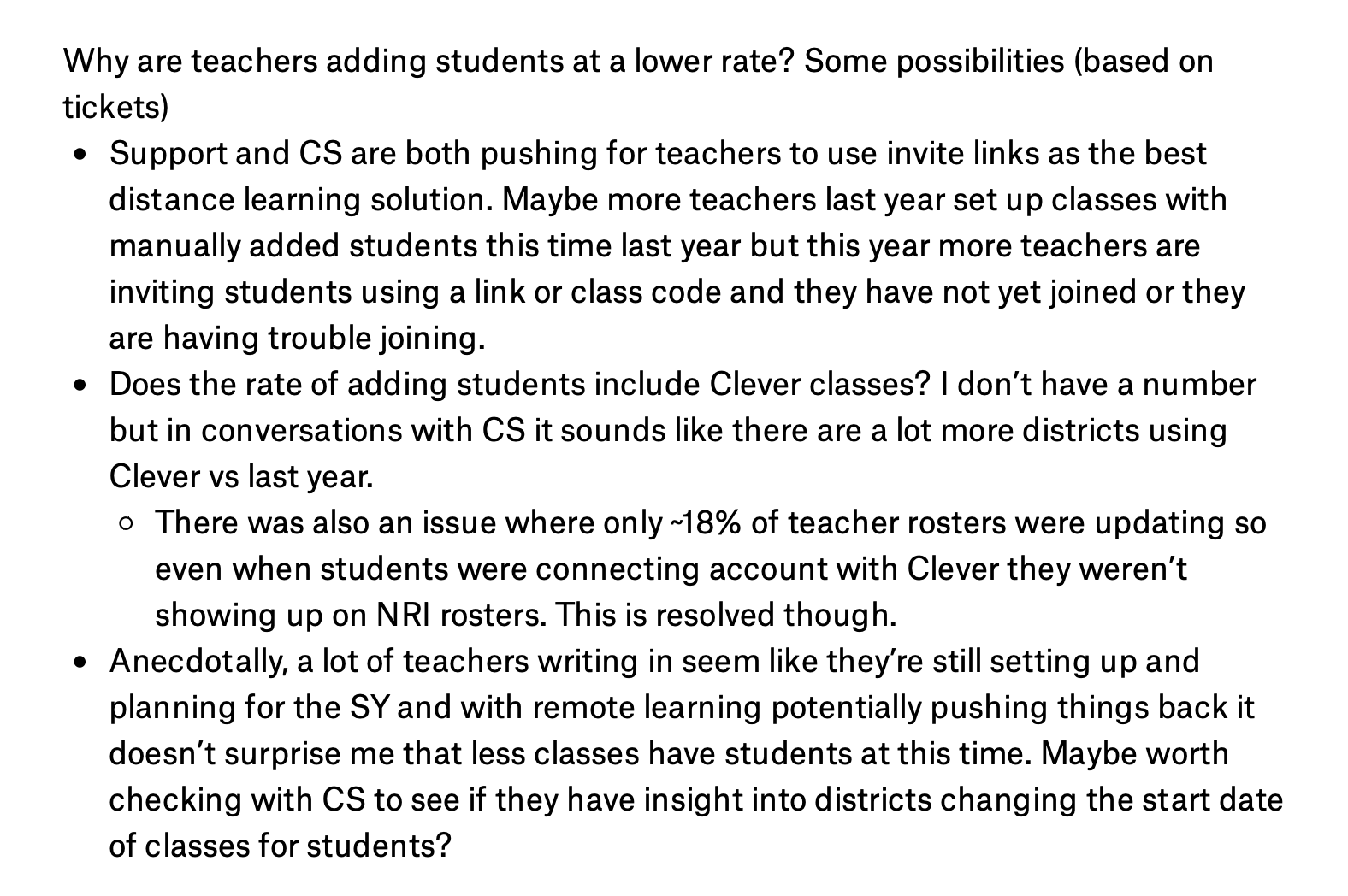
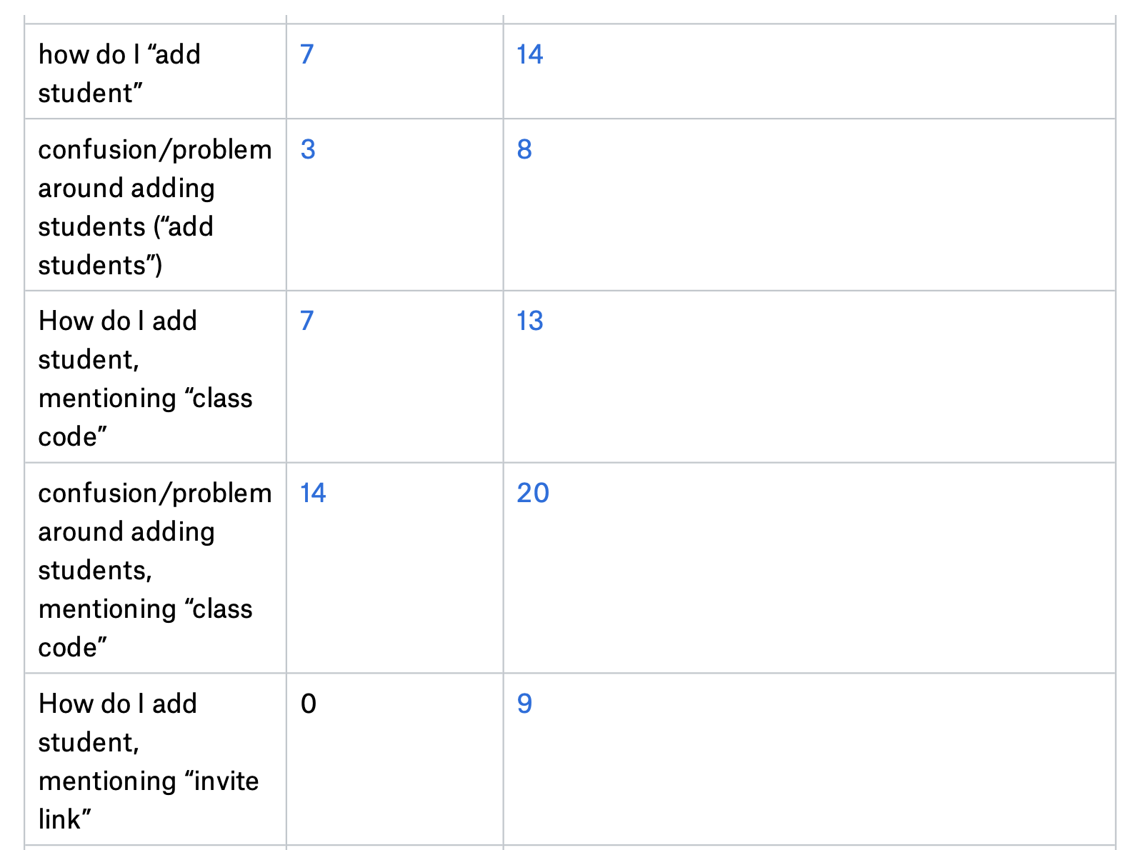
When the COVID-19 pandemic hit, we started seeing fewer teachers add students and thus fewer new teachers using NoRedink. Talking to our Support team, we heard reports of more teachers adding students via invite links, among other things. Quantitatively, we were seeing more tickets opened from teachers about adding students.
Making it Official
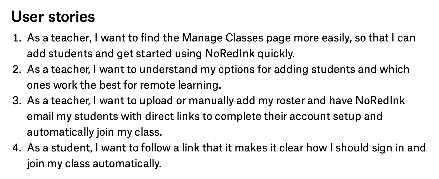
Our findings were formalized into a product guide that summarized the goals of this new project, what the problems were, and what the user needs were. The core improvement we sought was to help teachers make the right choice about how to add students. We also specified that we wanted to add a feature to allow teachers to send students a join email, in order to make adding students easier. Specifying a solution as a user need was unusual for us, and probably not best practice, but we felt the need was strong and obvious.
Surveying the Landscape
To get a sense of what the possibilities in the problem space were, we took a look at what similar sites were doing. We found reminder emails about adding students, multi-choice class settings, bulk email, and illustrated examples. Our competitors weren’t doing things too differently from what we were already doing and what we planned to do, so we felt comfortable jumping in and working with what we had.
Brain Storming
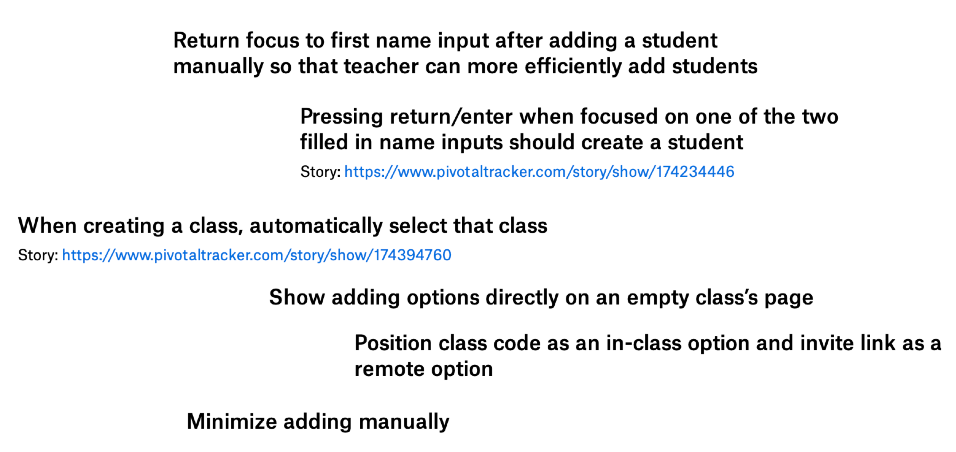
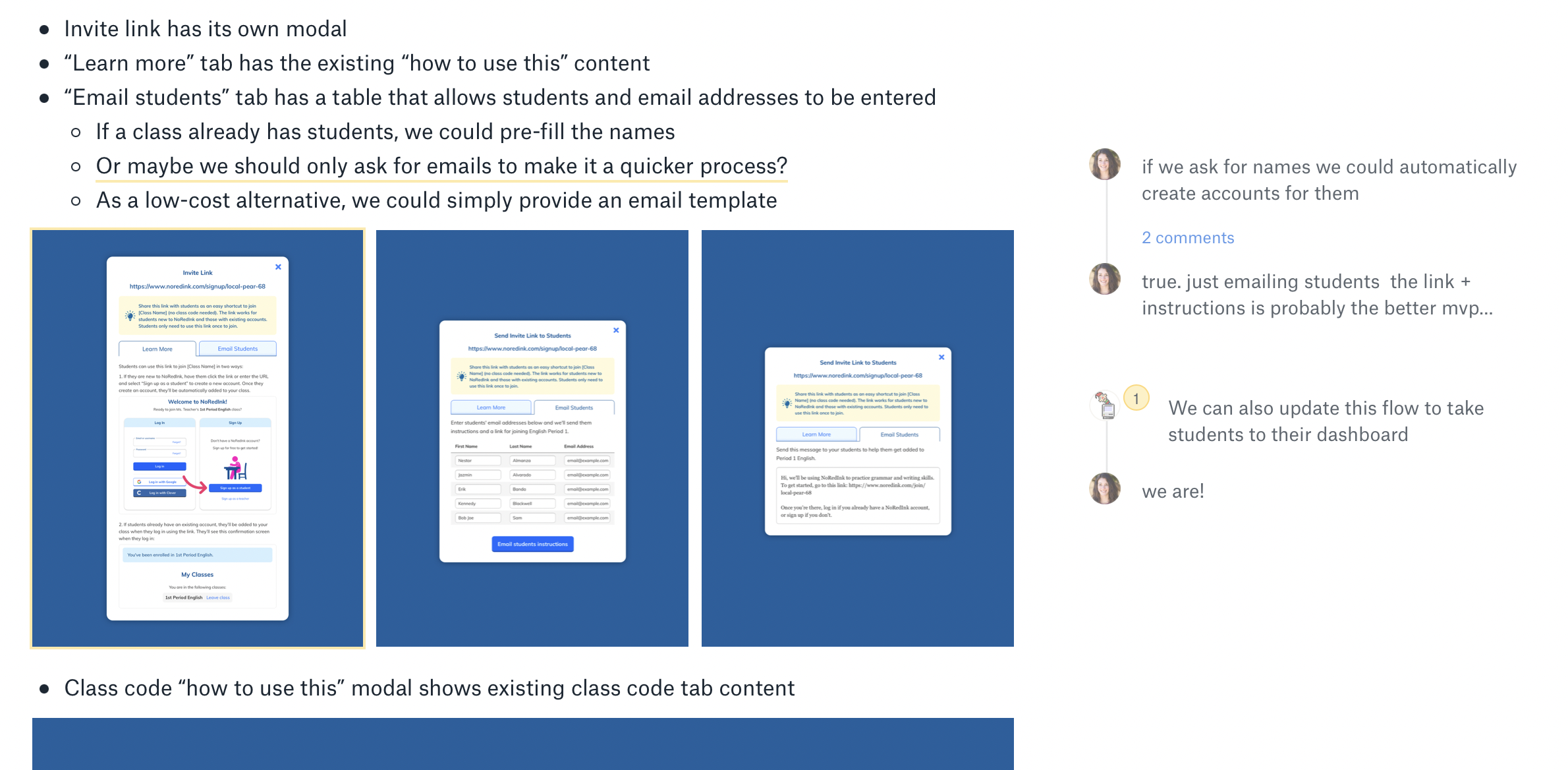
Getting right into the thick of designing, I brainstormed a number of different solutions for our user needs. Some of the options we considered included a full page redesign, UX improvements for faster student adding, requiring fewer steps to get to the actual adding of students, more clearly labeling the methods, pre-written email copy, a wizard, and of course an email students option.
Iteration
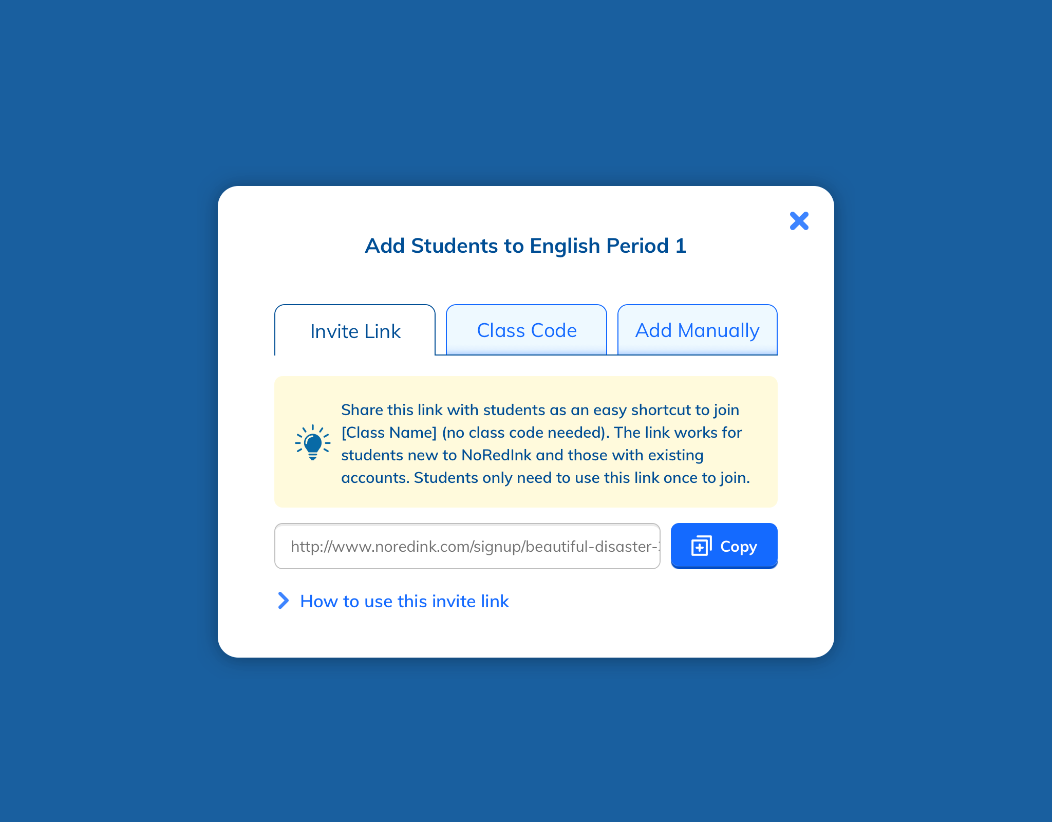
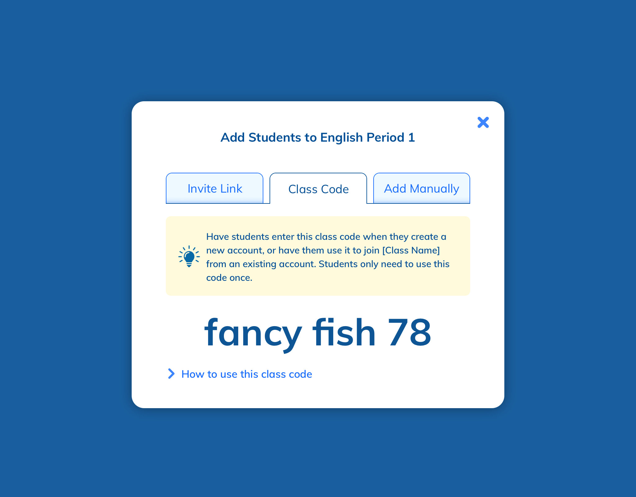
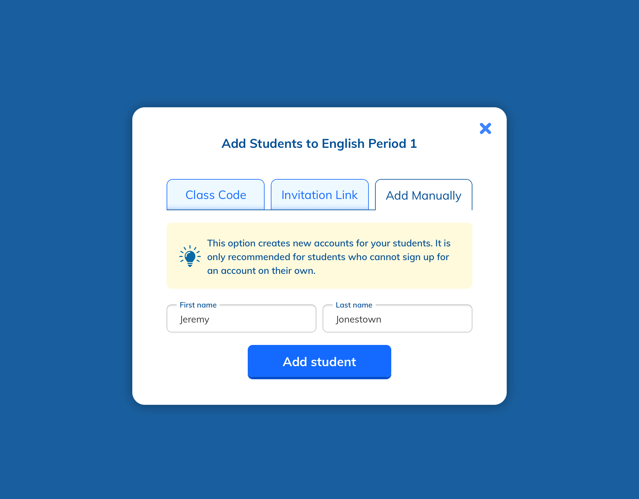
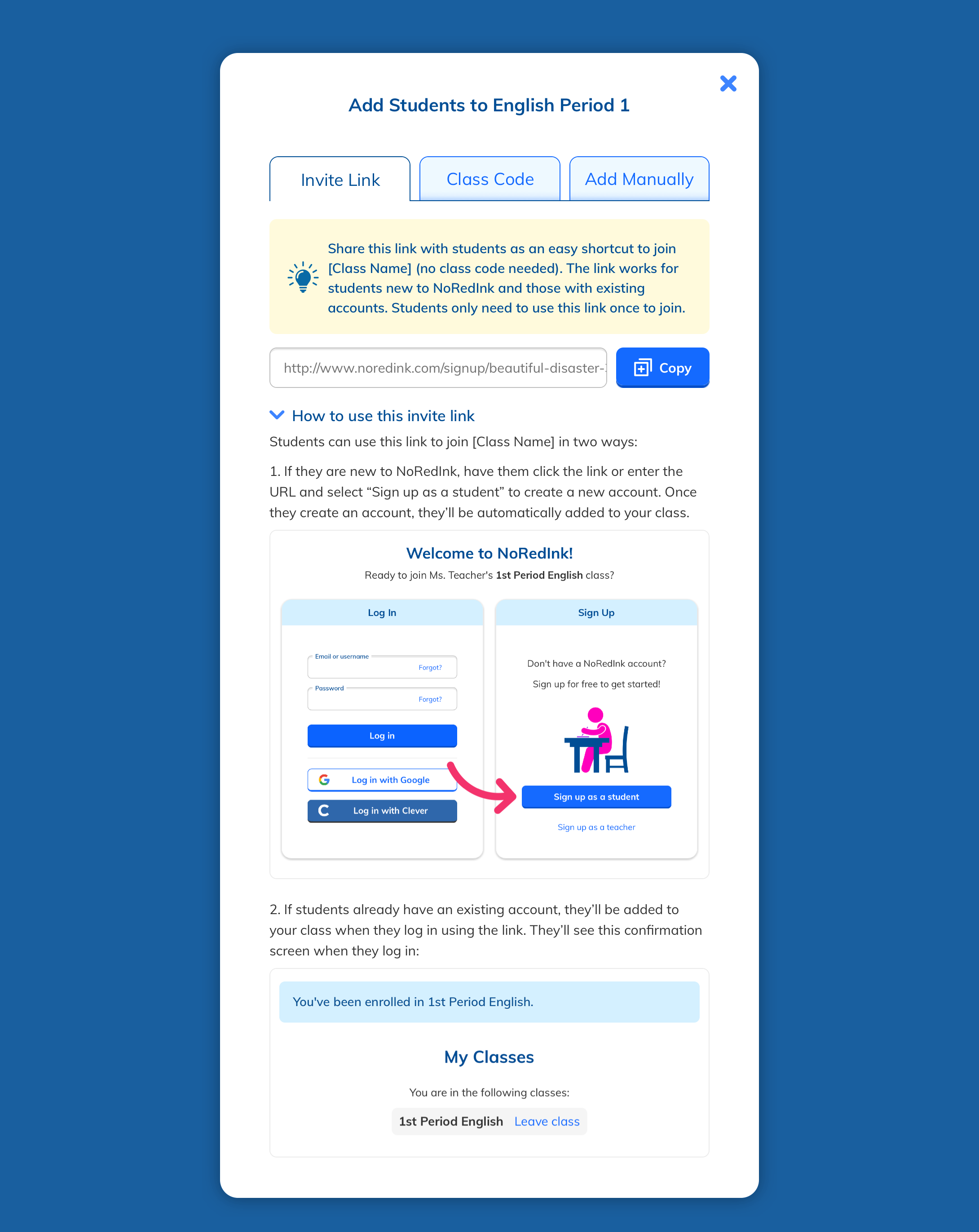
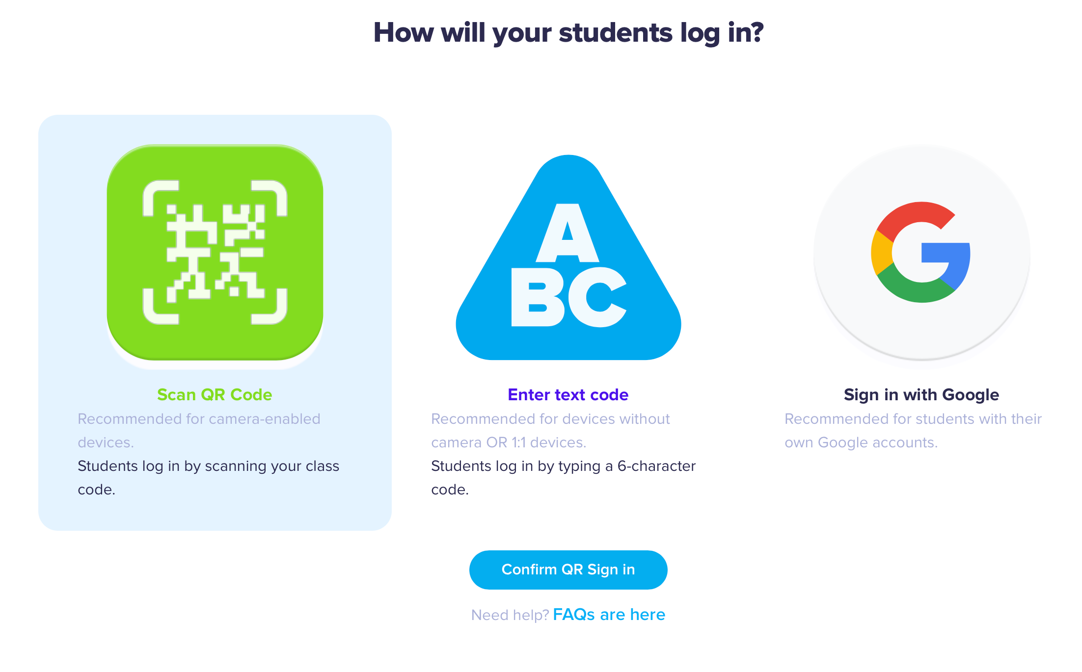
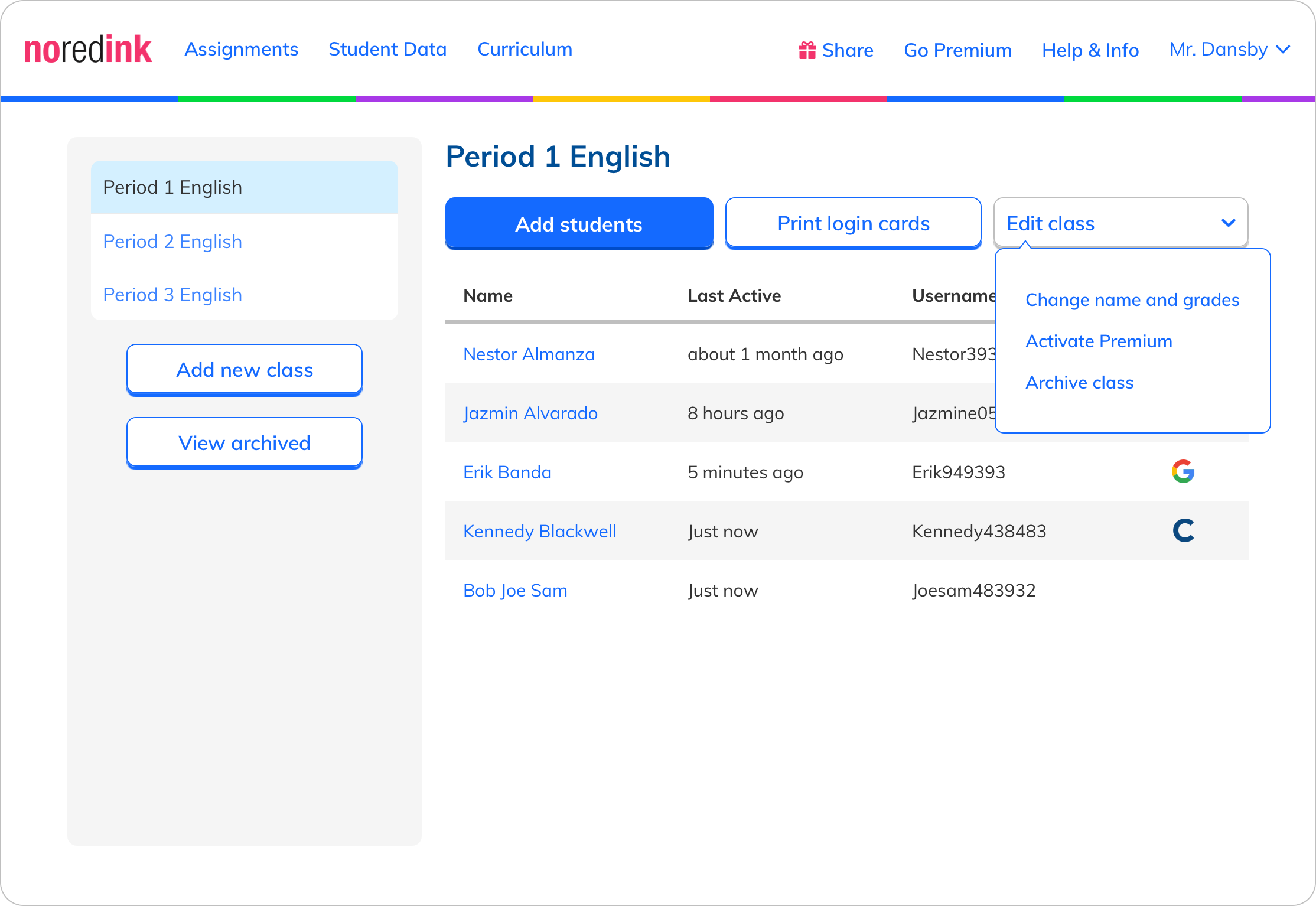
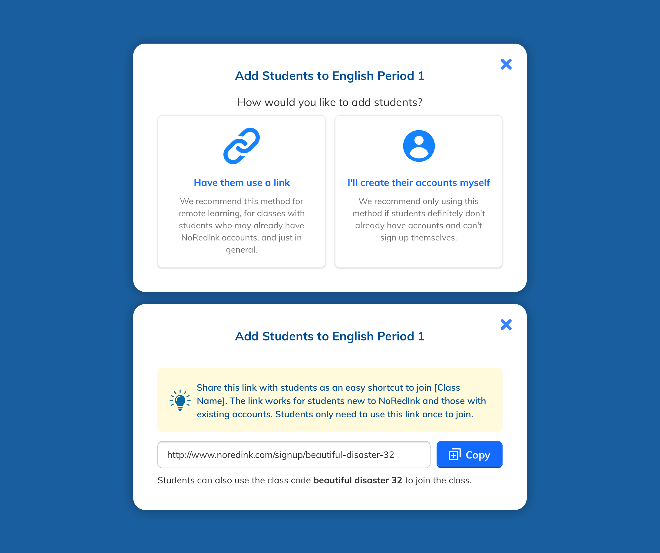
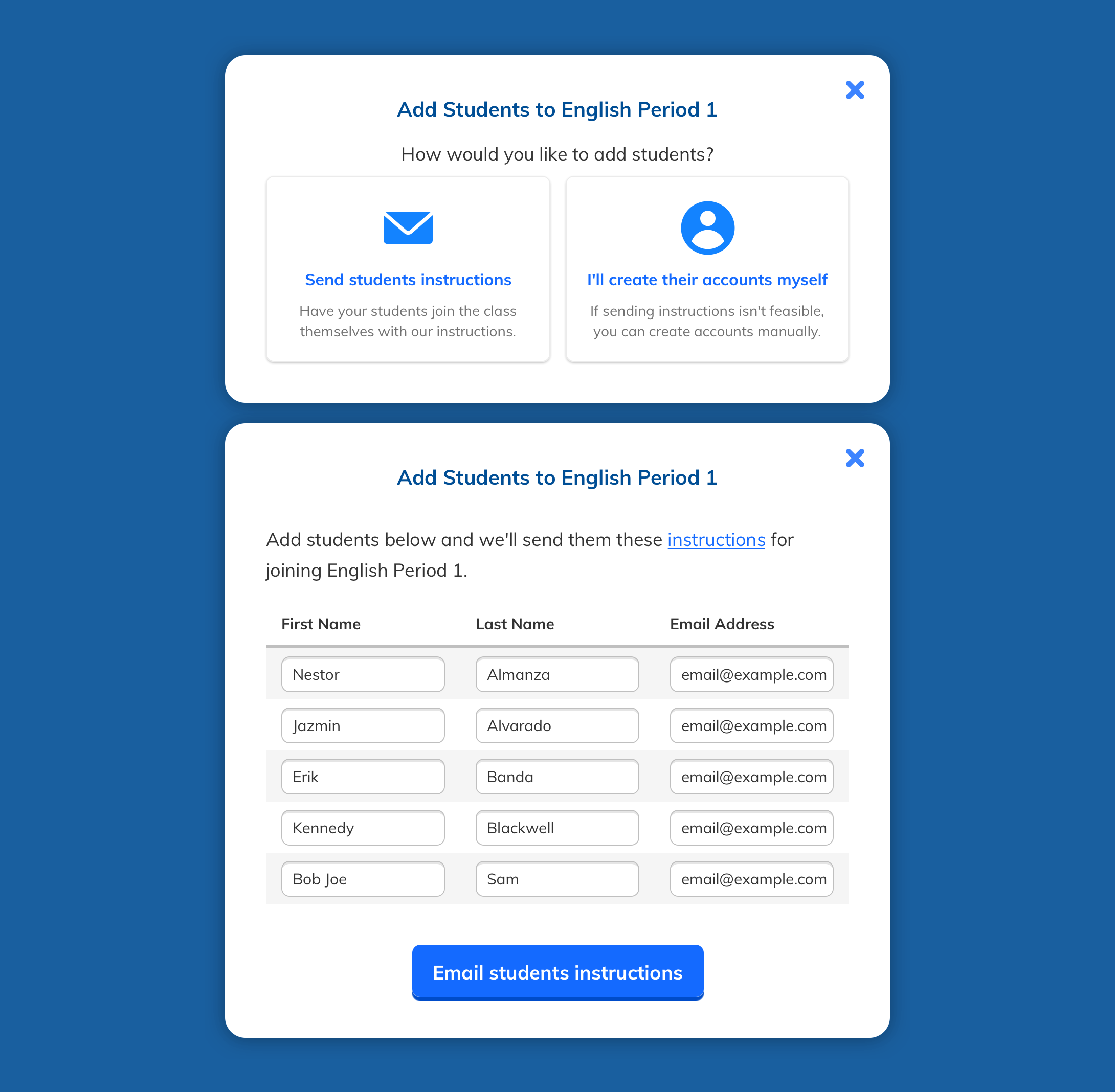
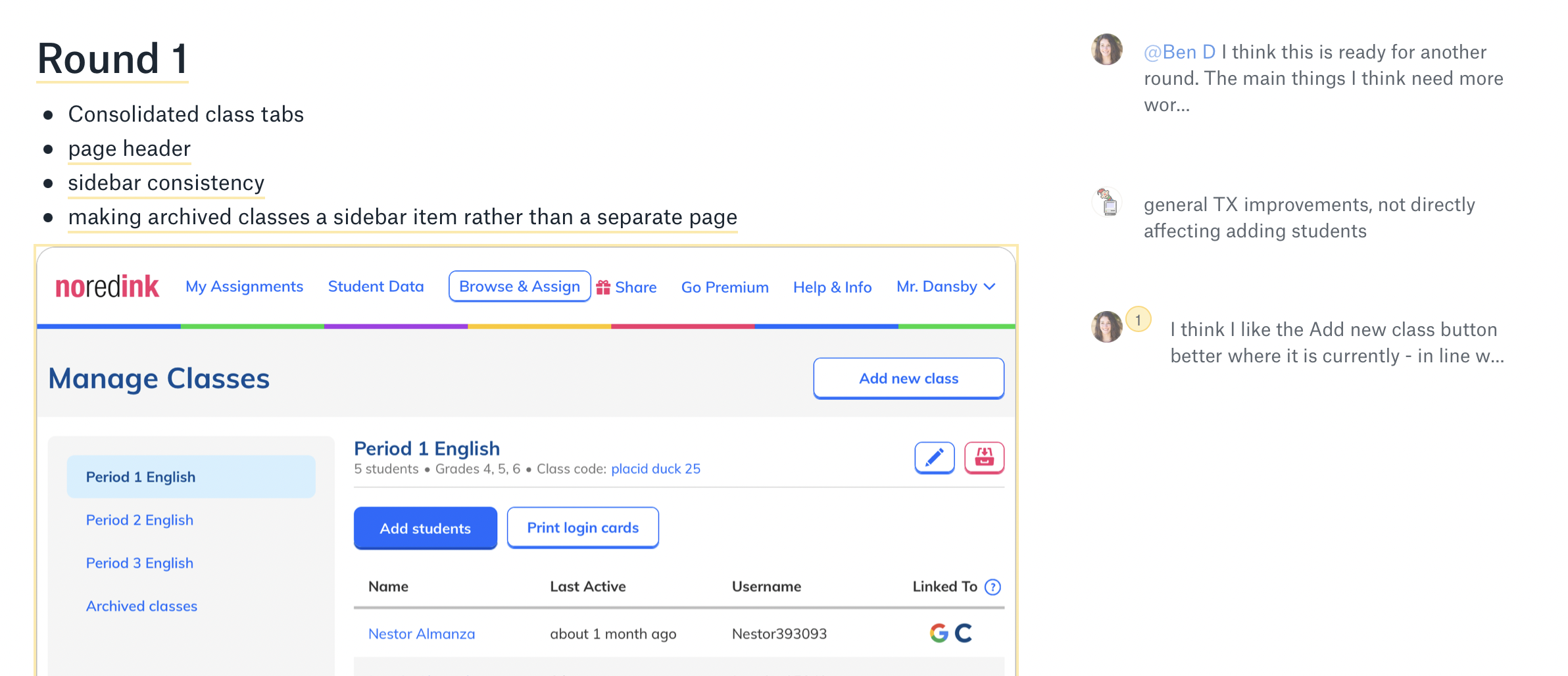
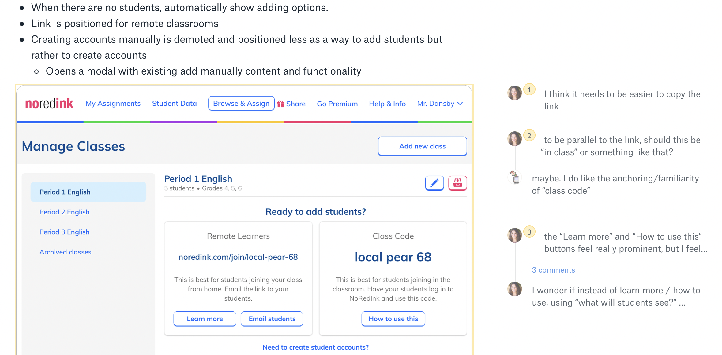
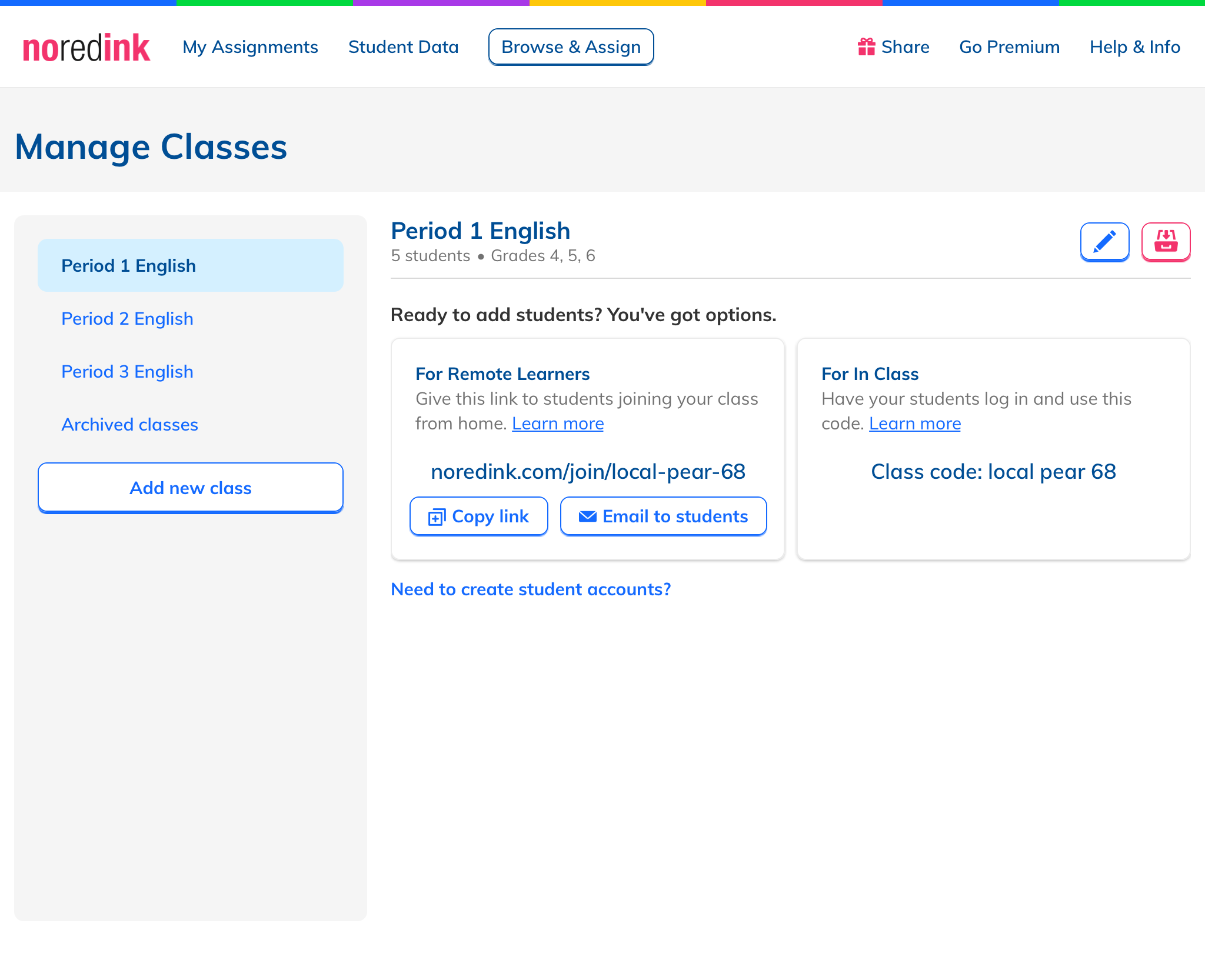
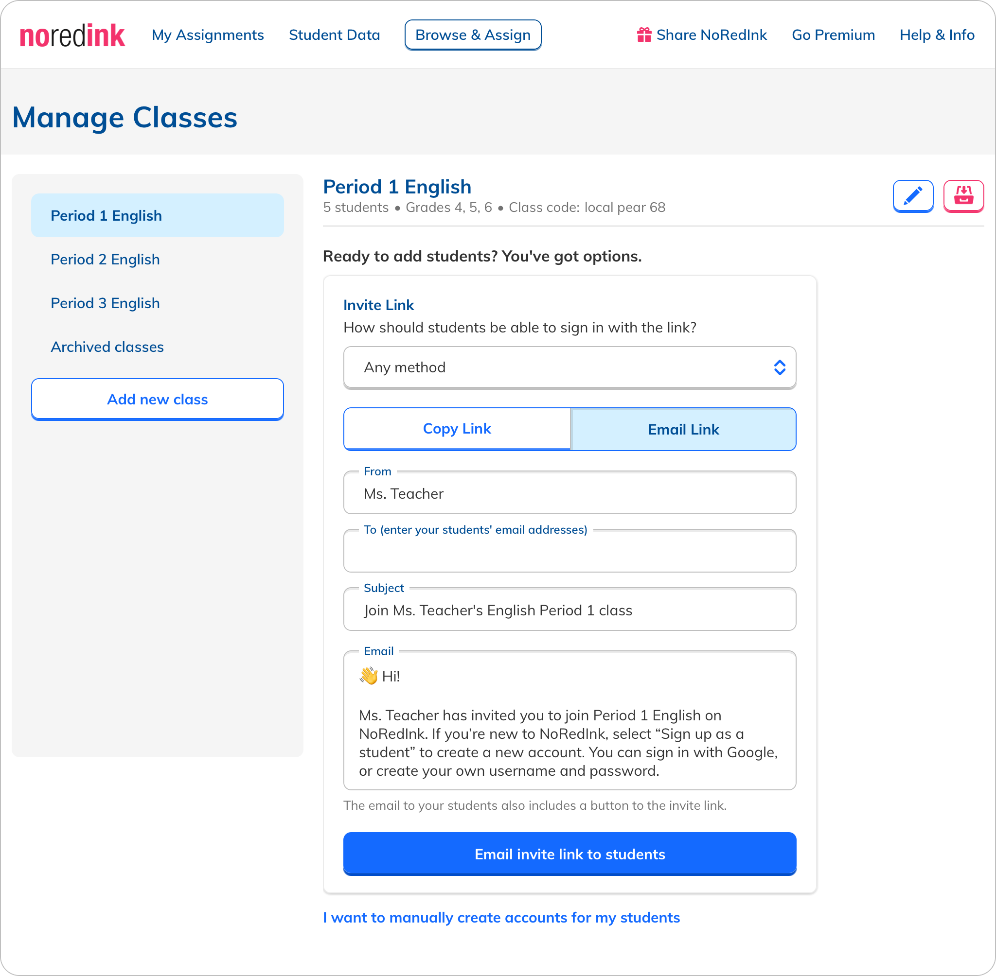
After the team chose the most promising ideas, I set about incorporating them into a cohesive design. We worked through several rounds of feedback, refining the design to the point where we were ready to test it with users. What we showed them was a page with all information of a class consolidated into one view, placing the methods for adding a student directly on the page when a class has no students, prominent options for using a class code or link with labels that emphasized their use case, an email option, and a de-emphasized "manual add" option.
User Testing
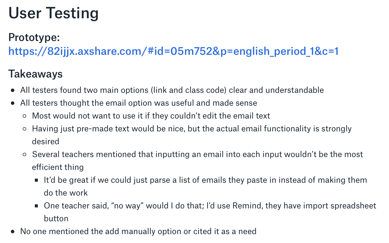
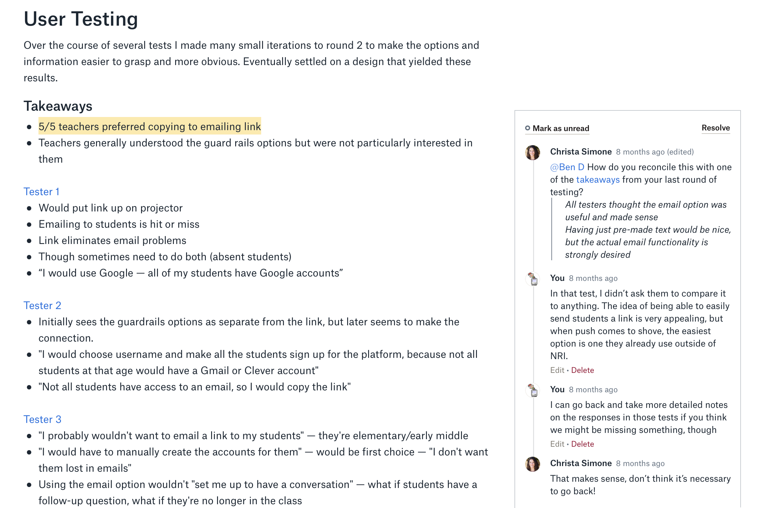
Using UserTesting.com, we put a prototype in front of users and asked them to look around and click around. We found that they were able to get to the page, understood the options presented to them, and were interested in the email feature, though they had some clear feedback and under what conditions they would use it. In all, we got a validation of the design as well as some good guidelines for how to specifically spec the feature.
Detour
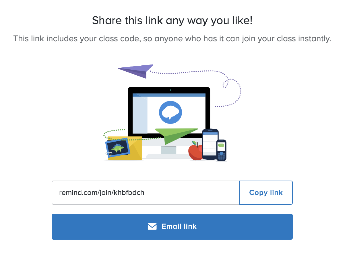
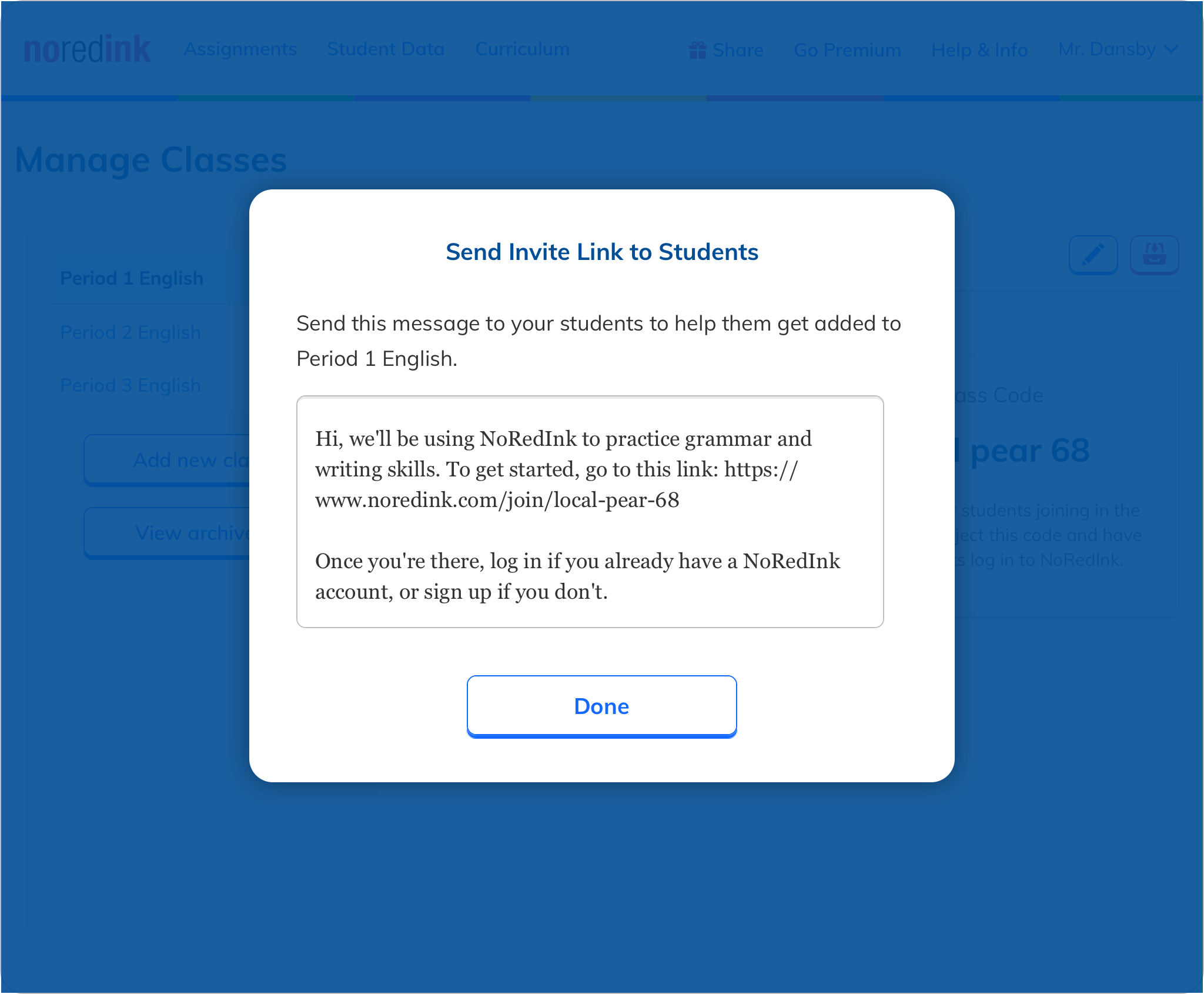
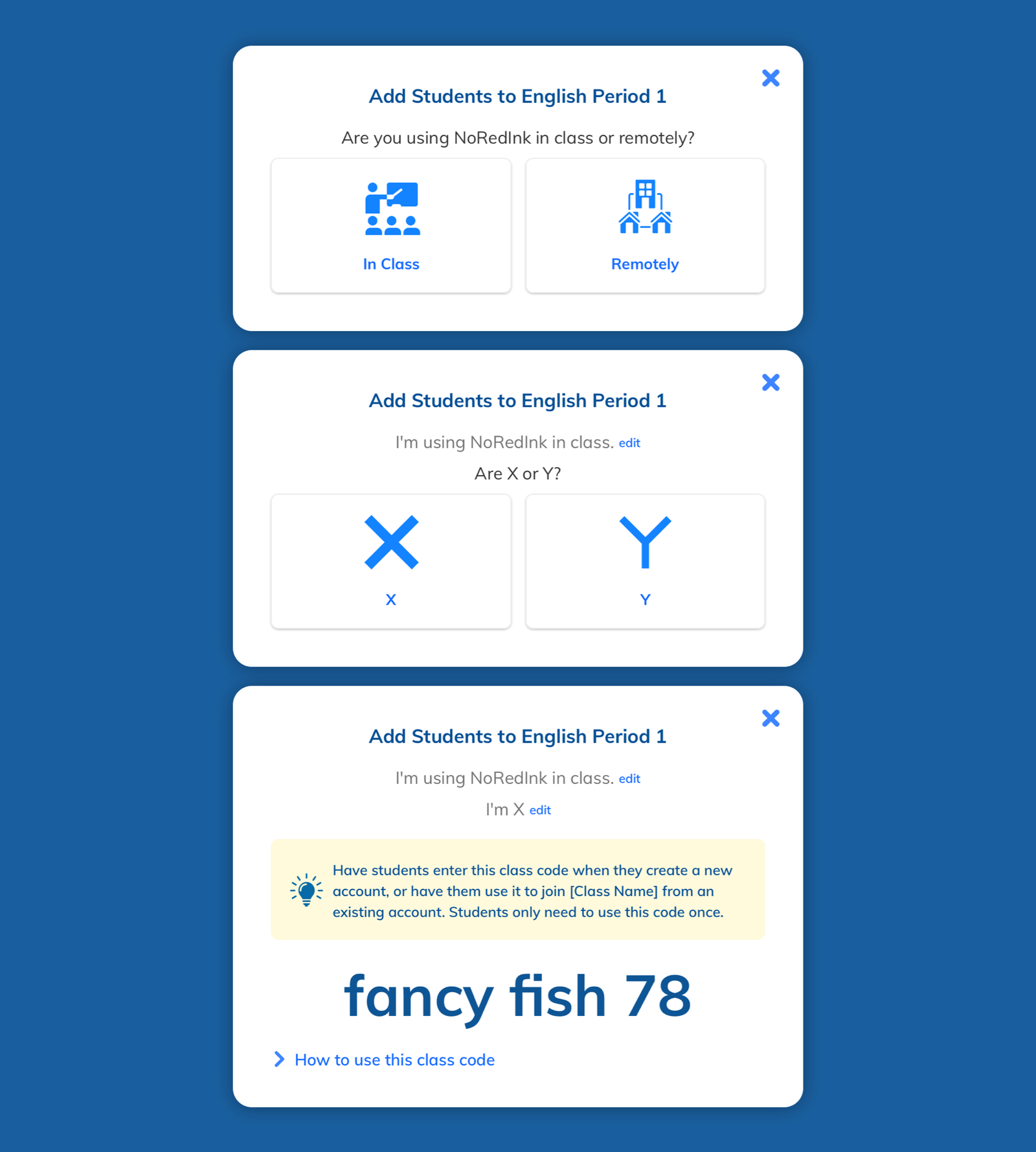
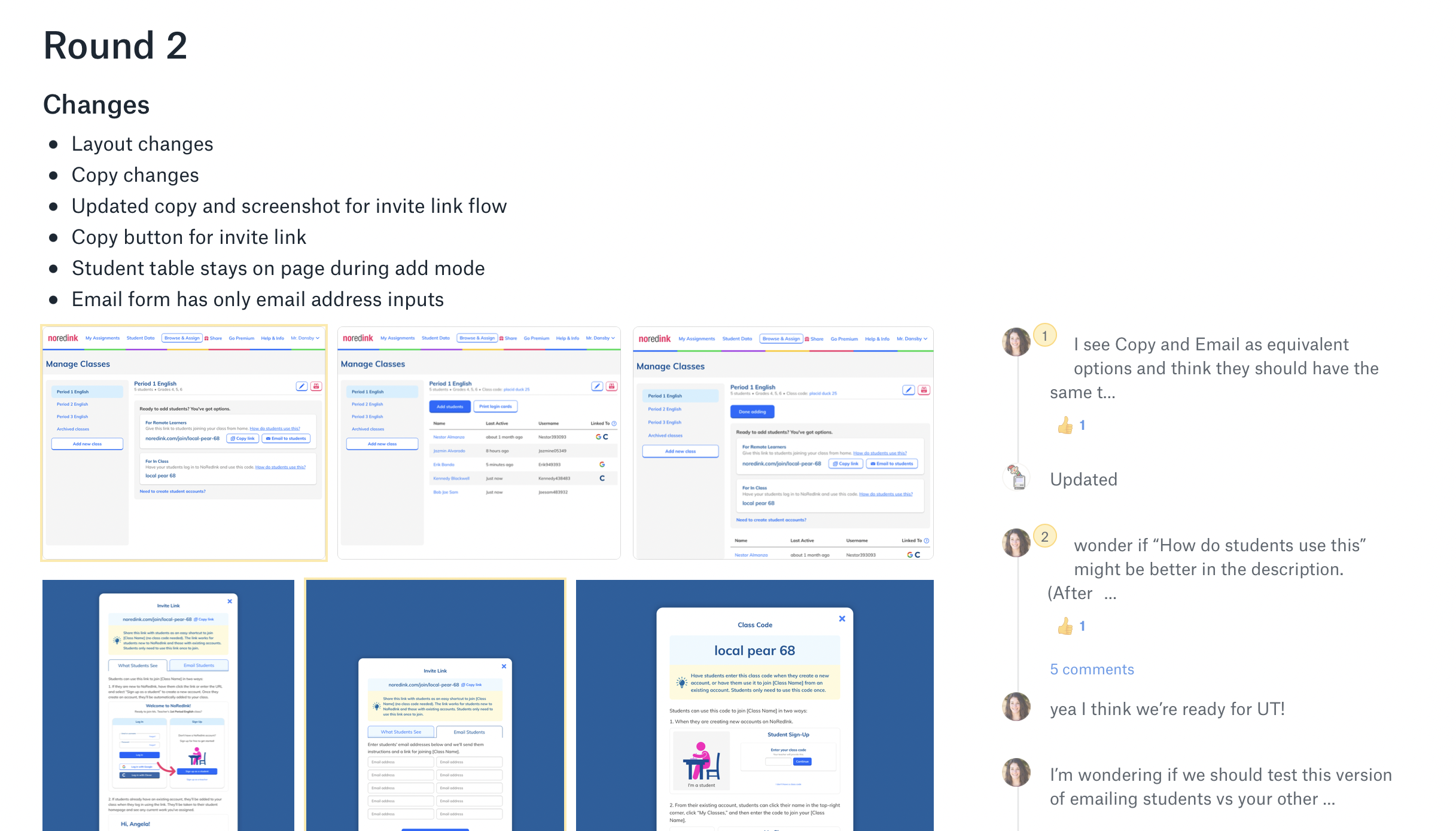
At this point, I had a new idea for improving the experience of adding students to a class. I thought of this feature as “guard rails” — allowing the teacher to control how students could actually join a class, such as only using a Google sign-in. The rest of the team was intrigued and I iterated on it before moving on to user testing. What I found was that not only were teachers not particularly interested in the guard rails, they weren’t interested in the email feature either. Compared to the earlier test, this one asked teachers to directly compare copying a link versus emailing a link. In that context, it became obvious that copying a link was much more versatile. I reported the findings to my team and we agreed that we could drop the email feature.
Speccing
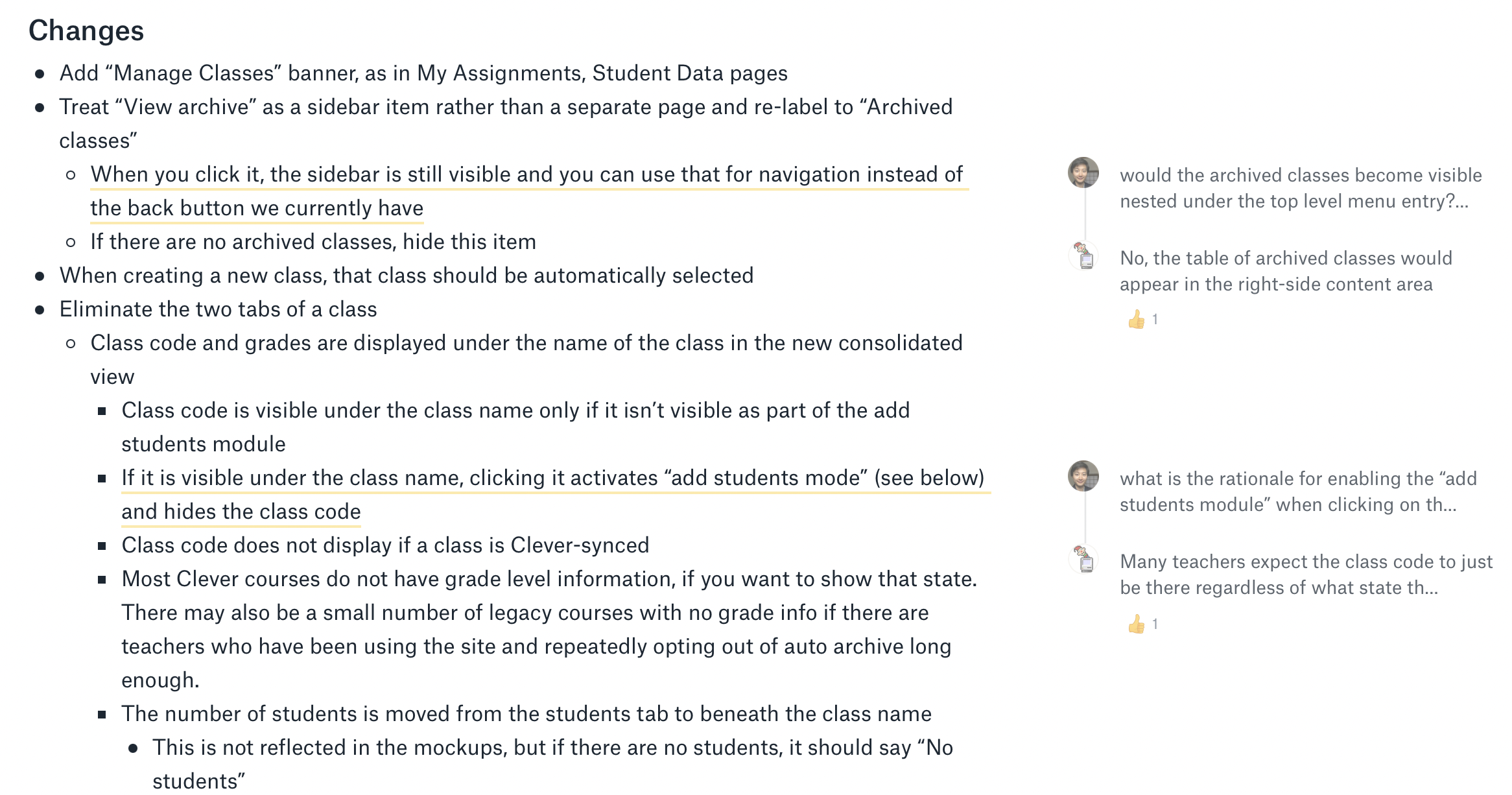
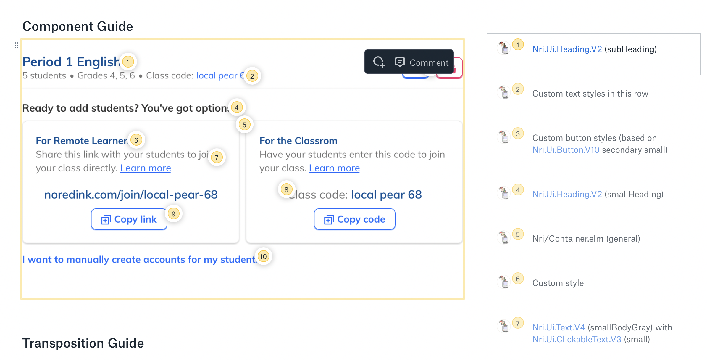
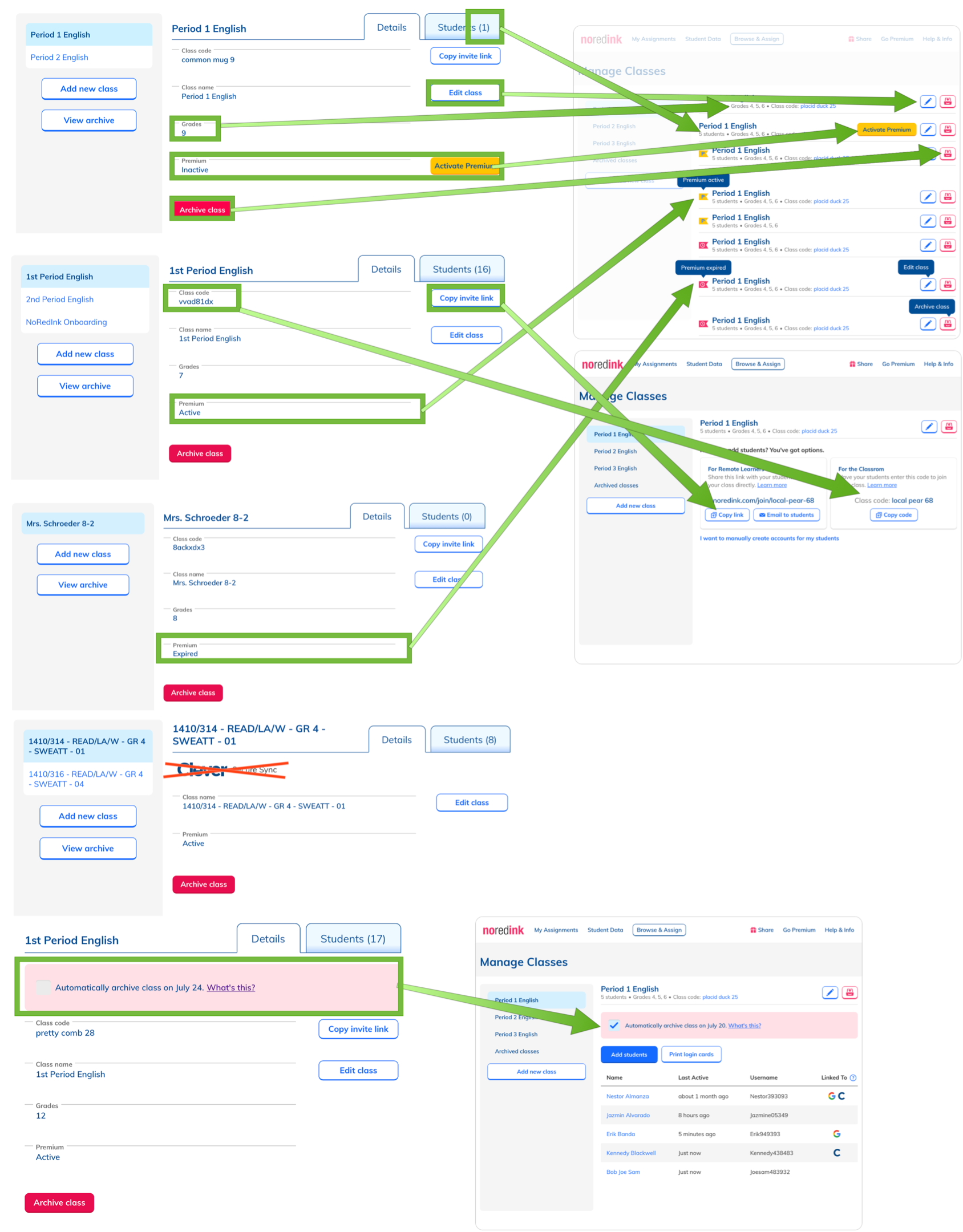
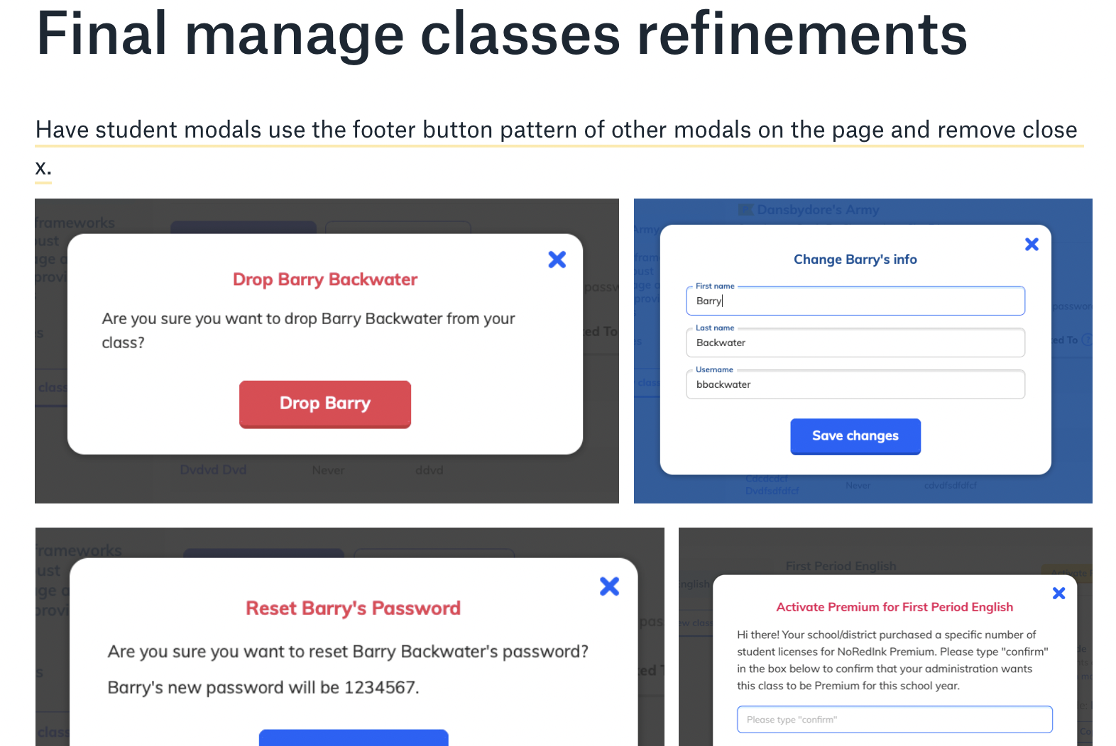
After incorporating a few more refinements and additions, the design was complete, and so I created a spec for the engineers to base their work on. I also demonstrated various states that needed to be accounted for on the page, gave the engineers visual specs, and included a guide for how to transpose data on the current page to the new design.
Development & Release
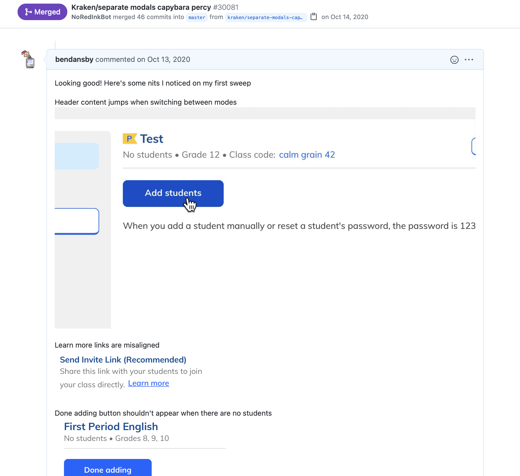
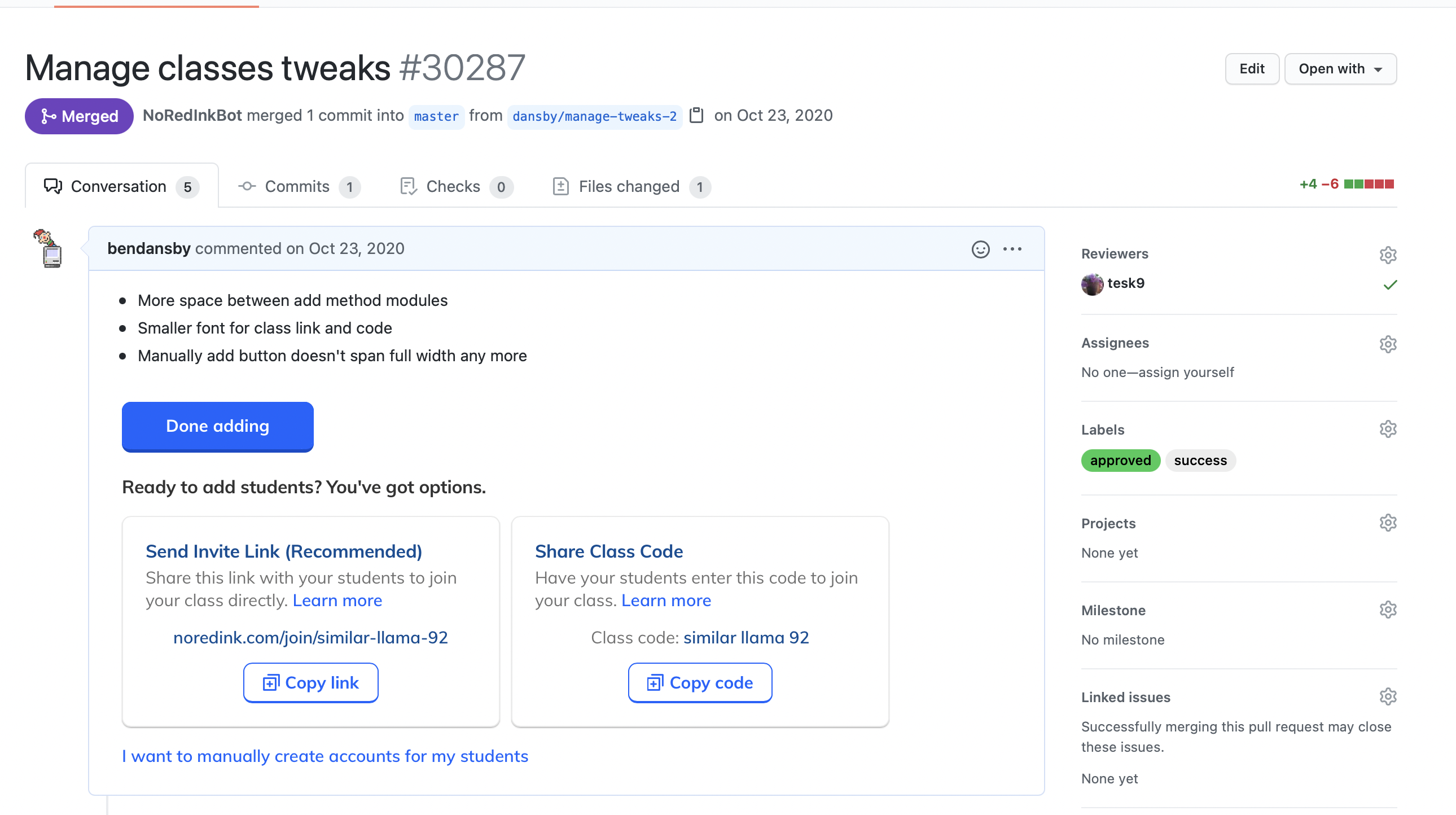
Our engineers went to work, and I reviewed their PRs, providing visual feedback along the way. They also brought up UX suggestions and technical concerns, and we discussed solutions. For example, I had originally specced that when clicking a button to copy a link, a tooltip should appear confirming the action. To make things simpler from both a code and UI perspective, an engineer suggested simply changing the button copy upon click. This made sense to me and we implemented the change.
Post-Release
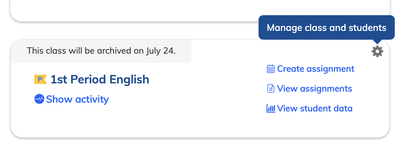
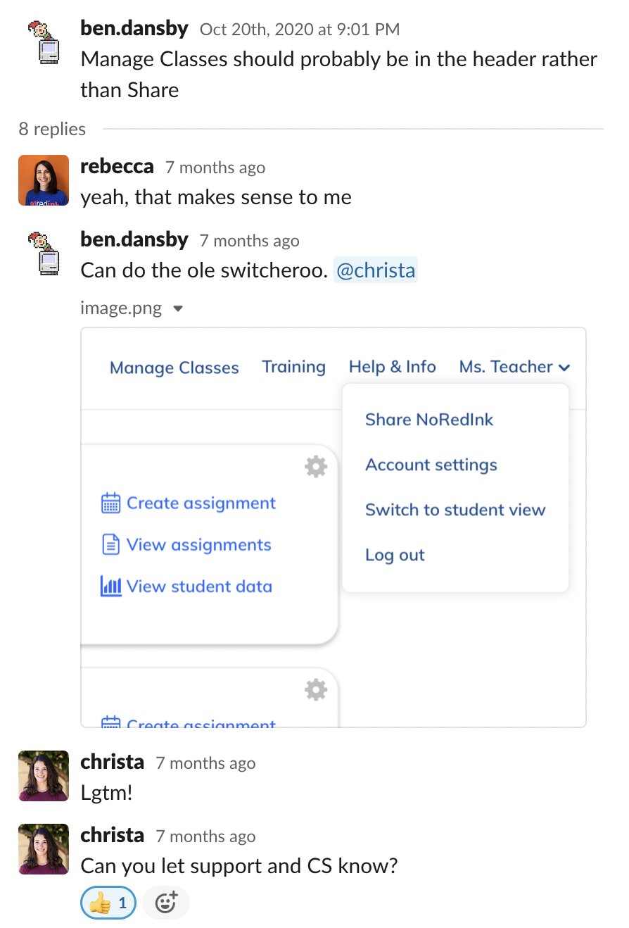
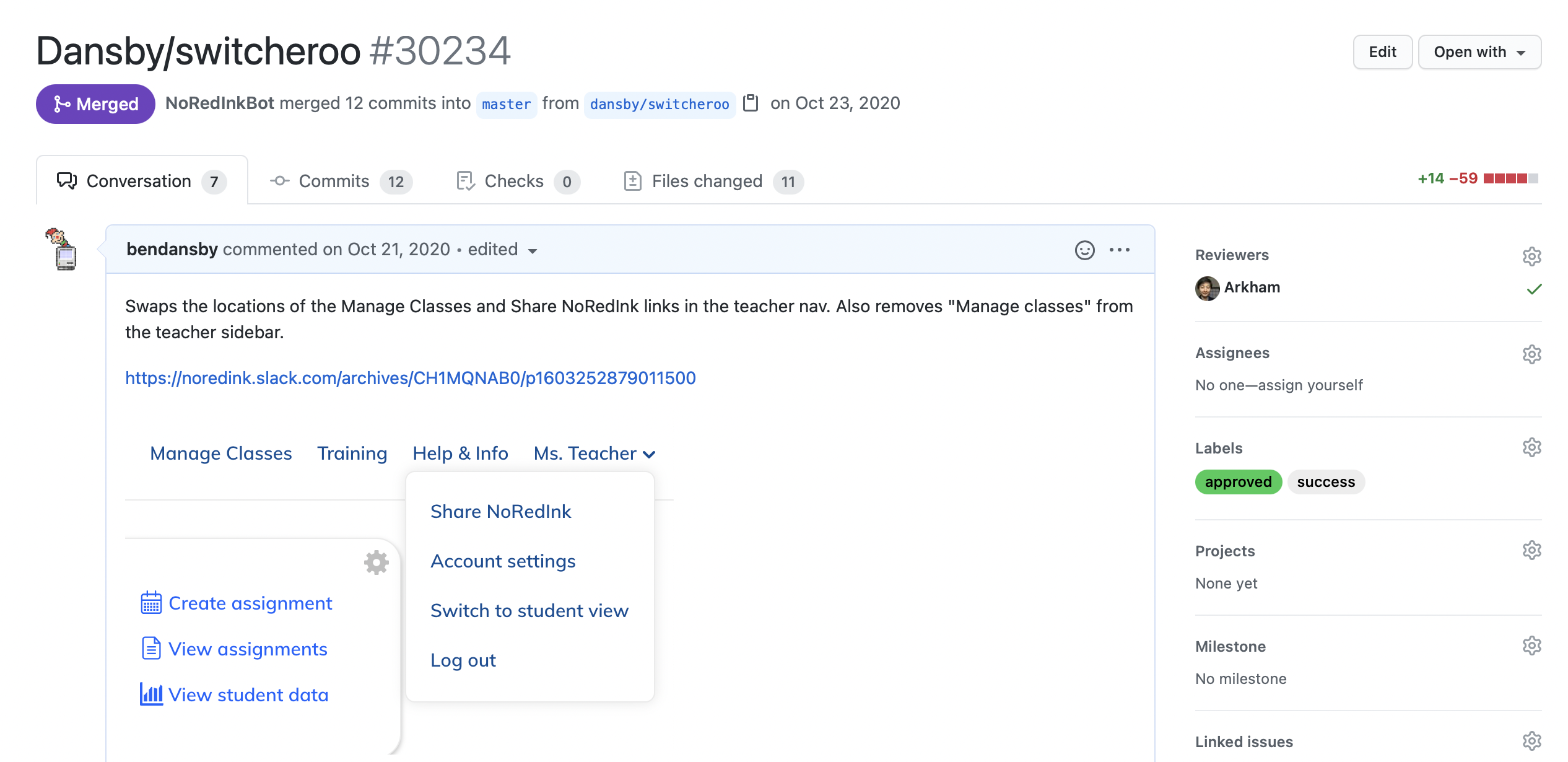
Right as engineering was wrapping things up, it struck me that we could directly address one of our user stories (I want to find the Manage Classes page more easily…) with a very simple tweak that hadn’t previously occurred to us. I floated it to the team, got the thumbs up, and merged it myself. I also did a couple other PRs to refine the visuals on the new elements we had just released.
Takeaways
- In fact, don't define user needs as solutions
- Be open-minded
- Don't be afraid to let go of your babies
- Ask in multiple ways
- Be flexible