Case Study: Benchmark Revamp

Benchmarks were NoRedInk’s first offering in the assessment space, allowing school districts to administer district-wide assignments assessing students on grammar and writing skills. This was a shift from NoRedInk’s individual teacher-centric model, and the feature had its own workflows and views.

With Benchmarks, admins create an assessment and send it out to teachers. Teachers then assign it to their students. The data from all teachers, classes, and students aggregates to the admin to view and take action on. This process can then be repeated at a later date to compare results and track growth.

Eventually, customer feedback led us to believe that adoption of Benchmarks was suffering in part due to some deficiencies in the interfaces admins used to monitor progress and results. Thus a new project was undertaken to make key improvements to several aspects of the Benchmark experience to improve adoption and outcomes.

Research and Prioritization

To understand how districts were using Benchmarks and where the existing product was falling short, we ran a research effort that included a feature audit, admin interviews, a competitive analysis, and a pedagogical review. Across these sources, a consistent picture emerged: districts were looking for a writing-anchored diagnostic that could support planning, intervention, and instructional decision-making.

Administrators described two primary goals for Benchmarks: getting a reliable snapshot of where students stand relative to grade-level expectations, and using those insights to guide coaching and targeted support. However, the current Benchmark experience didn’t deliver enough instructional value to justify the time required. Results didn’t lead to clear next steps, rubrics didn’t map cleanly to state expectations, and district leaders couldn’t quickly identify patterns in the data.

What this translated to at a feature level was surfacing trends at the district and school levels, supporting the writing process rather than just the final submission, and laying the groundwork for targeted instructional recommendations. The research clarified the direction for the redesign: a Benchmark that provides at-a-glance insights and next steps.

Starting Point

That's a lot to bite off, so we determined to focus first on addressing fundamental issues with the views that admins used to track progress and view Benchmark results. This would provide the foundation the feature would need for future enhancements supporting next steps and recommendations in the long term, while giving admins more data in a more usable format in the short term.

The existing version of Benchmarks gave admins a Dashboard to view their active assessments, and a Results page to view detailed data on how students performed on them. The Dashboard lists each individual Benchmark grouped together by Series. The Benchmarks within a Series are essentially the same assignment given at different times, so that growth in student performance can be tracked.

The Results page allows admins to view results for all students, per school, per teacher, per class, and per student. At each of those levels, it breaks down the results by skill and gives a status and distribution of those statuses. Together, these pages offered the rudiments of the data and insights admins needed, but not much more, and not in the most helpful format.

Data Dead End

One big theme we synthesized from our research was that districts would benefit from being able to view aggregate participation and performance data by grade and school. This would allow them to get a bird's eye view on trends within their districts, independent of any given assessment.

In sketching out different options for how to incorporate this data into the Dashboard, I found myself having to make compromises or assumptions that I thought would make for a poor user experience. Essentially, because a single grade level or school can have multiple unrelated Benchmark Series assigned to it, there's no way to cleanly aggregate their data. We would have had to roll up results from Benchmarks with differing start and end dates, content, and student bodies as well as Series with differing numbers of Benchmarks. This would have required both detailed explanation to users and was not necessarily useful information.

I showed my efforts at designing this feature and relayed my concerns to the team. After discussion and consultation with our data analyst, we decided there was no real way to square this circle, that aggregate Benchmark data could not be accurately displayed in the way we were hoping. Thus the grade and school-level report feature was dropped.

Visibility and Insight

Though we eliminated aggregate reports, there was still an opportunity to provide users with more visible data. Our research had turned up the fact that users felt like they had poor visibility into their Benchmark results. The Dashboard was essentially opaque and offered few clues as to what the status of their Benchmarks was. Addressing this was crucial to addressing the need for actionable outcomes.

To do so, I added student participation data to each individual Benchmark. This was placed alongside the existing teacher participation data, which I made easier to understand through its placement into a new tabular layout. I also bubbled performance data up out of the actual Results page into the Dashboard. This gave admins a window into their results without having to click into each Benchmark Series.

These additions gave users some sense of the bird's eye view of the data they were looking for, while also making the Dashboard more useful. It also happened to result in a more streamlined Dashboard since we didn't need to have a separate data view required for the abandoned aggregate reports.

Bringing Things Together

During our research, we had heard from Customer Success Managers that the distinction between individual Benchmarks and a Series of Benchmarks wasn't conveyed clearly enough in the product, based on their interactions with admins. Relatedly, the distinction between creating a new Benchmark Series, and adding another Benchmark to an existing Series was confusing, causing admins to create one when they meant the other.

This feedback dovetailed with the incorporation of new data explored earlier and led me to a new layout that brings data to the forefront and makes the page and its constituent parts easier to scan and understand. Visually, the new design placed more emphasis on each Series of Benchmarks rather than their constituent Benchmarks, and gave a clearer sense of their sequence. That emphasis extended to the new prominent placement of the button that adds another Benchmark to a Series, as well as copy adjustments to button labels to make user actions clearer.

Incorporating Feedback

Once we had a design that we thought addressed customer needs and laid the foundation for the future to the degree possible given the constraints in our data and resources, we brought it to our Customer Success team members, who we used as proxy users, since we didn't have access to admins directly at the time.

Overall, they wer happy with the design, and appreciated the changes to the page and inclusion of new data, which they thought would make the page more valuable to admin users in gaining insight into the progress of their Benchmarks immediately. They gave us valuable bits of feedback that allowed us to put an extra touch of polish on the design. This included better affordances for the numbers in the status columns, numbering each Benchmark in a Series, and a change to the performance charts to look less like progress bars.

The final design also included alerts specifically calling out low participation. This meant that if admins took nothing else away from the page, they would see which Benchmarks were not on track for a successful outcome. The importance of this feature came from our research, which showed that actionable data—and thus actionable-looking data was vital to admins. After my suggestion, we opted to provide these alerts via email as well.

Preparing for Development

As we were finalizing the design, I wrote a spec to guide our engineers on the changes we were making and define the exact behaviors for each interaction. This allowed them to quickly make stories in Linear that described the project in whole.

I also prepared the Figma file to make each component and state available for inspection by engineers. Together with interactive prototypes, this gave them a full picture of the feature and its interactions and visuals. The design used our accessible component library, to ensure properly labeled and keyboard operable regions and components.

To complete the design phase of the project, I wrote the email for alerting users of low participation, ensuring that admins would be aware of problematic Benchmarks even if they never logged in. Since we knew that admins were often logging in only irregularly, it was crucial to reach them where they were, not just where we wanted them to be.

Moving Onto Results

As engineering started working on the Dashboard, we turned to the Results page, where detailed data per Benchmark and comparing Benchmarks within a Series is displayed. We knew from talking to customers that it was important for them to be able to compare how schools were doing relative to each other. This was a crucial piece of the actionability theme from our research. Some admins didn't realize that we already had a way to compare school-level results, so I realized that the design was not serving its function. The data admins needed was there, but not in a form that was obvious or easily digestible.

I initially tried modifying our existing layout to keep scope small, adding bar charts to the existing list of schools in order to make comparisons easier. Realizing that this wasn't prominent enough, I then moved them above the results table, until finally adjusting their orientation to make comparisons easy and the data prominent. This met customers' gaze, so to speak, rather than making them squint and interpret.

Data Hierarchy

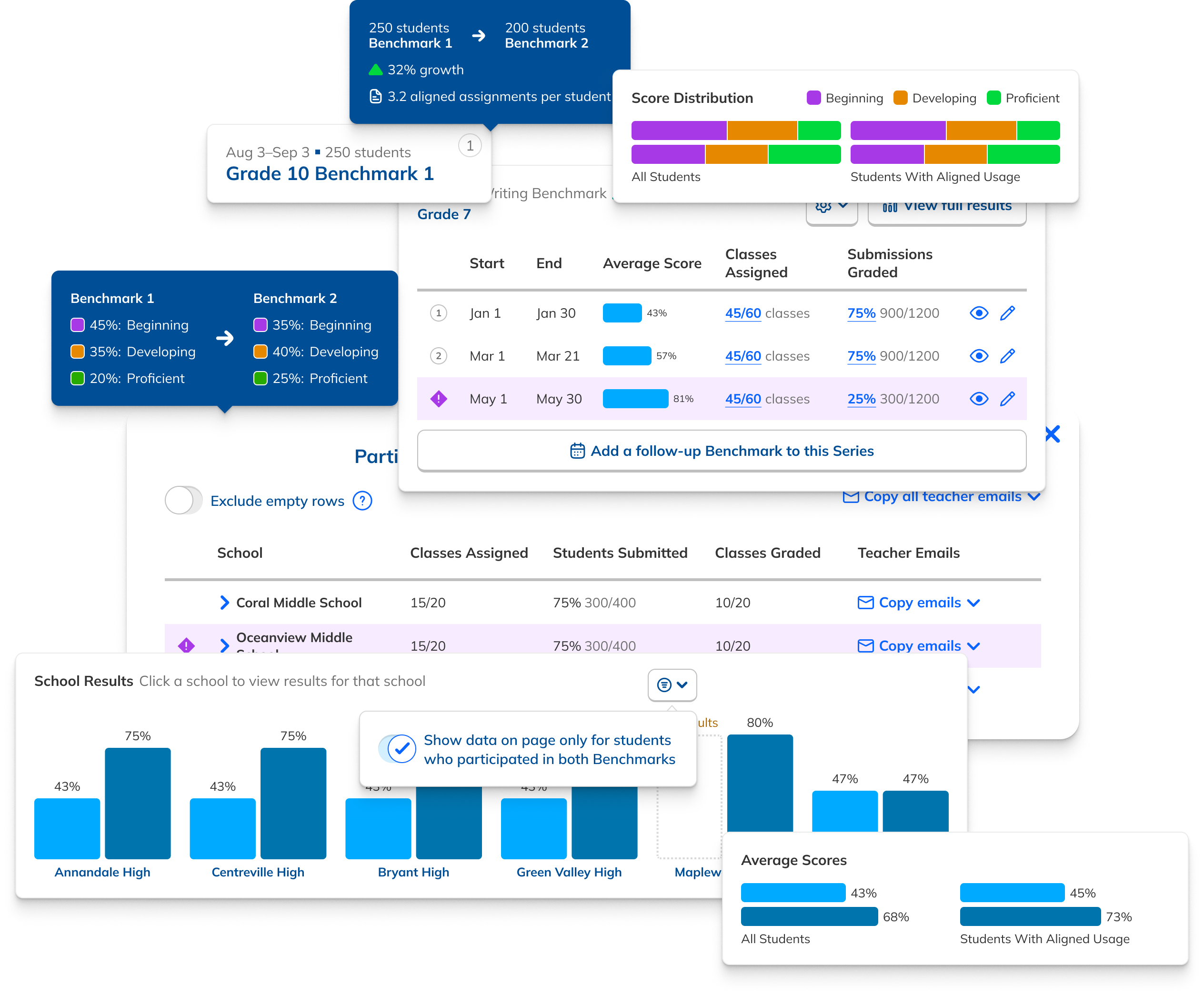
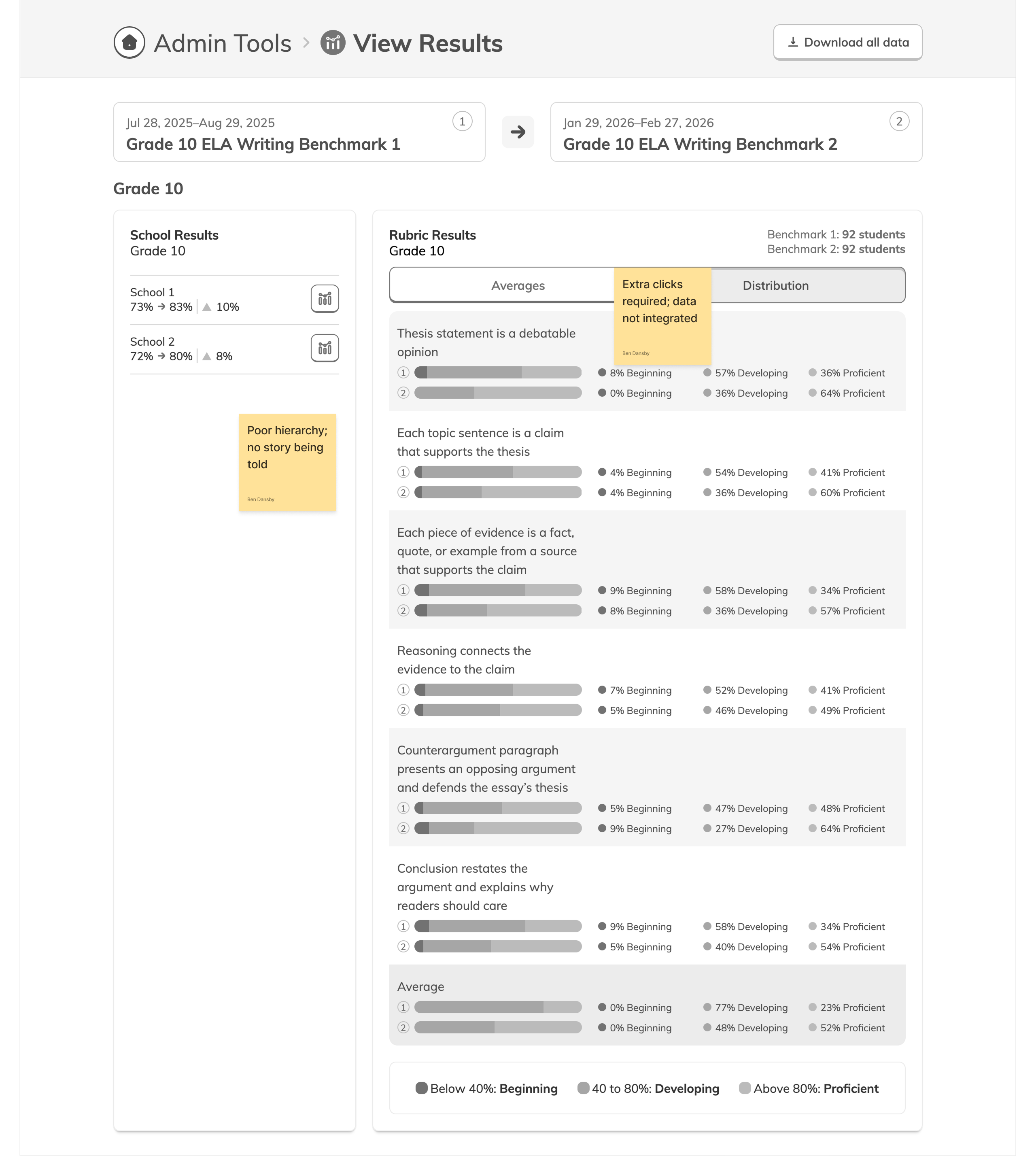
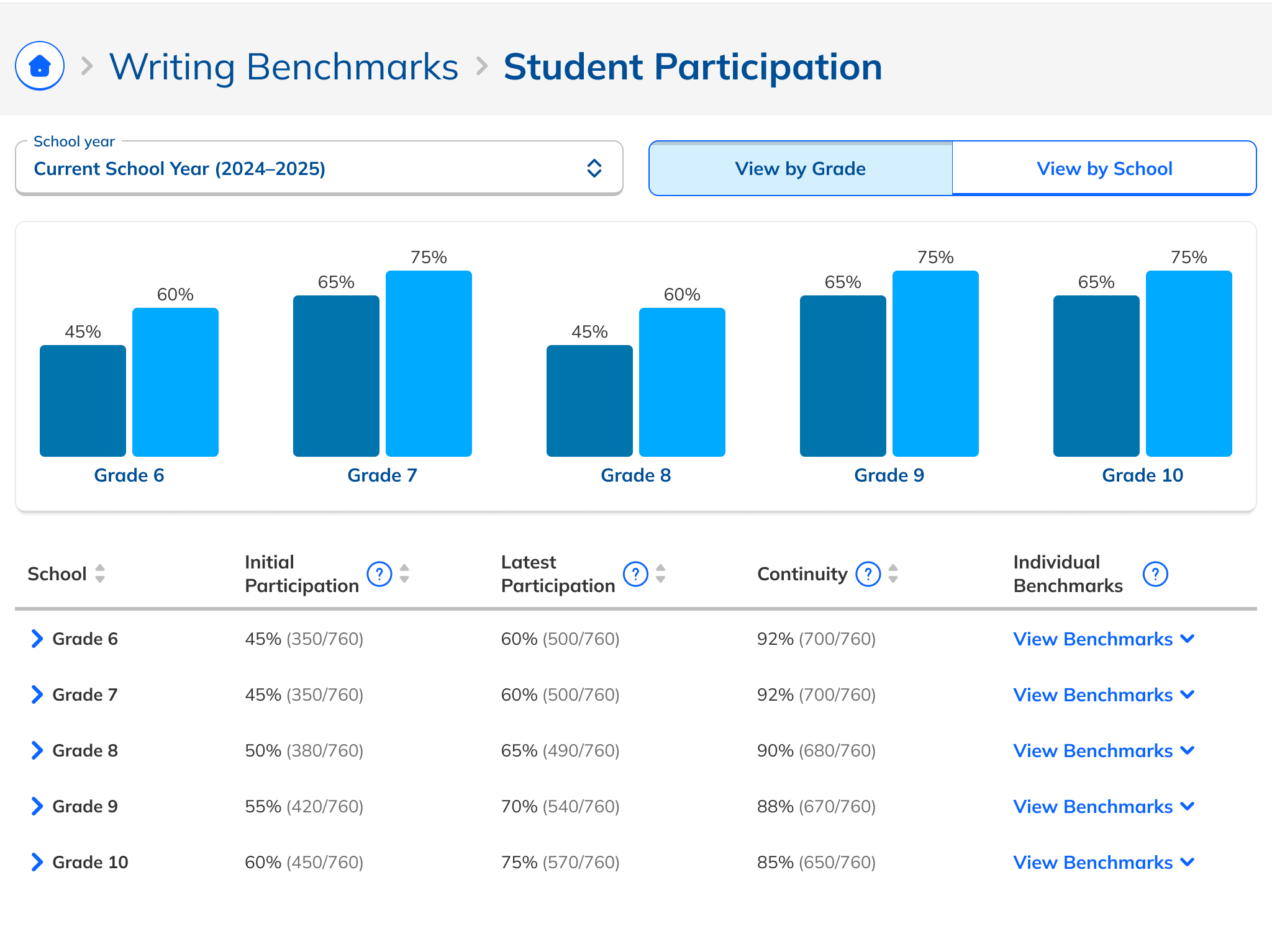
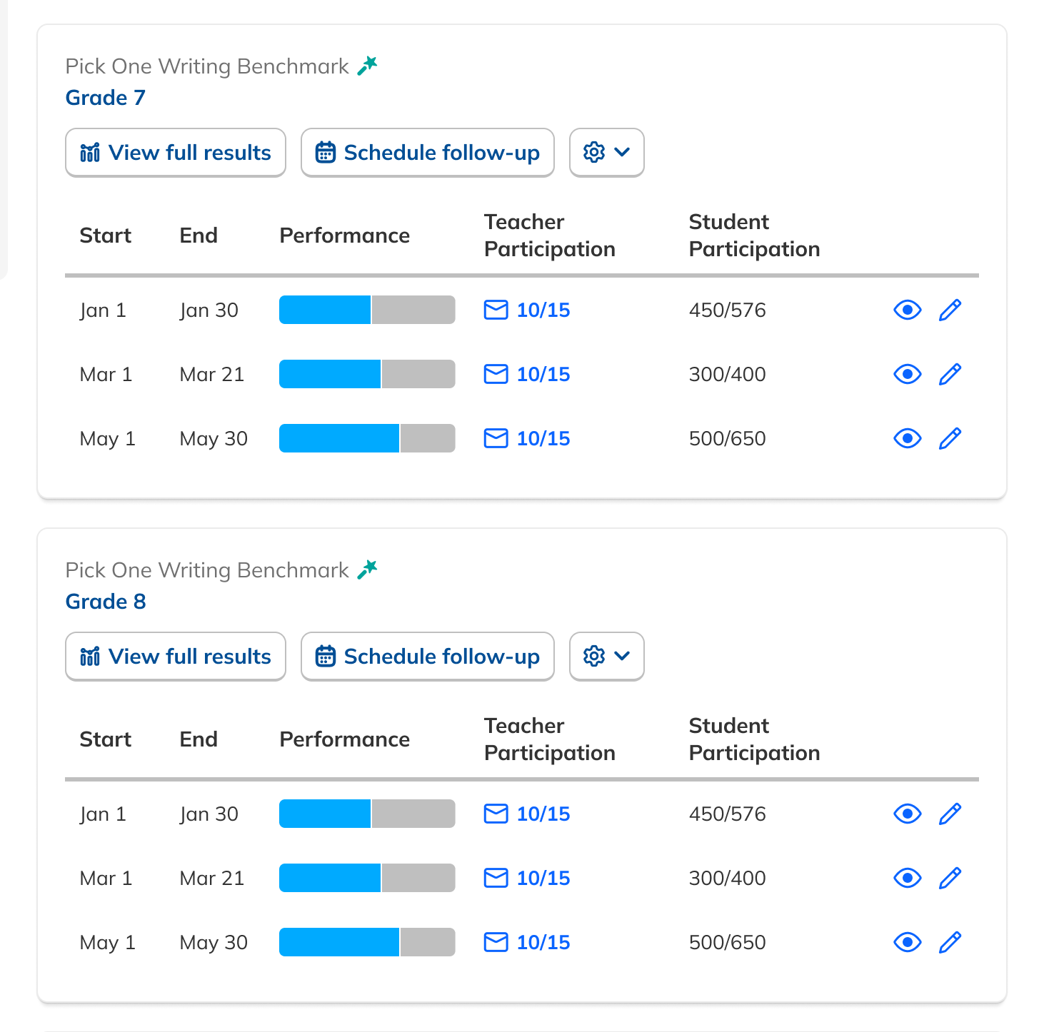
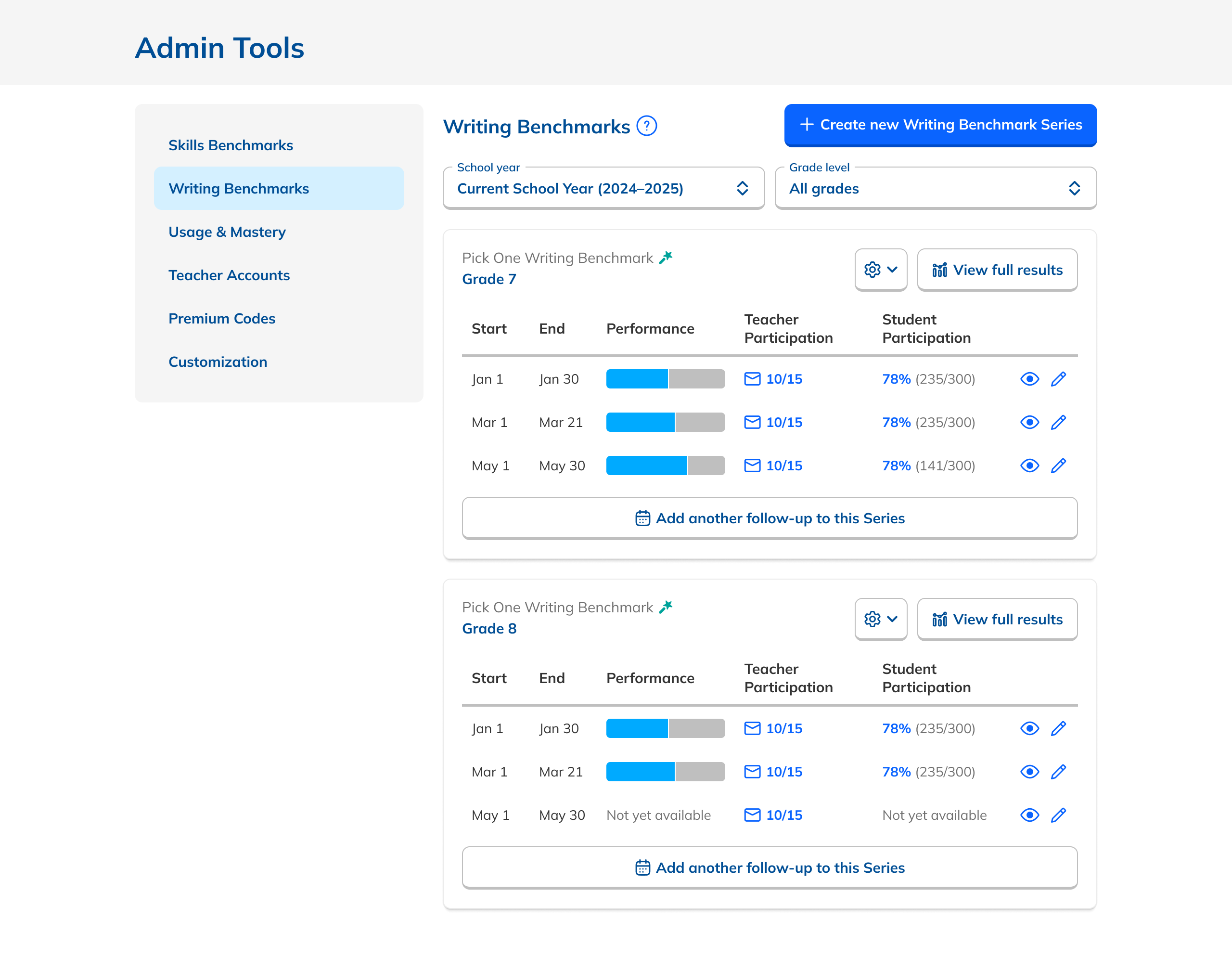
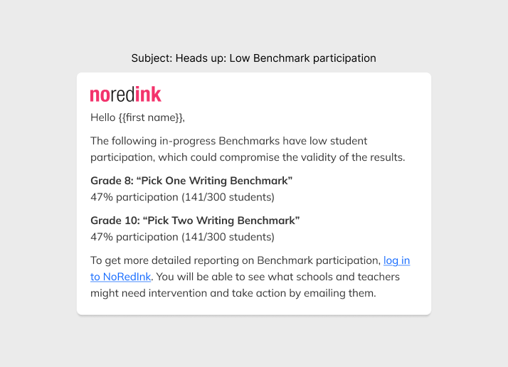
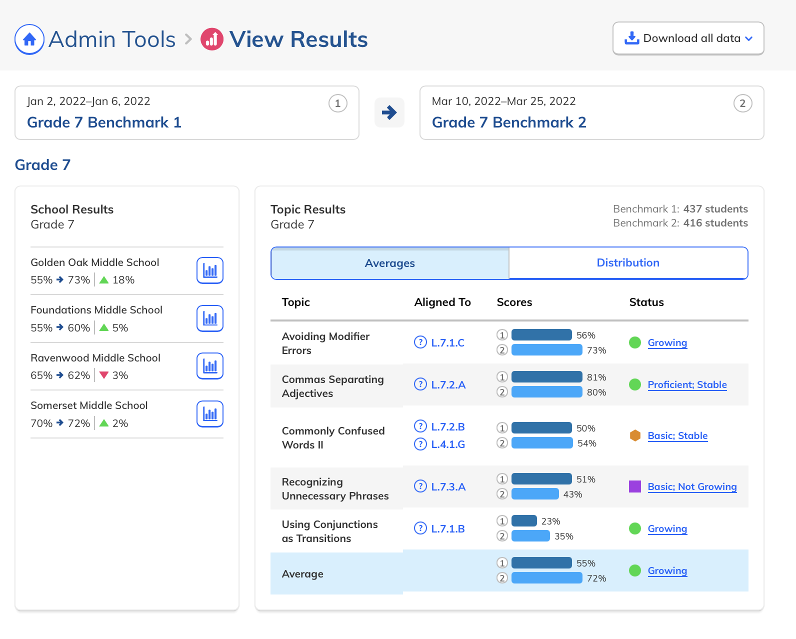
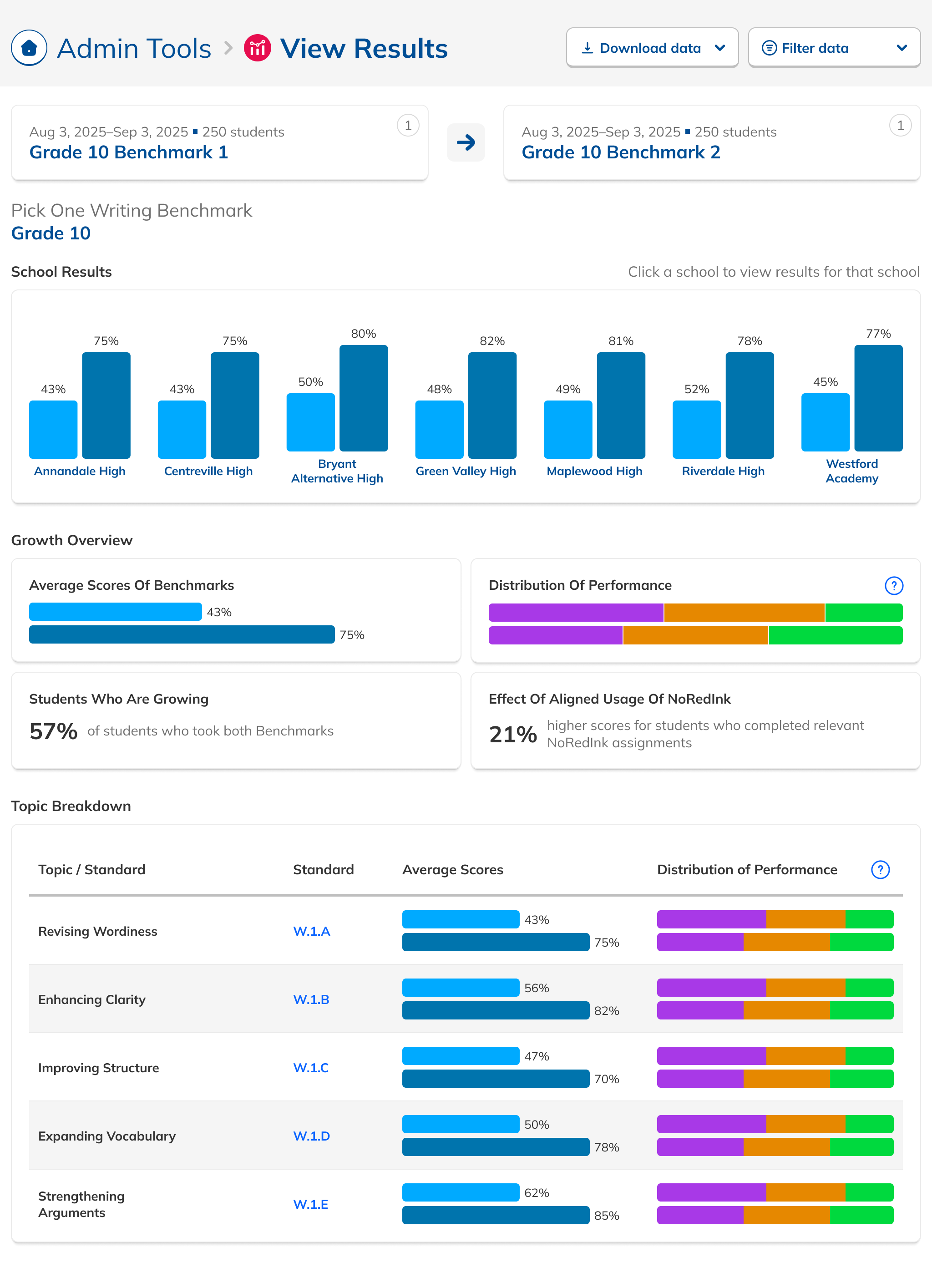
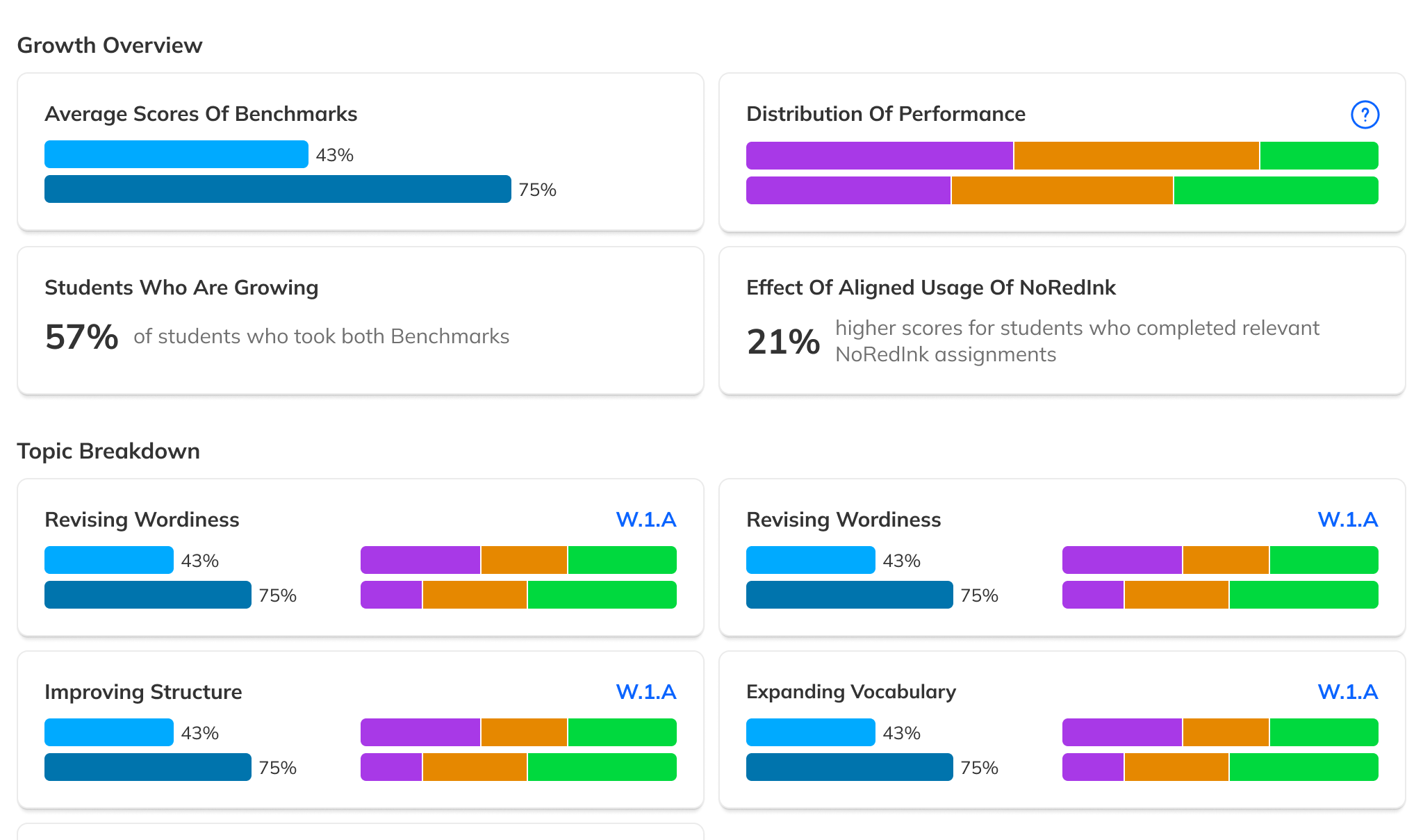
During our research phase, we heard from Customer Success that, though viewing results by individual score was important to customers, we were in fact putting too much emphasis on them at the expense of an overall score. In some cases, users didn't notice that overall scores were even available because they were subordinate to the skills. This was another case where the current design had the needed data, but was not presenting it in the most useful way. We were providing data but not telling a good story with it.

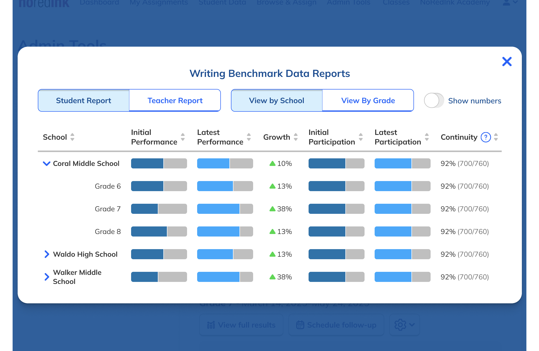
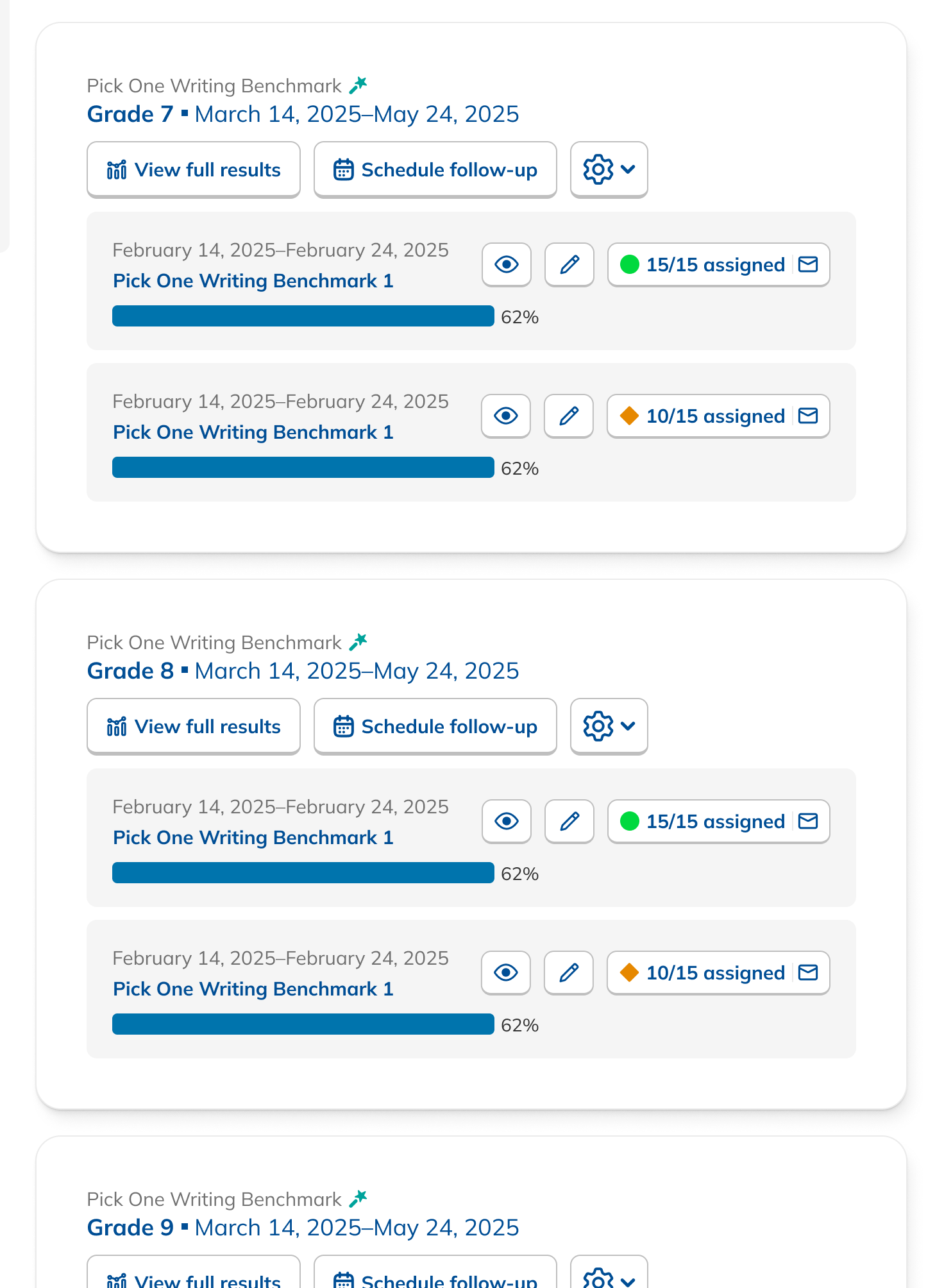
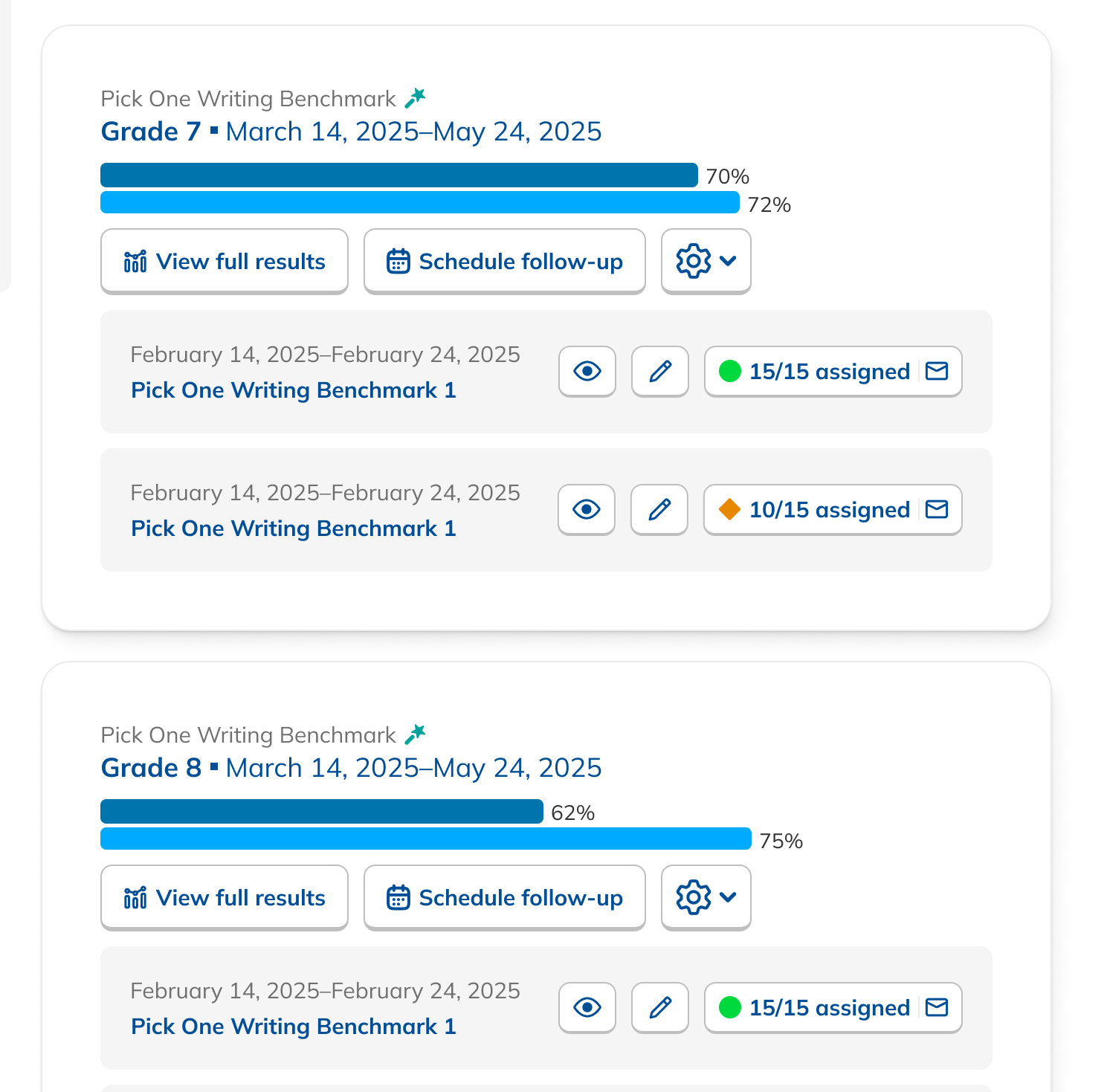
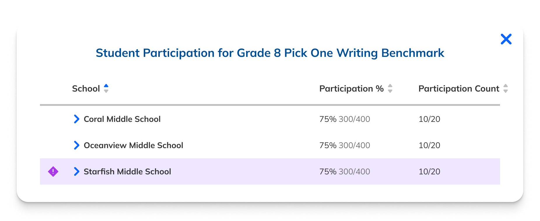
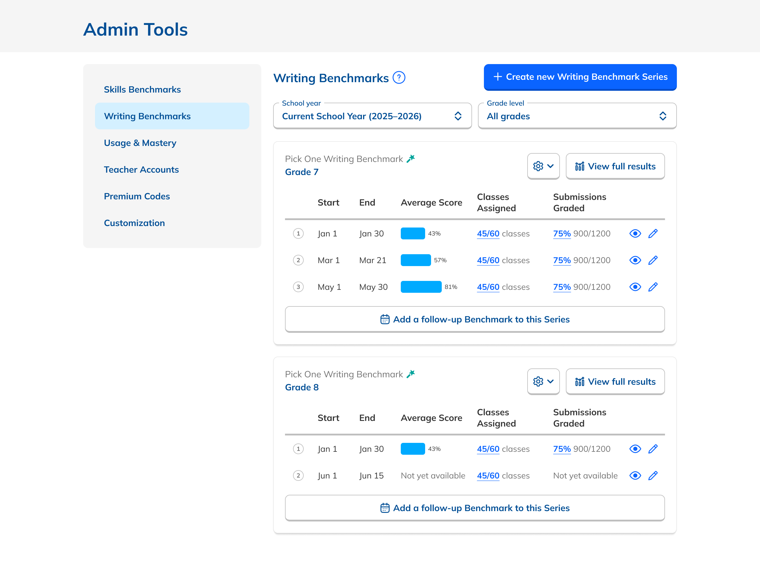
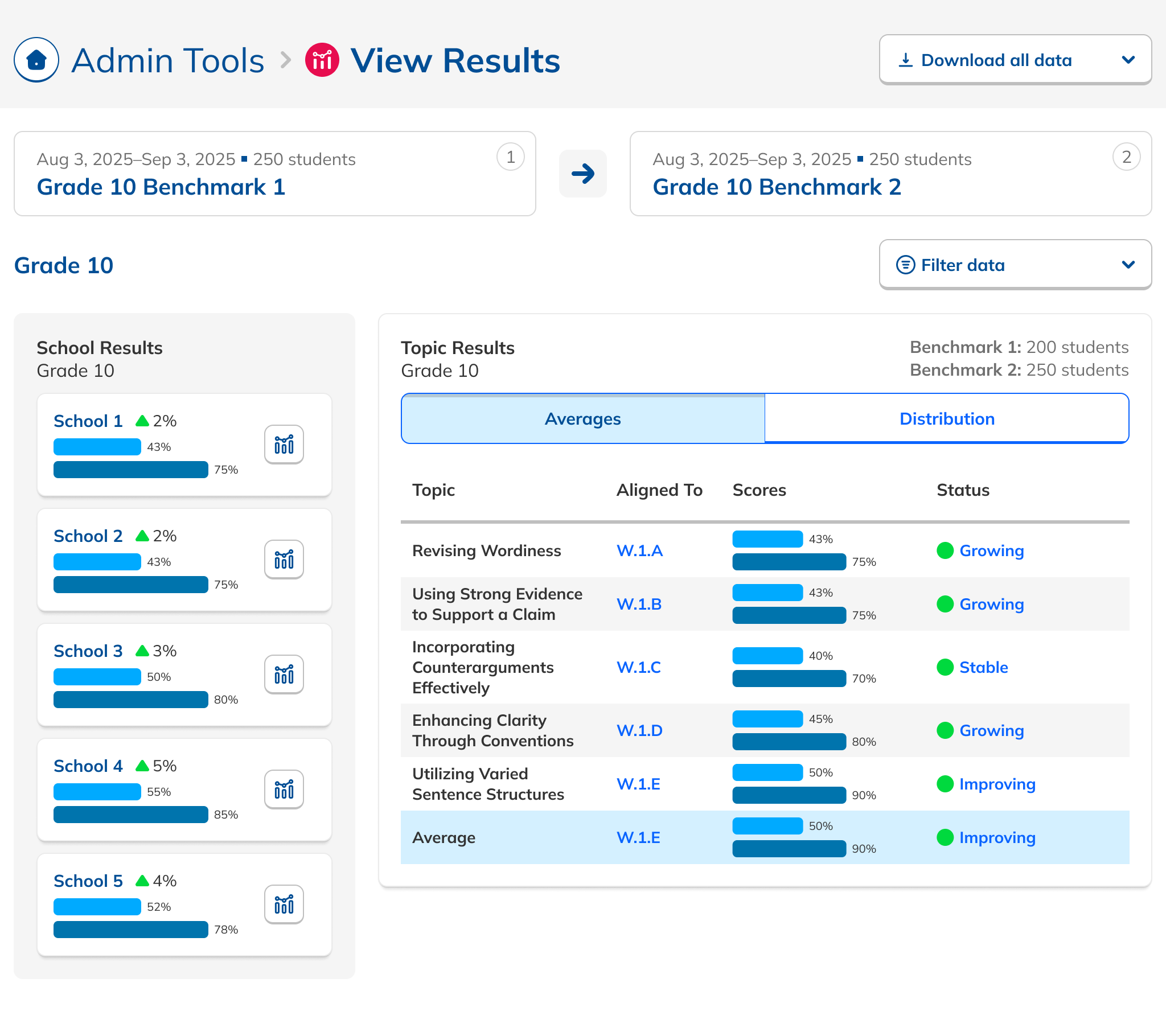
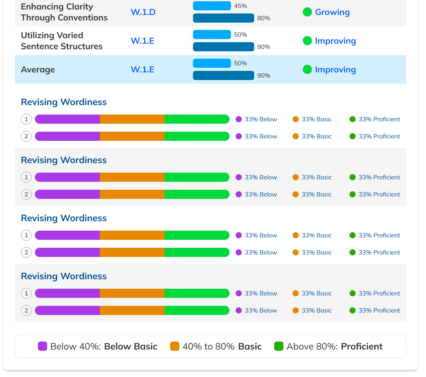
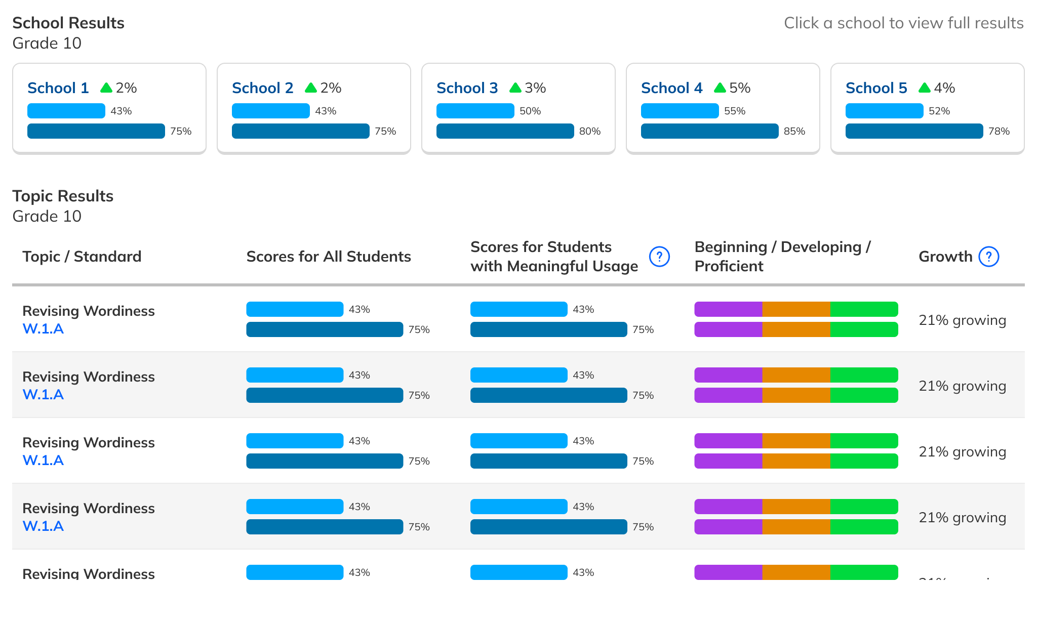
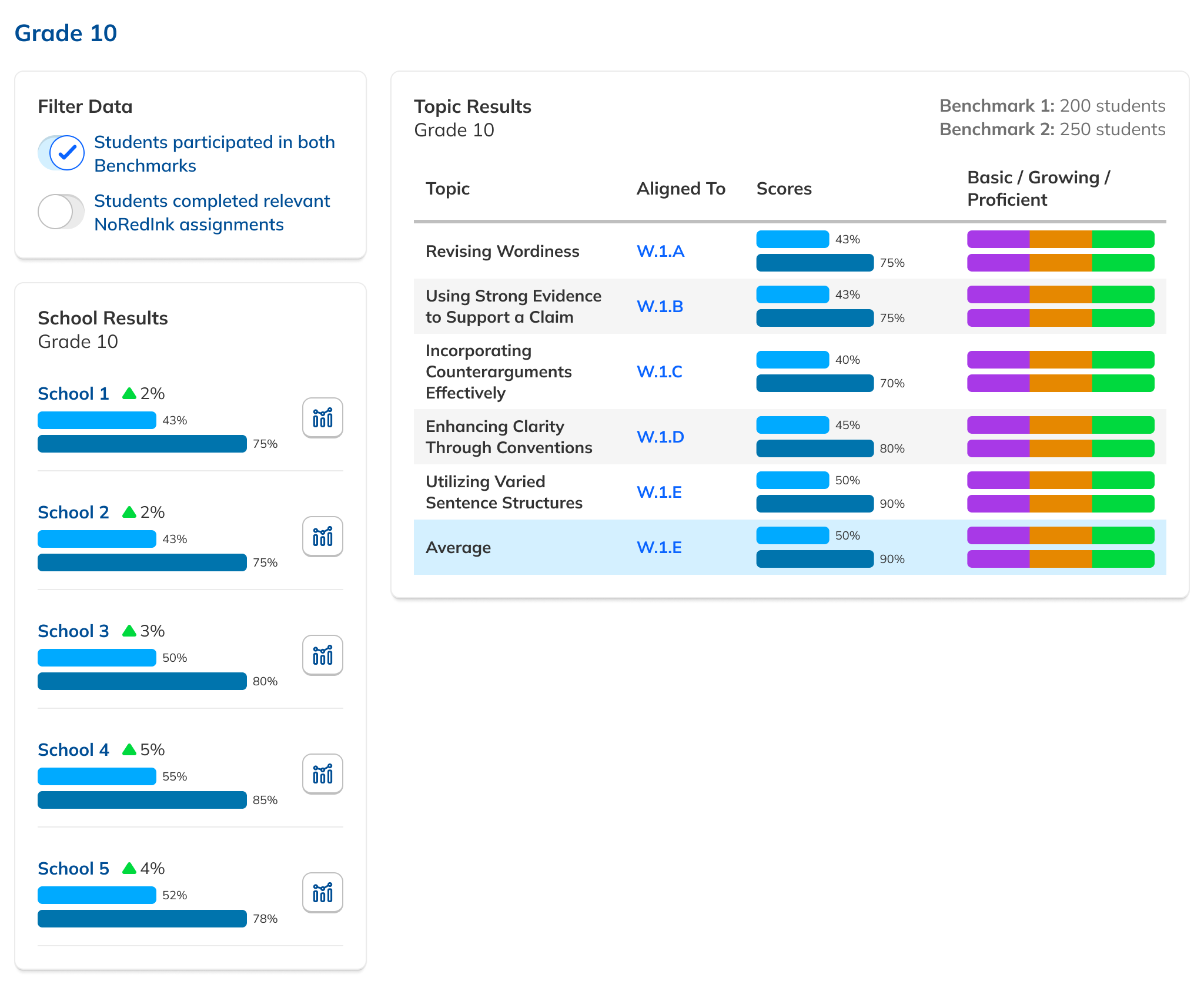
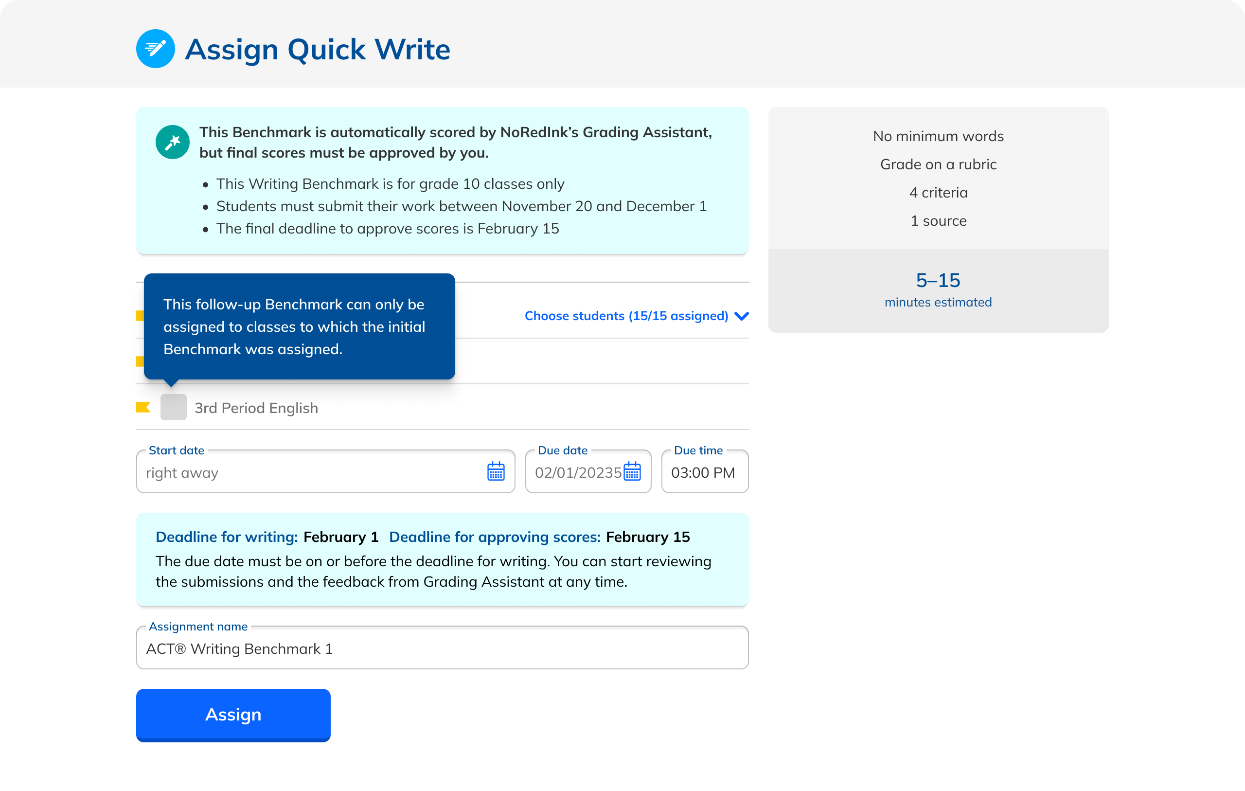
Our research had also revealed that, to ensure high fidelity results, admins needed to be able to view Benchmark data filtered to count only students who had taken both Benchmarks in a comparison view. This filtering need from customers coincided with one from NoRedInk itself. We wanted admins to be able to see data only from students who had completed activities on NoRedInk relevant to the skills assessed on the Benchmark. Having this view would allow us to demonstrate NoRedInk's efficacy to admins.

After some experimentation, I arrived at a design that offered more prominent overall performance data alongside the required filters. The filters were incorporated into headlining numbers that sat nicely beside the overall performance data we had broken out. All in all, this layout told a clearer story of the results, offered additional data, and provided control over the filtering of that data. We had arrived at a design that started to address the themes we heard during our research: clear, actionable data and useful trends.

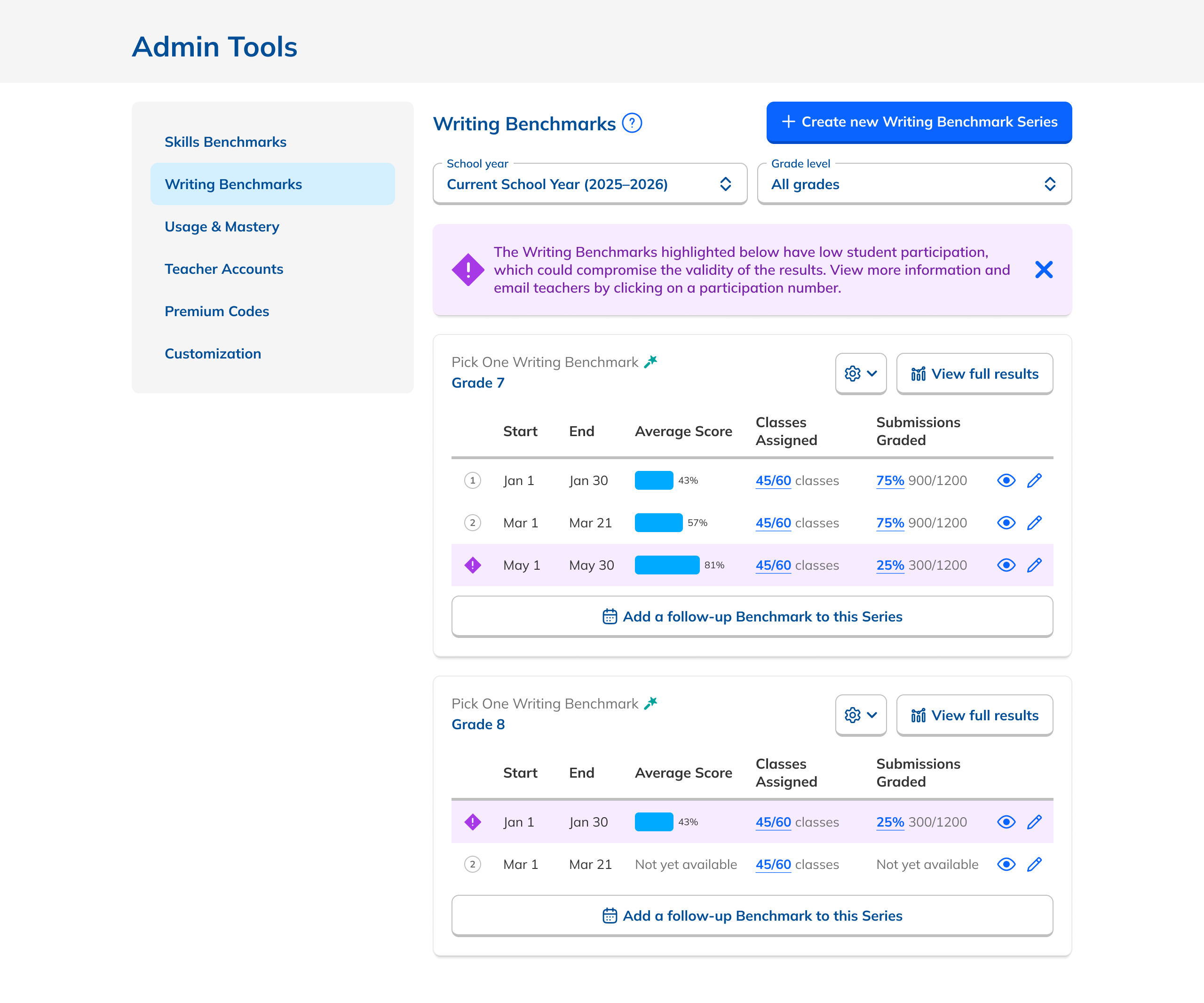
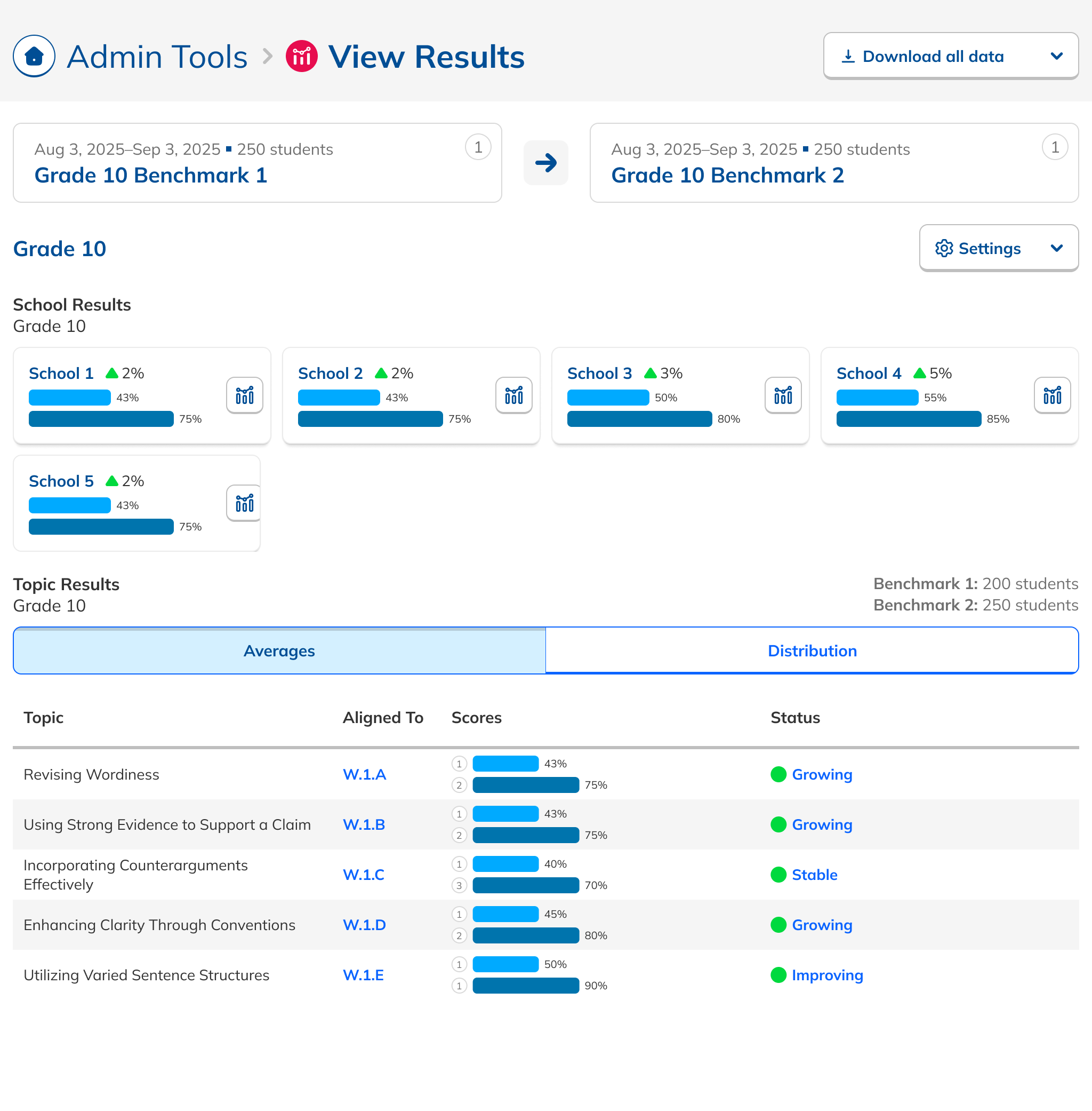
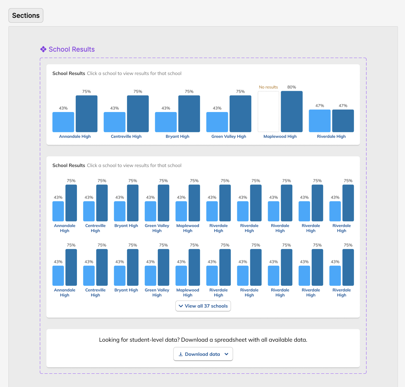
During this design process, we started hearing from our leadership team that they weren’t sure whether or not the idea of showing efficacy data was actually to our benefit. This uncertainty persisted for the rest of the project, such that it ended up informing the design. The layout evolved to be more modular and I designed the page in a way that allowed the data and filter to be easily shown or hid based on future decisions or conditions.

Finalization and Prep

This time around, feedback from our proxy users led me to improve how the page handled many bar charts at once. I was also inspired by feedback from users to level up our tooltips to display more information. After those changes, it was time once again to spec out the page for our engineers. Since results can come in a variety of states, including one, two, and three or more Benchmarks, with data pending and missing, and with grammar or writing skills, it was important to account for each one.

The Figma prototypes I prepared reflected this, with several different flows describing different scenarios. In this design, tooltips were an especially prominent pattern used, and these were both featured in the prototype and accessible independently in the source Figma file, which laid everything the engineers would need to see out. Development kicked off with a presentation by me to the team, and stories in Linear were created from there. Additional edge cases were fielded on Slack and in Github as they arose during development.

Flow Enhancements

To increase the likelihood that these new views would actually be used by admin users, we also aimed to improve the flow whereby Benchmarks are created in the first place. In doing an audit of the creation flow, I found that there was a huge amount of content that users could choose from that simply wasn’t appropriate to use for a Benchmark assessment. I recommended that we eliminate this content to reduce cognitive load and to achieve better outcomes for the assessment. I also found that our AI graded assignments weren’t clearly labeled, that editing an assignment for a Benchmark wasn’t consistent with the rest of the site, and that selecting dates was buggy. I suggested solutions for all of these and we systematically improved the flow to reduce friction.

Working with our Customer Success and Curriculum team members, I also discovered that there were a number of parameters that were potentially causing less than ideal outcomes for Benchmarks. By tightening up the rules around these parameters, we would increase the chances of good results. This included requiring enough time between indvidual Benchmarks in a series, ensuring that the grade levels a Benchmark is assigned to match the content chosen, and that the same classes were being assigned all Benchmarks in a Series.

Year over year, in part due to these flow enhancements and the increased confidence CSMs had in the feature, we saw a 72% increase in Benchmarks that used our Grading Assistant feature and we saw a 17% of teacher adoption of Benchmarks sent out by their admins.

Takeaways

Beyond specific metrics, our goal was to advance the experience of Benchmarks for admins so that the data they offered was more useful and more actionable, increasing the attractiveness of the feature and improving the chances of good outcomes for districts. In that, I think we succeeded, and the work here provides a foundation on which to address more of the needs we learned about during our research.

One of my major takeaways from this project is to always voice concerns, even if you might think they've already been accounted for. While designing the view showing aggregate data by school and grade, I kept running into the problem of the data not being suited for such a view. I knew my attempts to make it work were problematic from a user experience perspective, but since that view was initially framed as a requirement from my product manager, I assumed that we would have to live with it. And indeed when sharing the designs with the team, no one brought up the concerns I had, reinforcing that assumption. Only when I explicitly voiced those concerns did my team members understand the problem or its implications. This led to the discussion and analysis that caused the feature to be dropped.

Another takeaway for me is to not be afraid to break the mold. On both the Dashboard and Results designs, I spent a good deal of time trying to fit the changes we wanted to make into the existing frameworks of their respective pages. Only when I mostly ignored what we had already, did the existing designs come together. That's not to say that keeping scope in mind and working iteratively isn't a good practice, but that there's value in keeping an open mind from the beginning.