Benchmarks.
How redesigning admin-facing views drove clearer data, better decisions, and a 17% lift in teacher adoption of district assessments.
Ben Dansby · Product Design
The foundation was there. The usability wasn't.
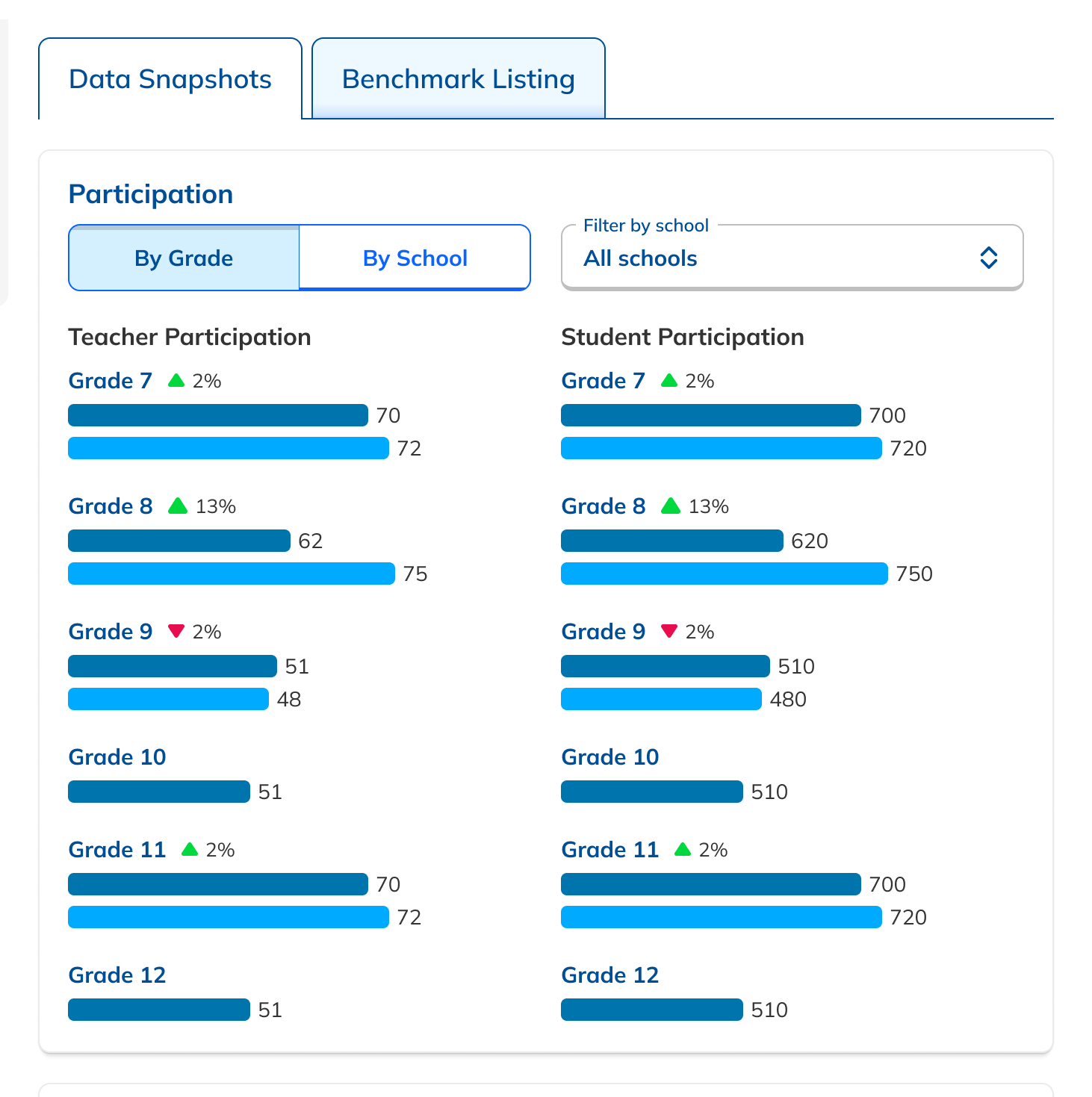
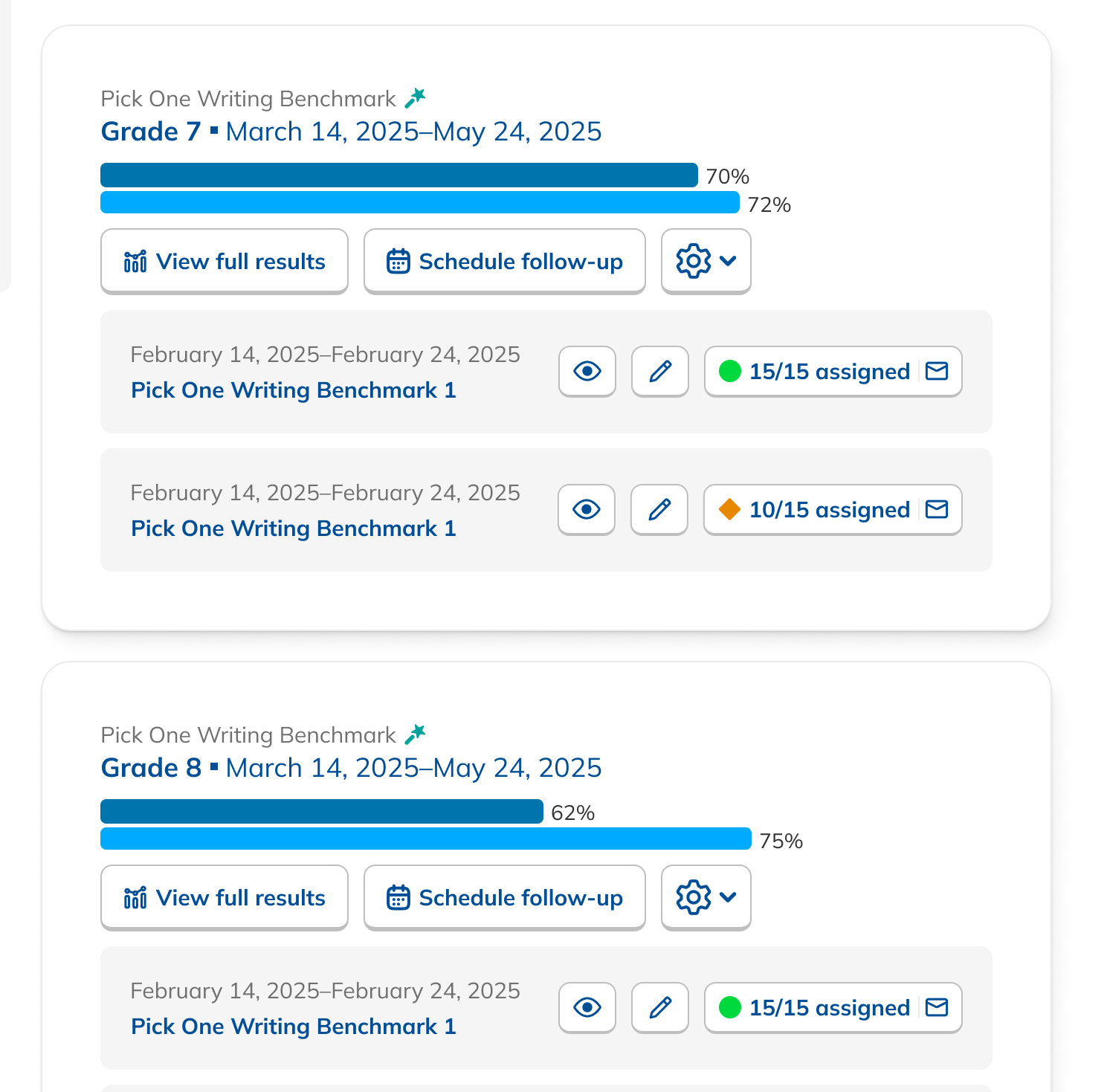
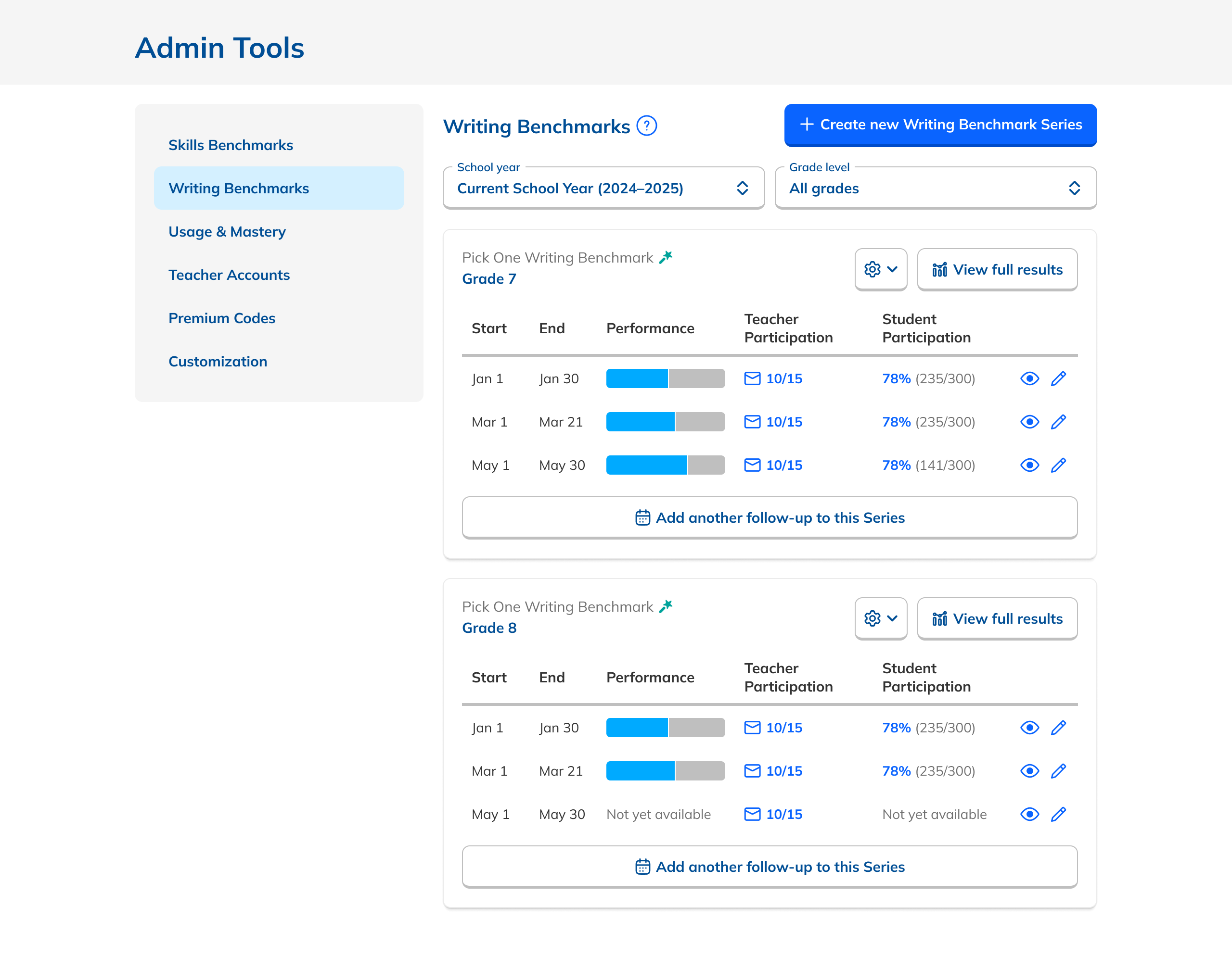
Admins had a Dashboard listing active assessments grouped by Series, and a Results page with breakdowns by school, teacher, class, and student. The rudiments were right, but the data was buried and the layouts made it hard to act on anything.
Not every request can be fulfilled.
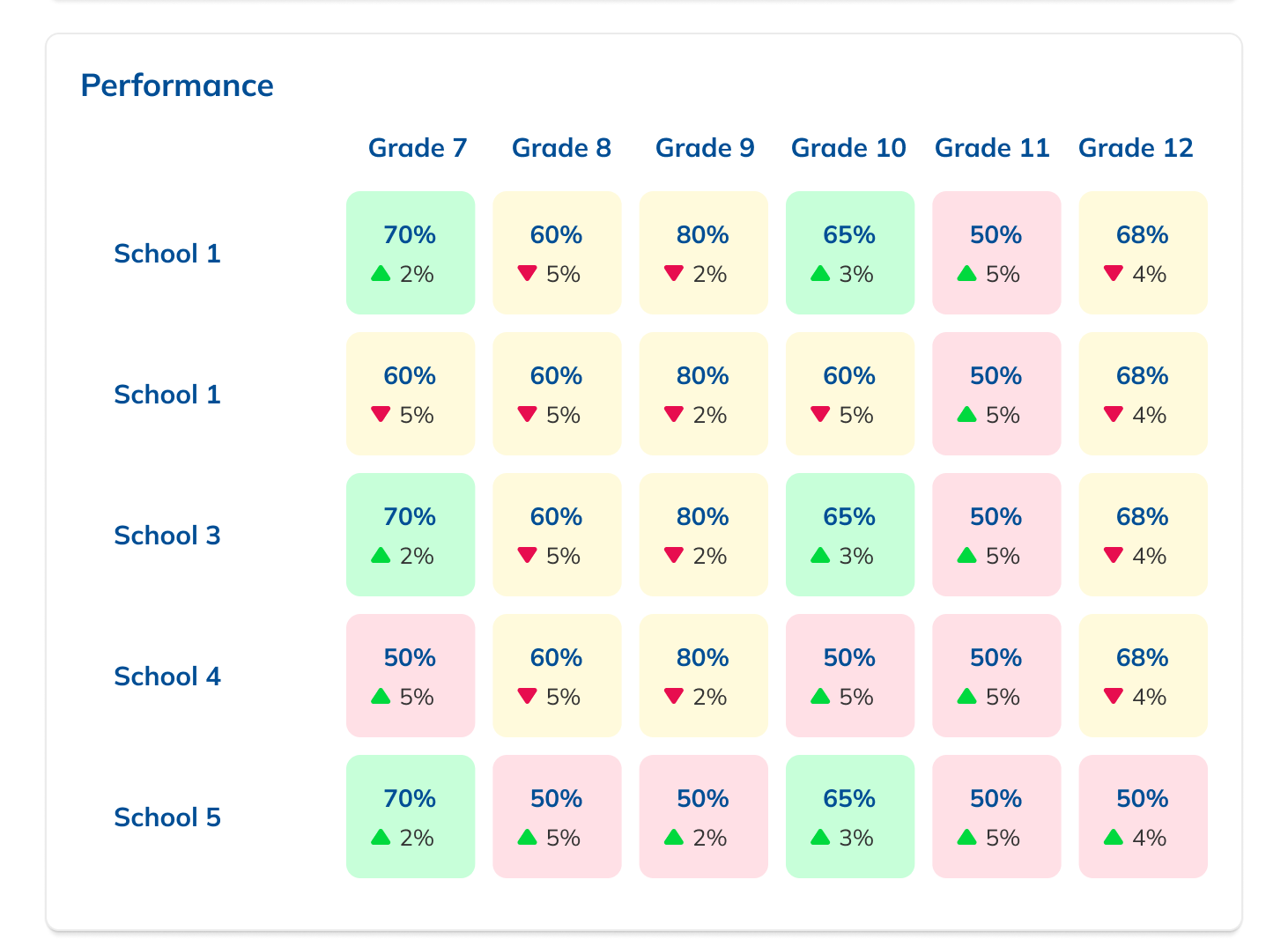
Research surfaced a desire for aggregate reports: performance data rolled up by grade and school, independent of any single assessment.
I explored this deeply, but hit a fundamental data problem. A single grade or school can have multiple unrelated Series, so aggregating across them would mix differing dates, content, and student bodies. Meaningless at best, misleading at worst.
We dropped the feature rather than ship something that looked authoritative but wasn't.
Knowing when to say no is as much a design skill as knowing what to build.
More data where admins already looked.
Though aggregate reports were out, the Dashboard was still nearly opaque. I added student participation data alongside teacher participation in a new tabular layout, and surfaced performance data directly on the Dashboard, so admins got a real window into results without drilling into each Series.
These additions gave users the bird's-eye view of data they were looking for while keeping the page focused and uncluttered.
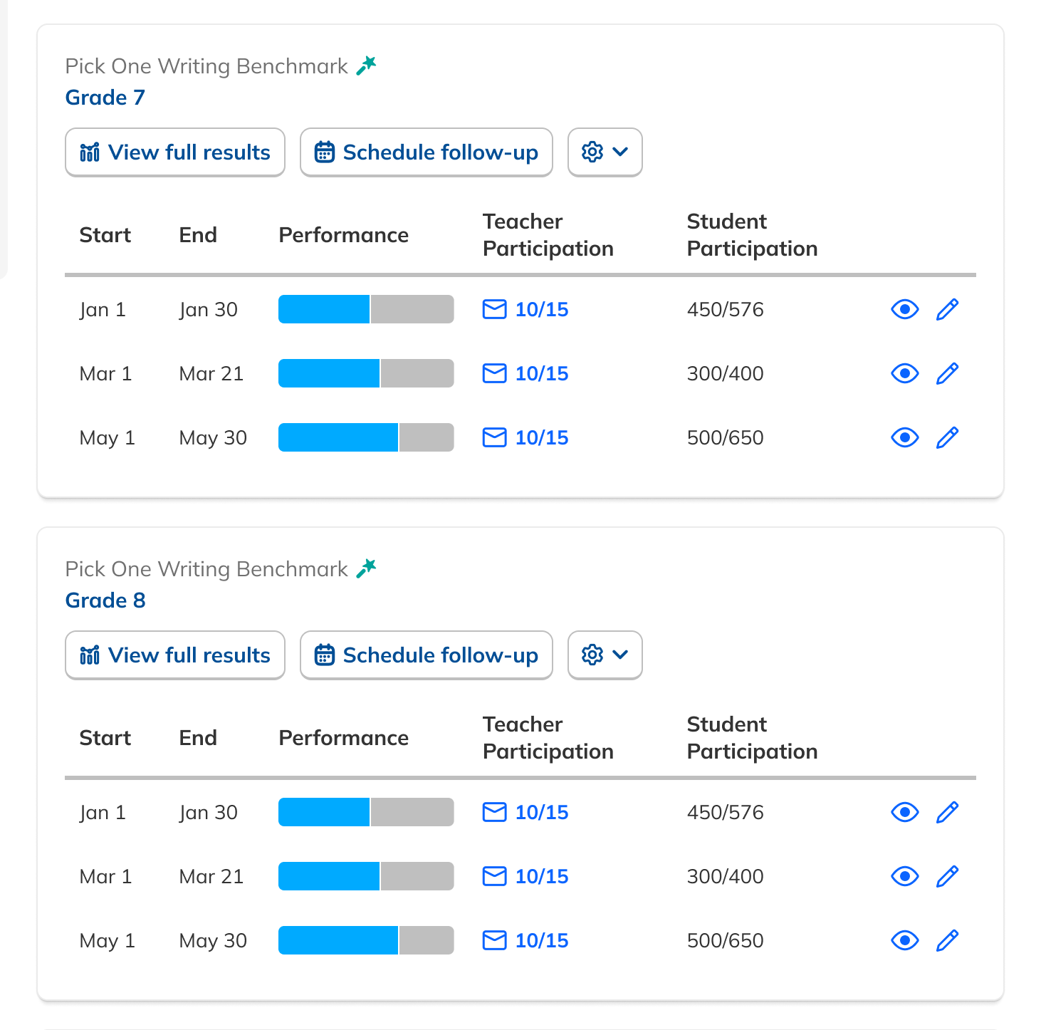
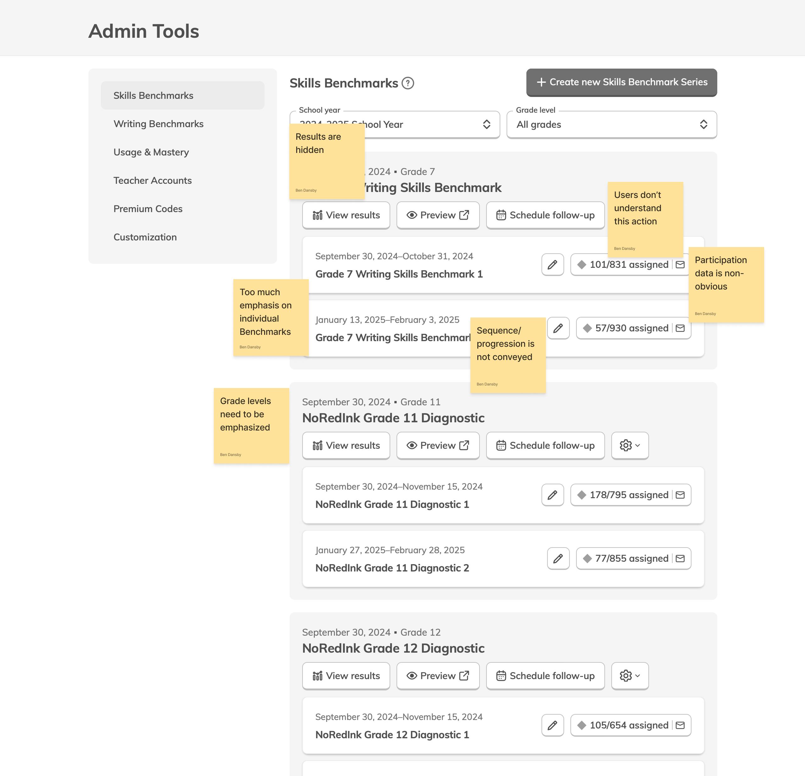
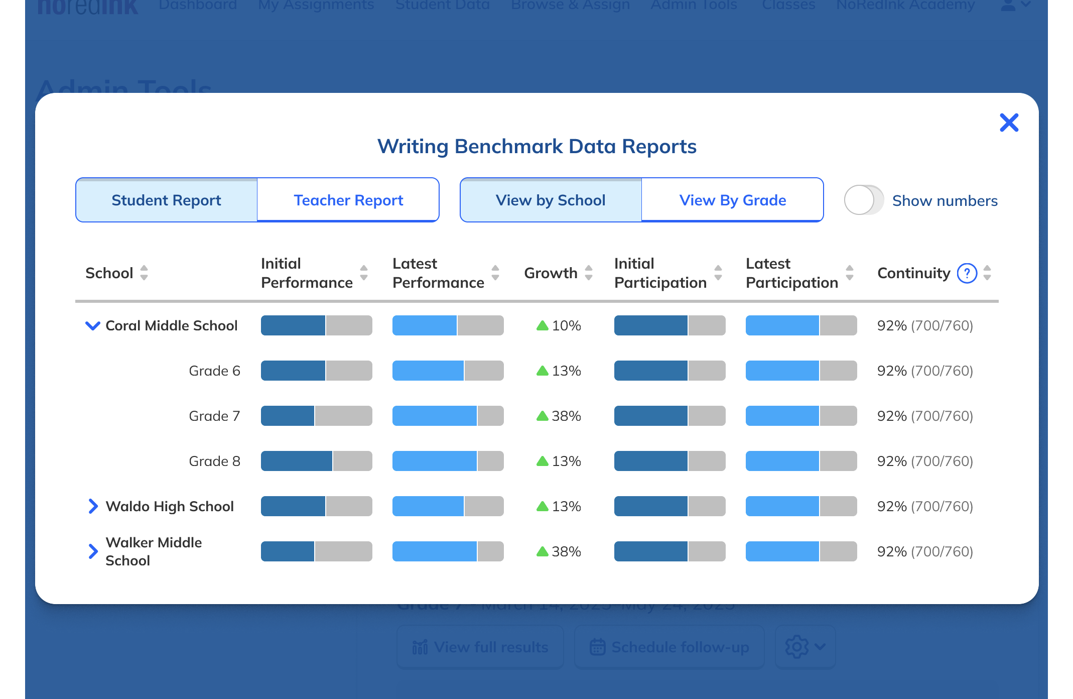
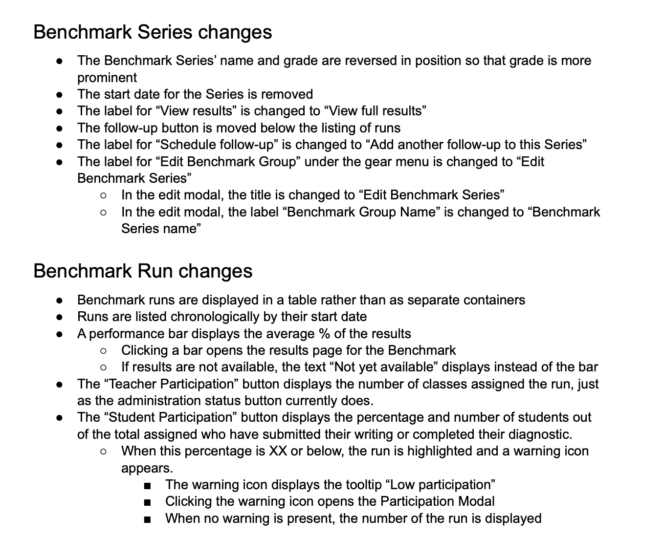
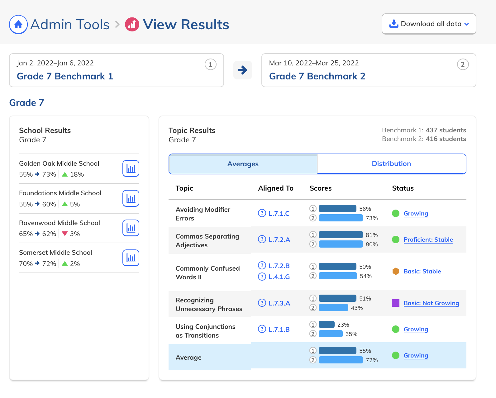
Series first. Data forward.
Customer Success told us the distinction between individual Benchmarks and a Series wasn't clear enough, causing admins to create duplicate Series when they meant to add to an existing one.
The new layout put Series at the center rather than the individual Benchmarks within them. Sequence became visually explicit. Button copy was tightened to clarify intent. And with the aggregate report concept gone, the page became simpler and more focused.
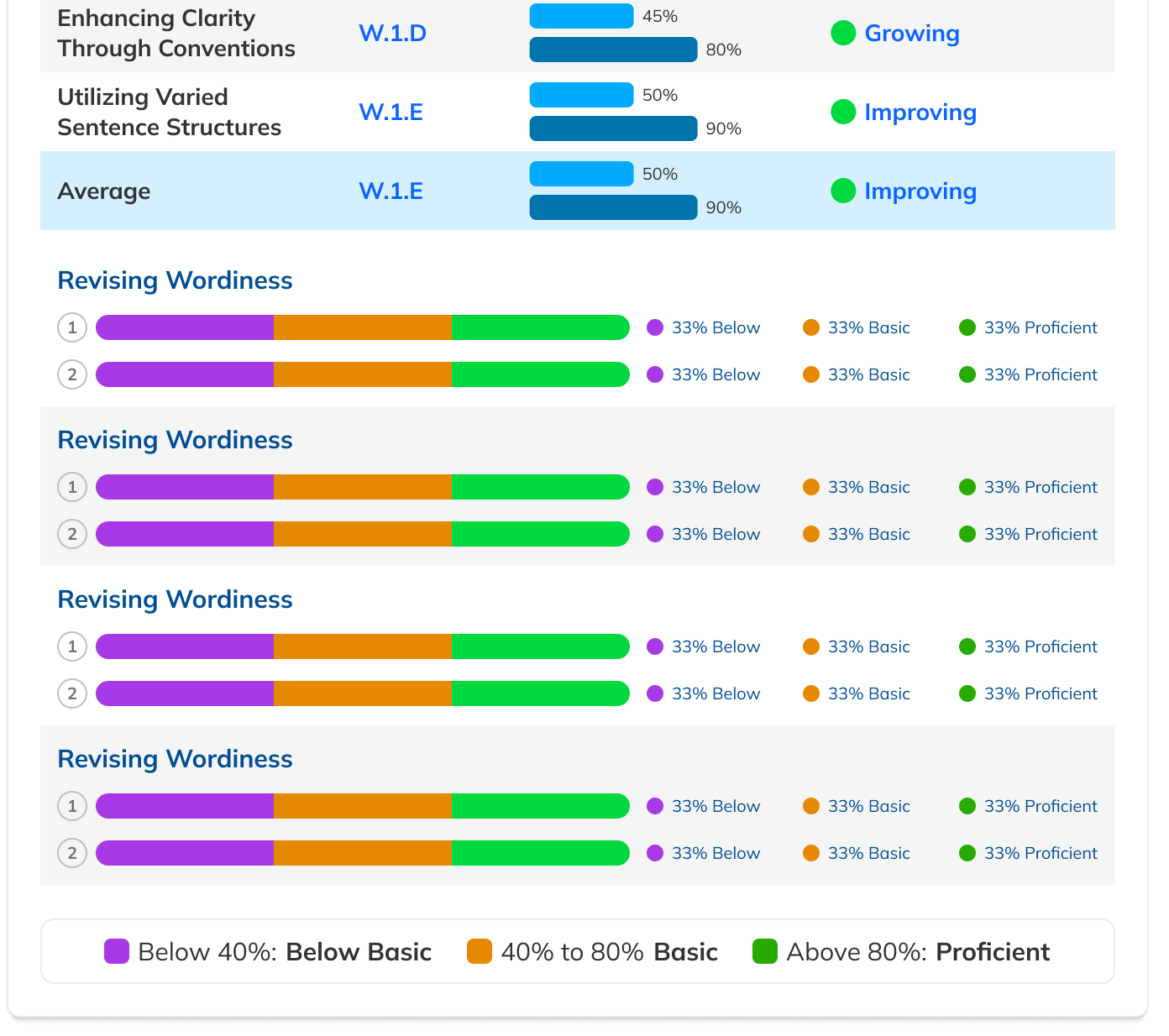
More emphasis on Series hierarchy
Clearer sense of sequence within a Series
Revised copy to reduce action confusion
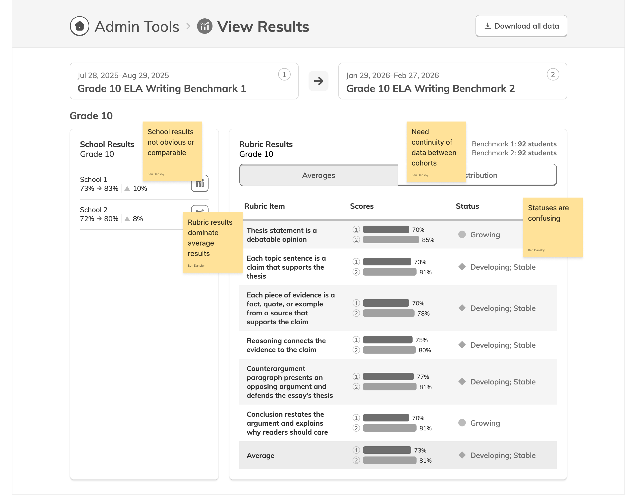
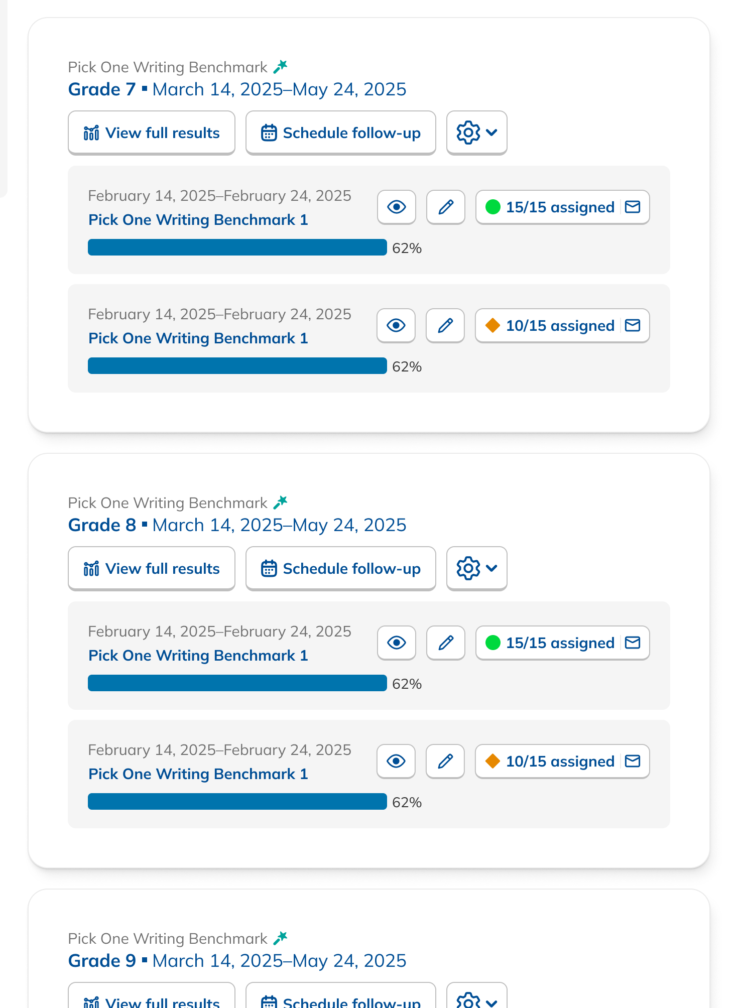
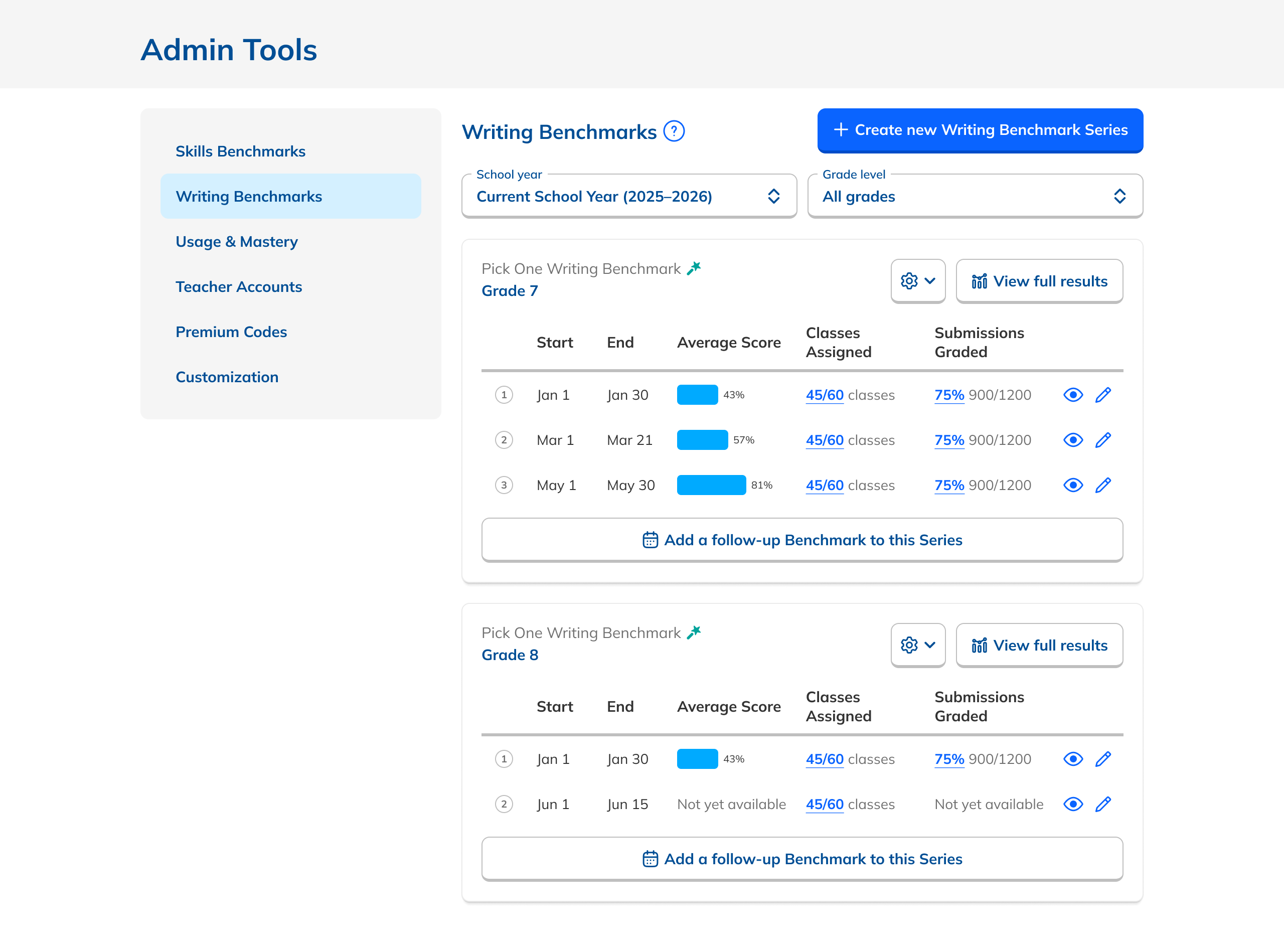
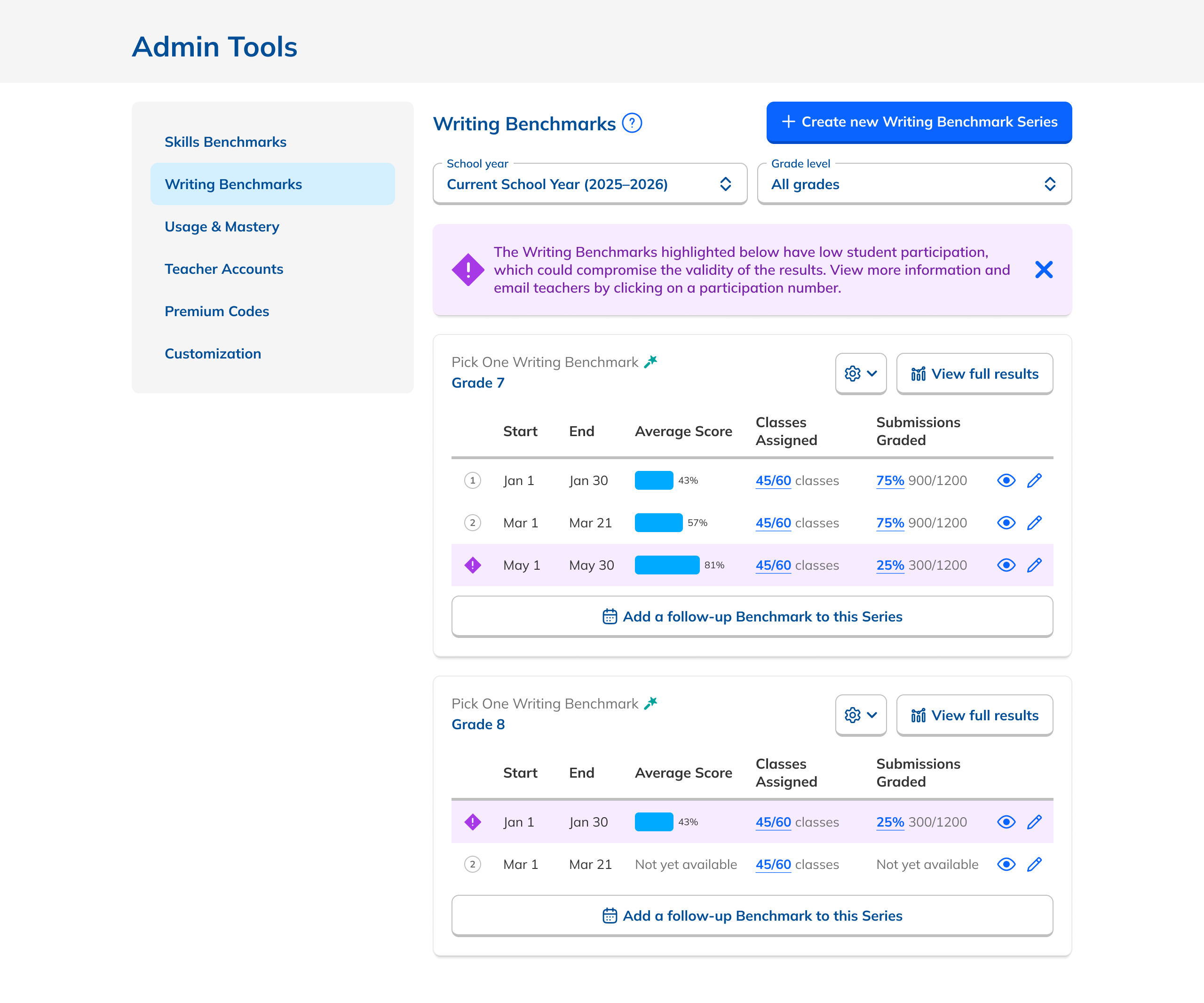
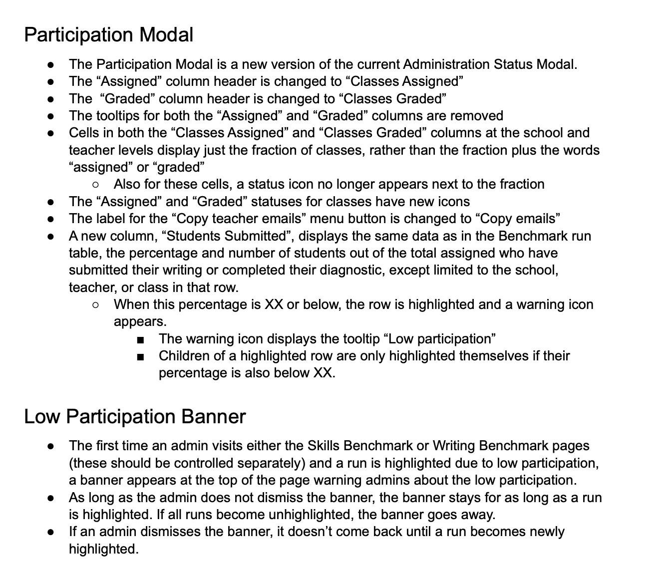
Testing sharpened the details.
Prototype walkthroughs surfaced four targeted improvements that made the data more legible and the interface easier to act on.
Better affordances for status numbers
Made participation counts more legible and easier to interpret at a glance.
Numbered each Benchmark in a Series
Reinforced sequence and made it obvious how many had been administered.
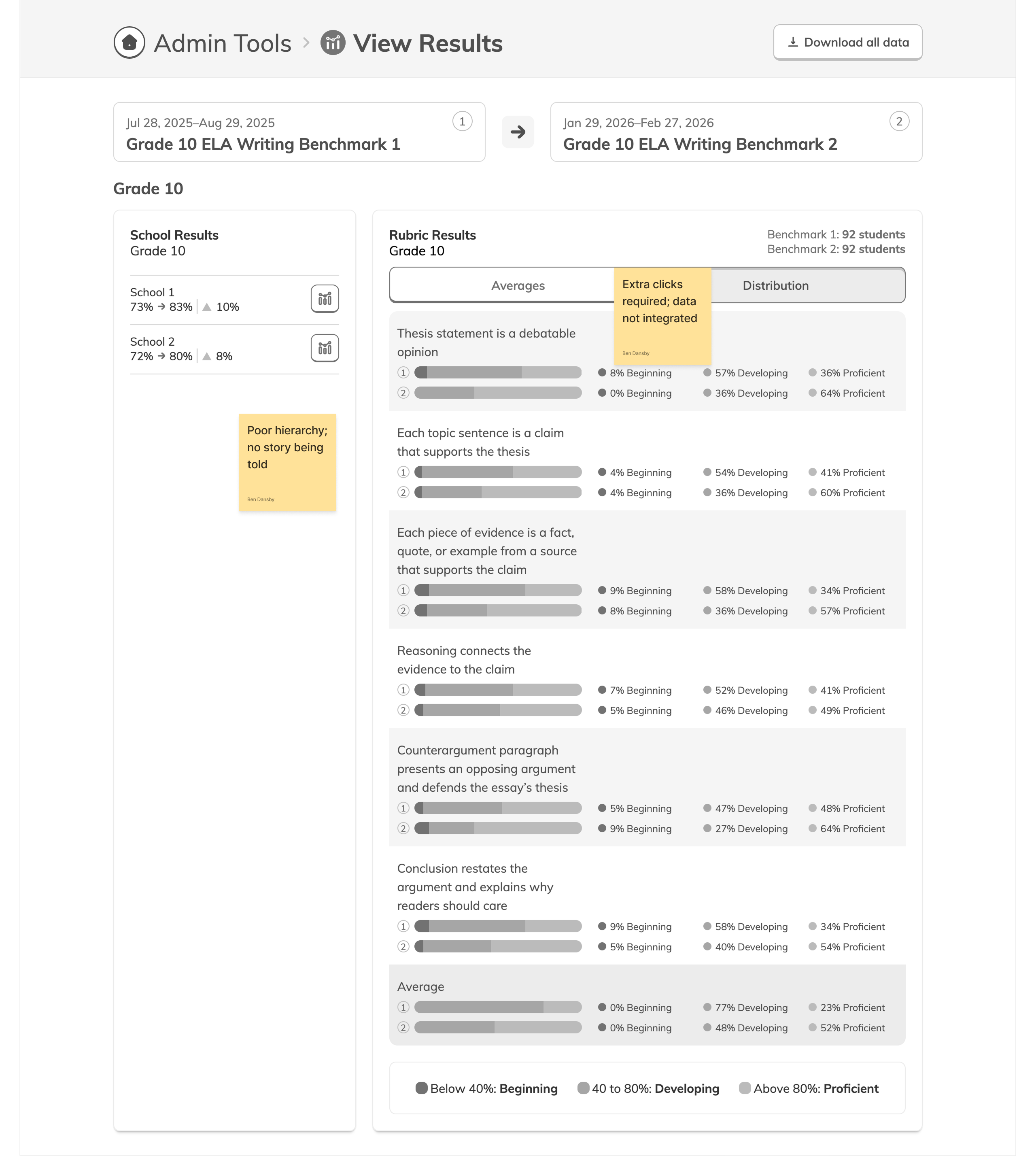
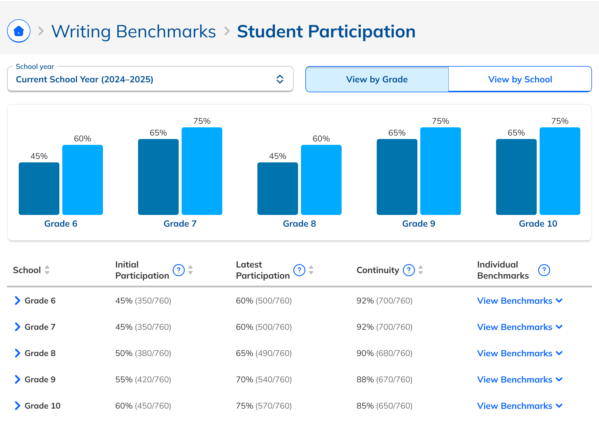
Updated performance charts
Redesigned to read less like progress bars and more like comparative data.
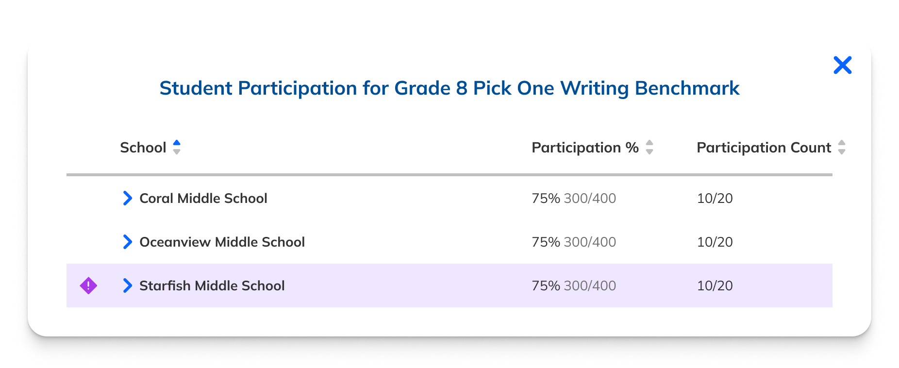
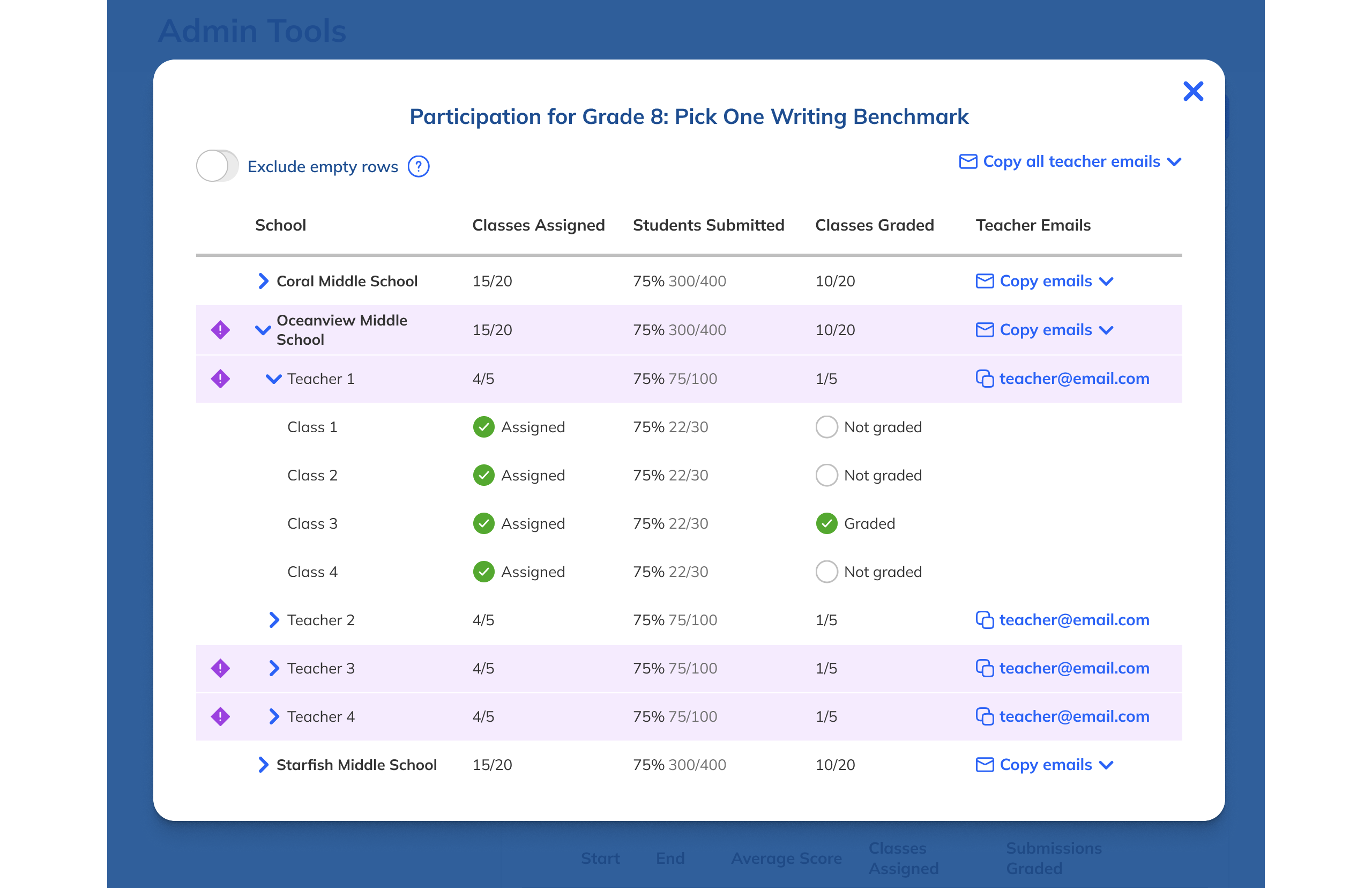
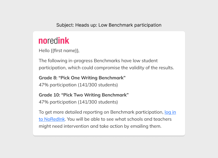
Low participation alerts + email
Admins who rarely logged in would still be alerted to underperforming Benchmarks.
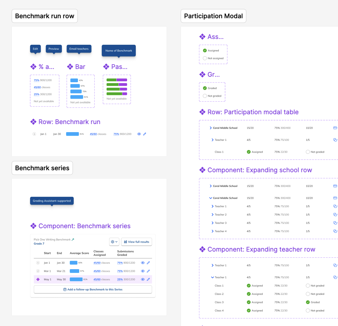
Spec'ing complexity.
A thorough handoff gave engineers everything they needed: interaction specs, Figma prototypes covering each Benchmark state and edge case, and the low-participation email copy that admins would rely on when they weren't actively in the product.
I kicked off development with a team presentation, then fielded edge cases on Slack and in GitHub as they arose.
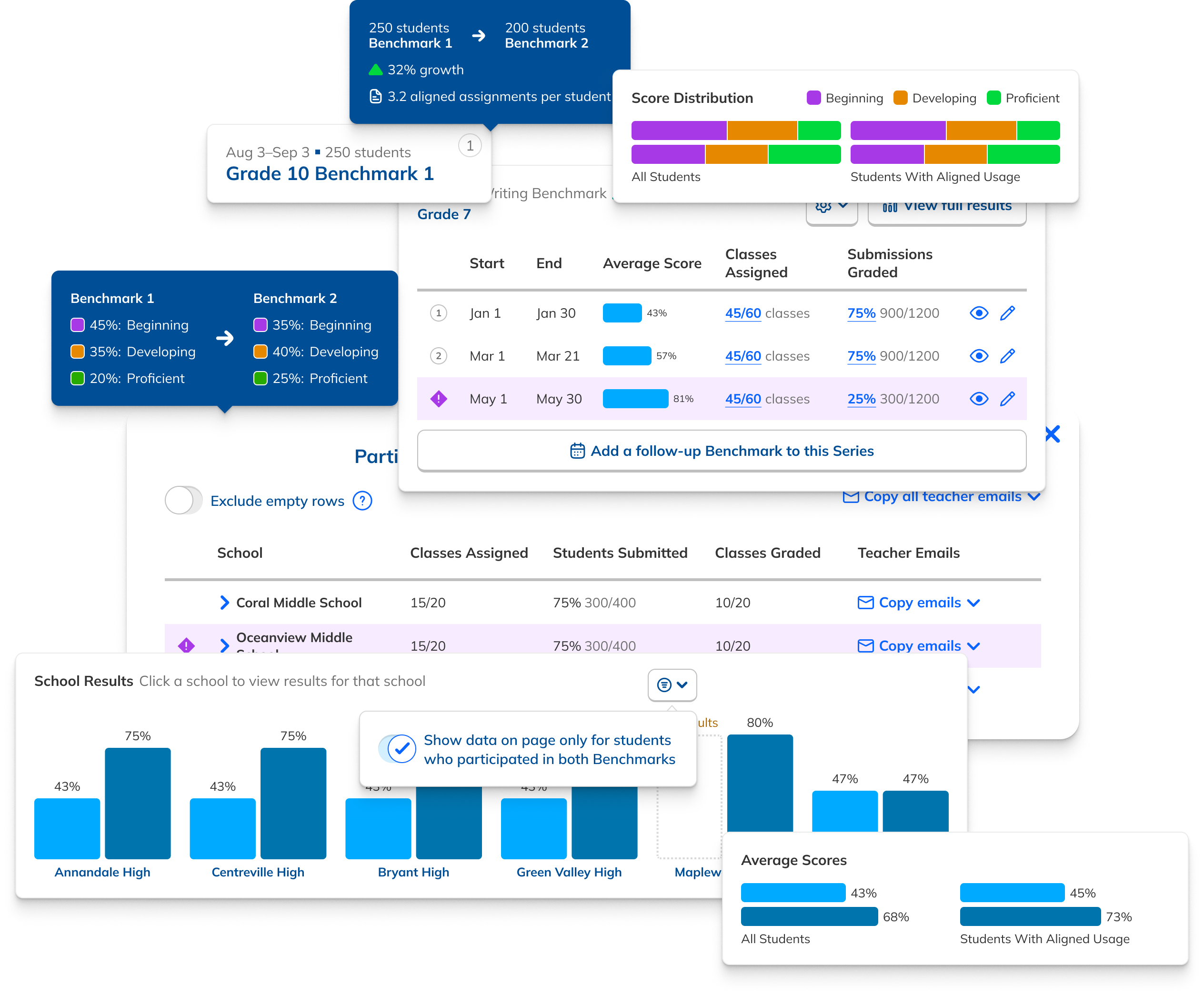
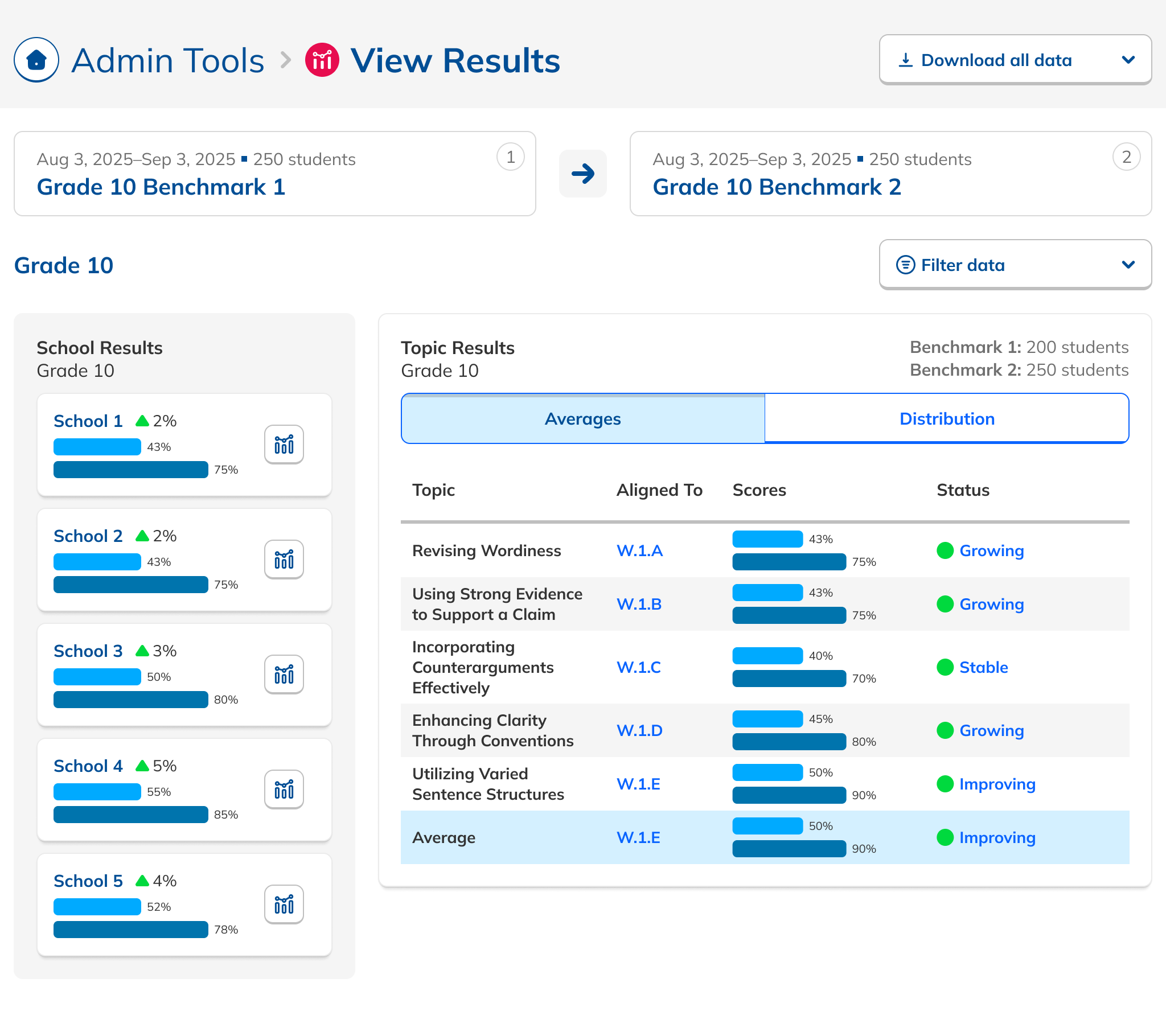
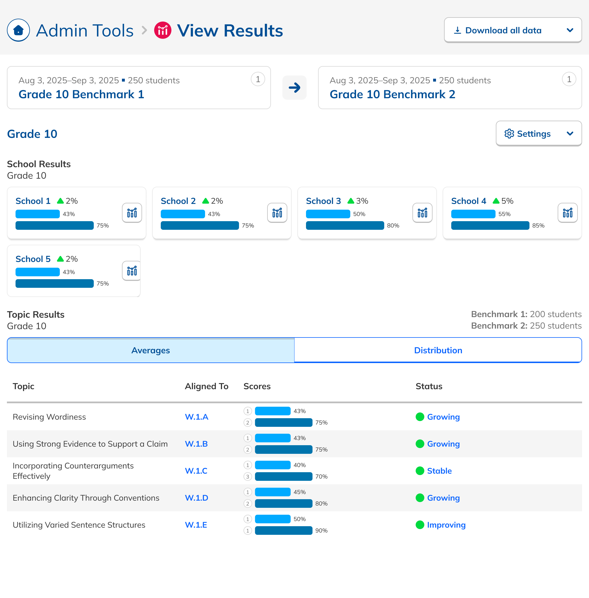
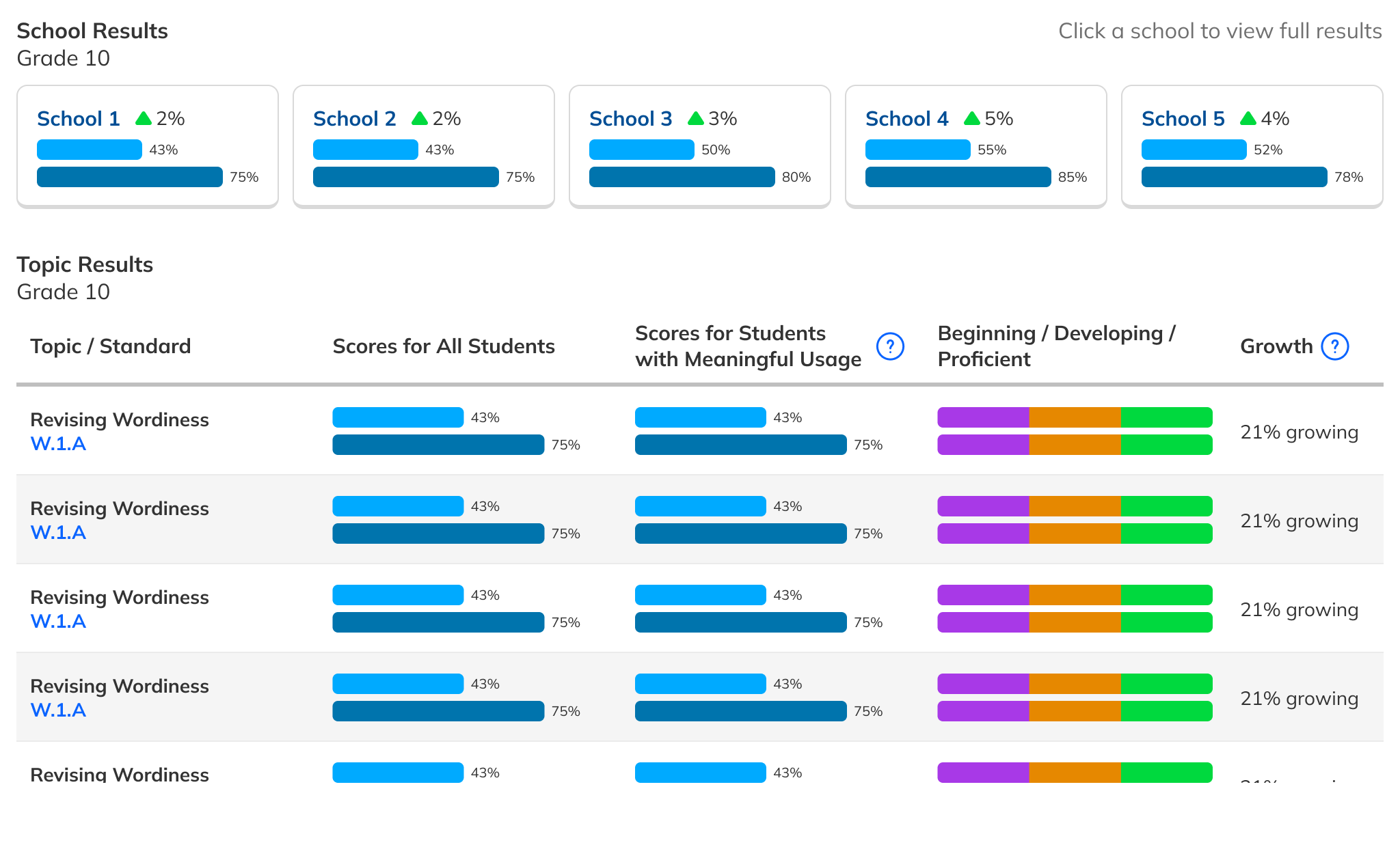
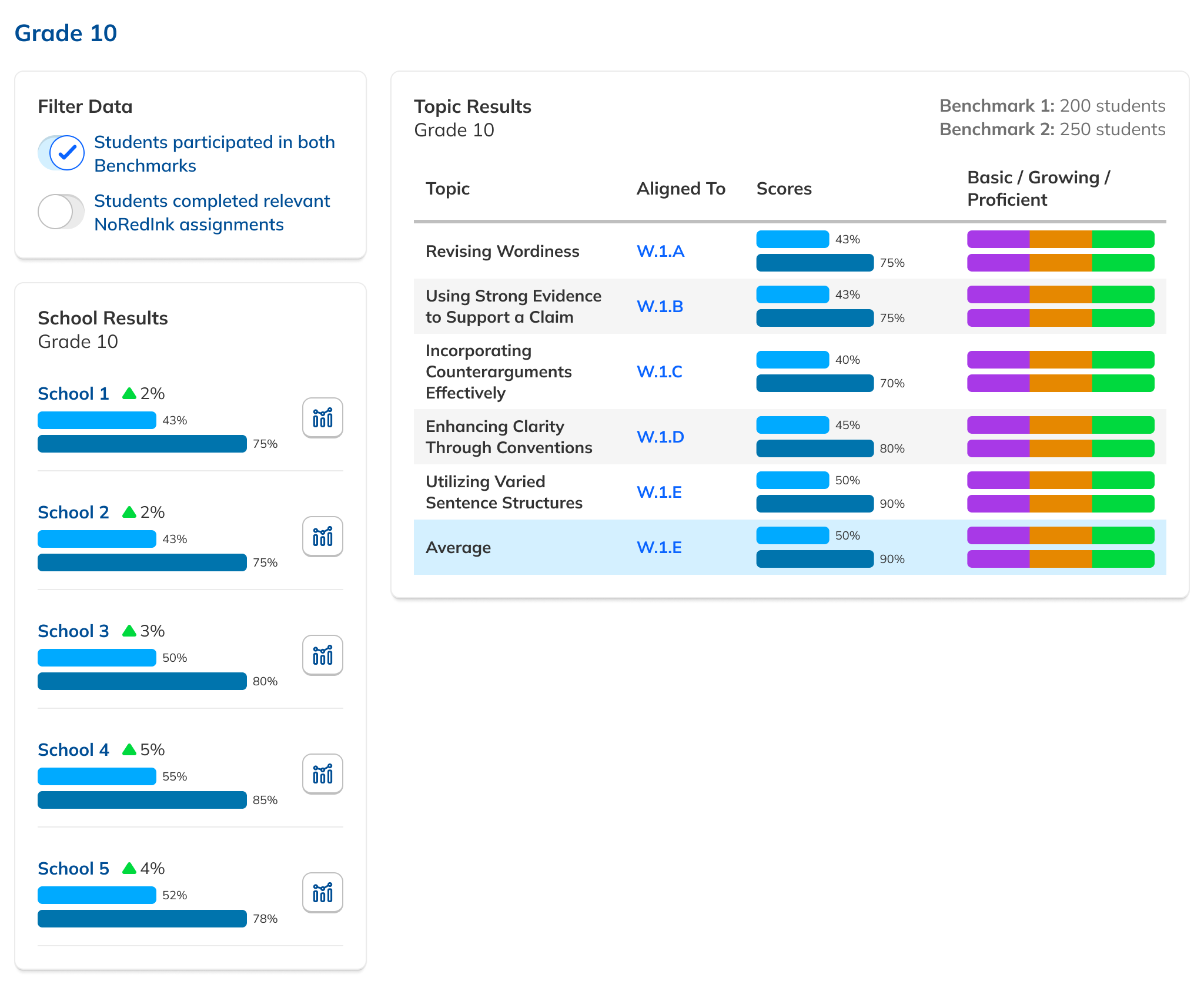
Making school comparison effortless.
With the Dashboard in development, we turned to the Results page. Admins needed to compare school performance at a glance, but many didn't even realize the capability existed. I iterated from inline bar charts, to charts above the table, to the final horizontal layout that made comparisons obvious rather than something you had to squint to find.
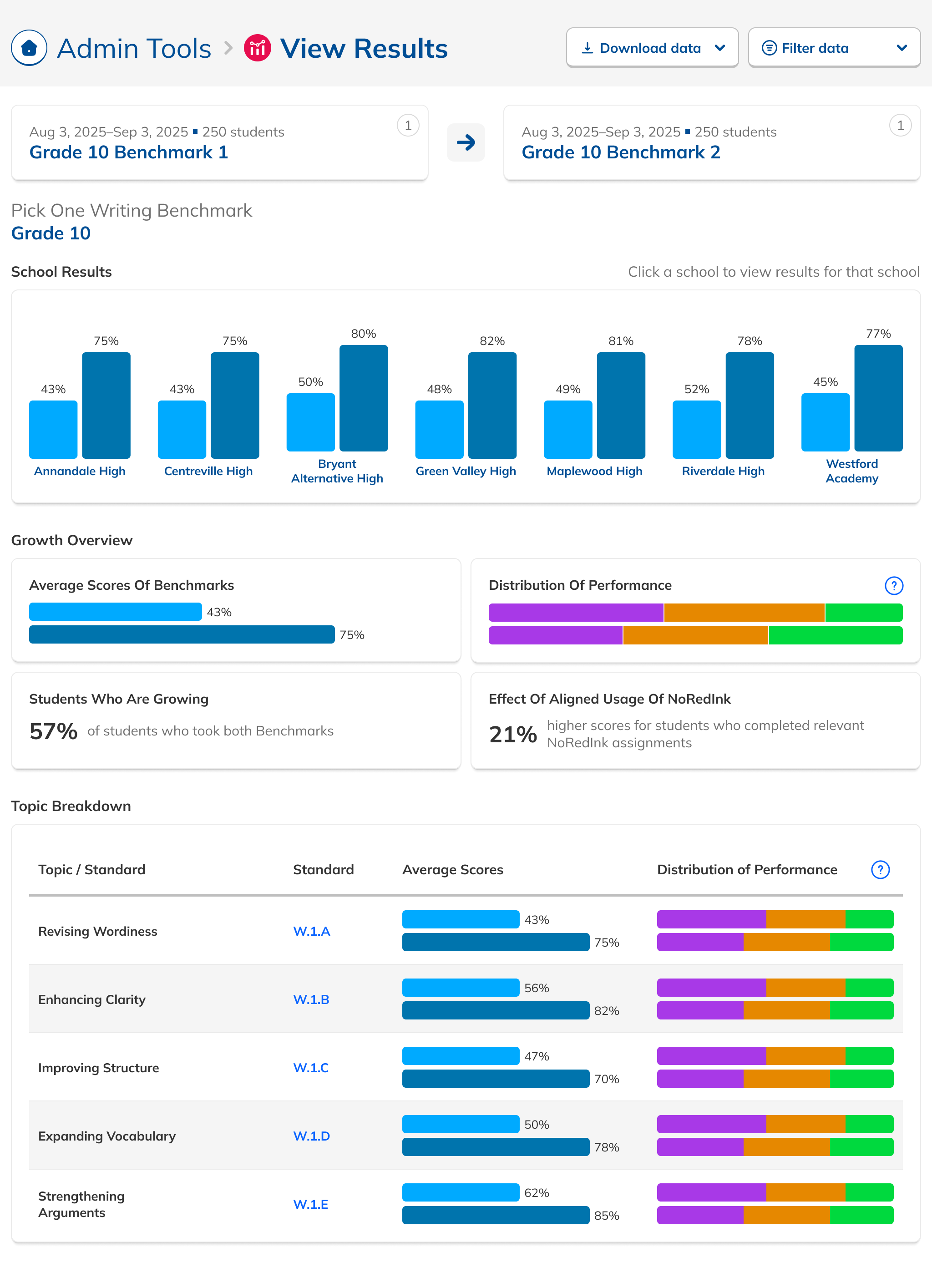
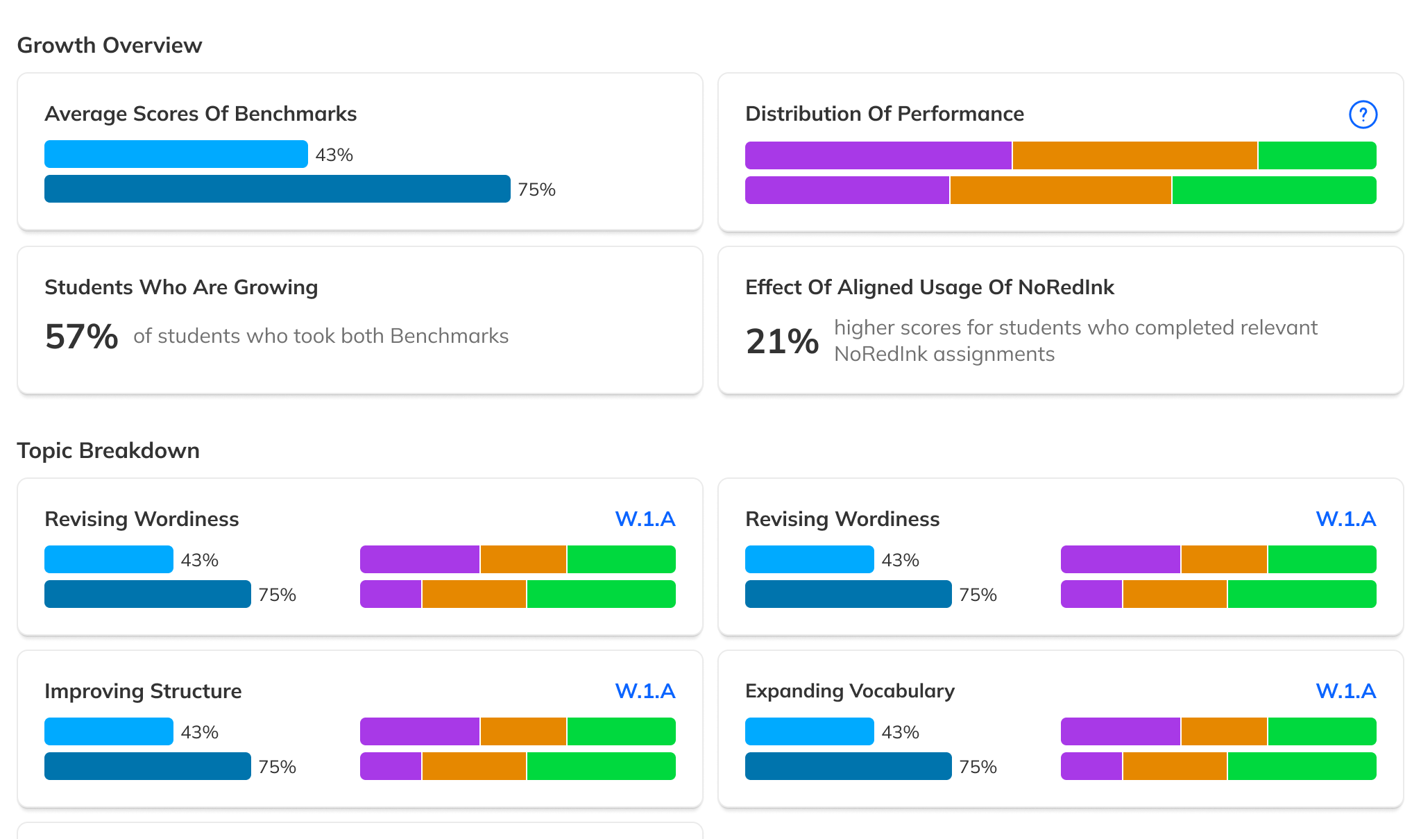
Tell the story, not just the data.
Customer Success flagged that overall scores were being overshadowed by individual skill scores. Some admins didn't even notice the overall score was available. We were providing data but not telling a story with it.
Research also revealed a need for filtered views: data counted only from students who had taken both Benchmarks in a comparison, ensuring growth numbers were apples-to-apples.
The redesigned Results page led with overall performance, added comparative filters, and was modular enough that efficacy-specific data could be surfaced or hidden based on future product decisions.
Reducing noise upstream.
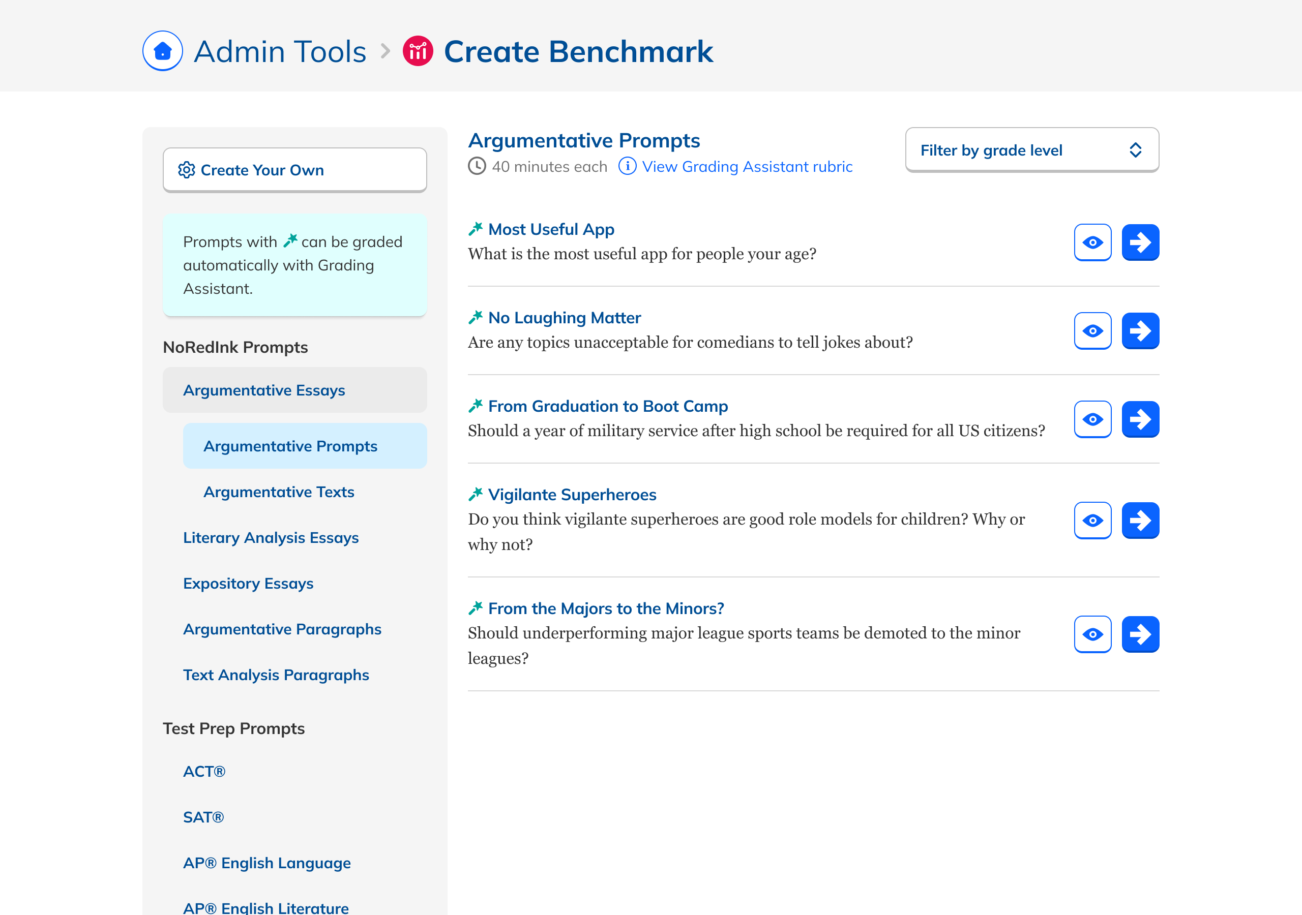
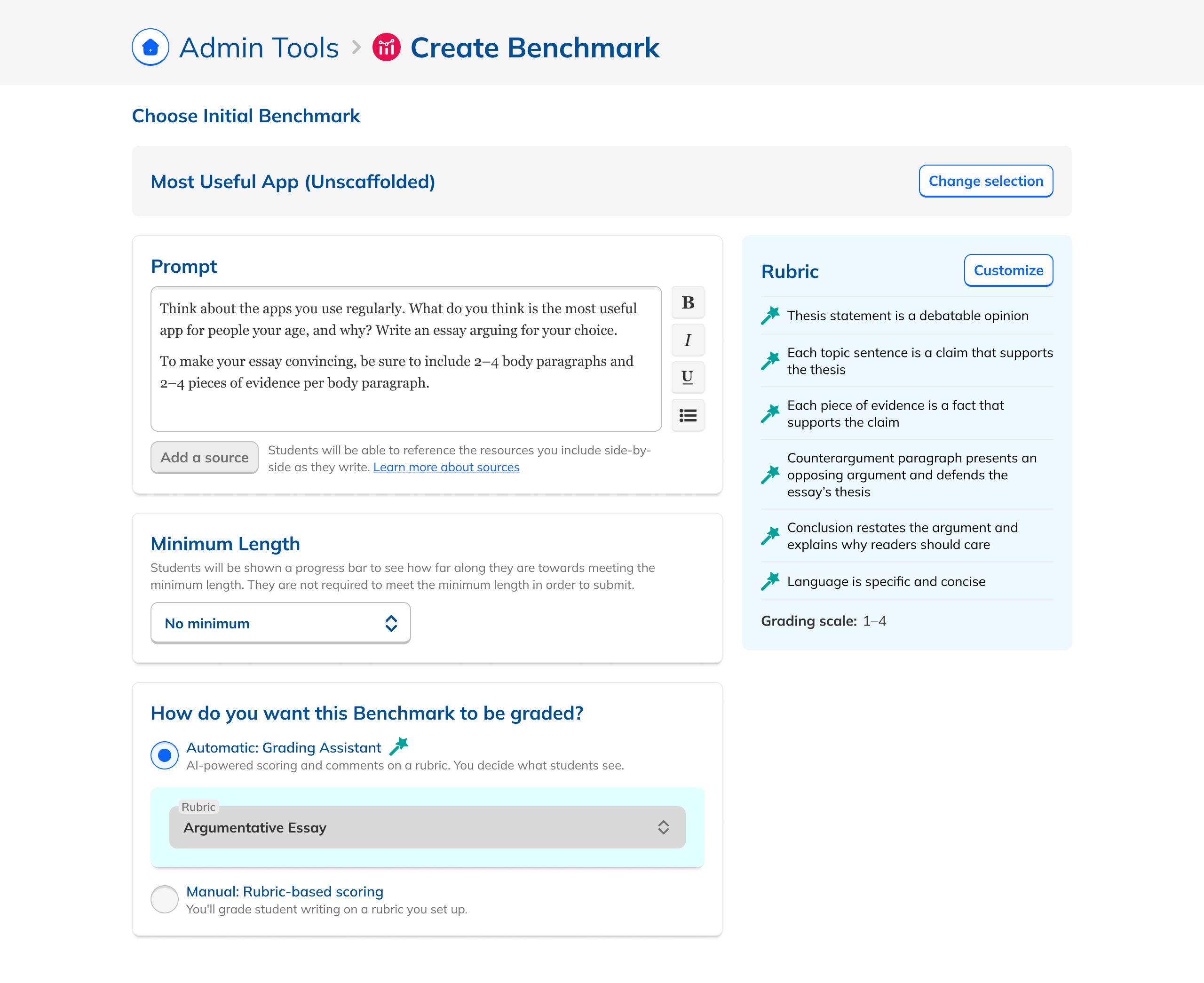
Better views only help if Benchmarks are set up correctly. An audit of the creation flow turned up a glut of inappropriate content, unlabeled AI assignments, inconsistent editing, and buggy date selection. Tightening guardrails (required time between Benchmarks, matched grade levels, consistent class assignments) meaningfully improved outcome quality.